seaborn.displot#
- seaborn.displot(data=None, *, x=None, y=None, hue=None, row=None, col=None, weights=None, kind='hist', rug=False, rug_kws=None, log_scale=None, legend=True, palette=None, hue_order=None, hue_norm=None, color=None, col_wrap=None, row_order=None, col_order=None, height=5, aspect=1, facet_kws=None, **kwargs)#
Figure-level interface for drawing distribution plots onto a FacetGrid.
This function provides access to several approaches for visualizing the univariate or bivariate distribution of data, including subsets of data defined by semantic mapping and faceting across multiple subplots. The
kindparameter selects the approach to use:histplot()(withkind="hist"; the default)kdeplot()(withkind="kde")ecdfplot()(withkind="ecdf"; univariate-only)
Additionally, a
rugplot()can be added to any kind of plot to show individual observations.Extra keyword arguments are passed to the underlying function, so you should refer to the documentation for each to understand the complete set of options for making plots with this interface.
See the distribution plots tutorial for a more in-depth discussion of the relative strengths and weaknesses of each approach. The distinction between figure-level and axes-level functions is explained further in the user guide.
- Parameters:
- data
pandas.DataFrame,numpy.ndarray, mapping, or sequence Input data structure. Either a long-form collection of vectors that can be assigned to named variables or a wide-form dataset that will be internally reshaped.
- x, yvectors or keys in
data Variables that specify positions on the x and y axes.
- huevector or key in
data Semantic variable that is mapped to determine the color of plot elements.
- row, colvectors or keys in
data Variables that define subsets to plot on different facets.
- weightsvector or key in
data Observation weights used for computing the distribution function.
- kind{“hist”, “kde”, “ecdf”}
Approach for visualizing the data. Selects the underlying plotting function and determines the additional set of valid parameters.
- rugbool
If True, show each observation with marginal ticks (as in
rugplot()).- rug_kwsdict
Parameters to control the appearance of the rug plot.
- log_scalebool or number, or pair of bools or numbers
Set axis scale(s) to log. A single value sets the data axis for any numeric axes in the plot. A pair of values sets each axis independently. Numeric values are interpreted as the desired base (default 10). When
NoneorFalse, seaborn defers to the existing Axes scale.- legendbool
If False, suppress the legend for semantic variables.
- palettestring, list, dict, or
matplotlib.colors.Colormap Method for choosing the colors to use when mapping the
huesemantic. String values are passed tocolor_palette(). List or dict values imply categorical mapping, while a colormap object implies numeric mapping.- hue_ordervector of strings
Specify the order of processing and plotting for categorical levels of the
huesemantic.- hue_normtuple or
matplotlib.colors.Normalize Either a pair of values that set the normalization range in data units or an object that will map from data units into a [0, 1] interval. Usage implies numeric mapping.
- color
matplotlib color Single color specification for when hue mapping is not used. Otherwise, the plot will try to hook into the matplotlib property cycle.
- col_wrapint
“Wrap” the column variable at this width, so that the column facets span multiple rows. Incompatible with a
rowfacet.- {row,col}_ordervector of strings
Specify the order in which levels of the
rowand/orcolvariables appear in the grid of subplots.- heightscalar
Height (in inches) of each facet. See also:
aspect.- aspectscalar
Aspect ratio of each facet, so that
aspect * heightgives the width of each facet in inches.- facet_kwsdict
Additional parameters passed to
FacetGrid.- kwargs
Other keyword arguments are documented with the relevant axes-level function:
histplot()(withkind="hist")kdeplot()(withkind="kde")ecdfplot()(withkind="ecdf")
- data
- Returns:
FacetGridAn object managing one or more subplots that correspond to conditional data subsets with convenient methods for batch-setting of axes attributes.
See also
histplotPlot a histogram of binned counts with optional normalization or smoothing.
kdeplotPlot univariate or bivariate distributions using kernel density estimation.
rugplotPlot a tick at each observation value along the x and/or y axes.
ecdfplotPlot empirical cumulative distribution functions.
jointplotDraw a bivariate plot with univariate marginal distributions.
Examples
See the API documentation for the axes-level functions for more details about the breadth of options available for each plot kind.
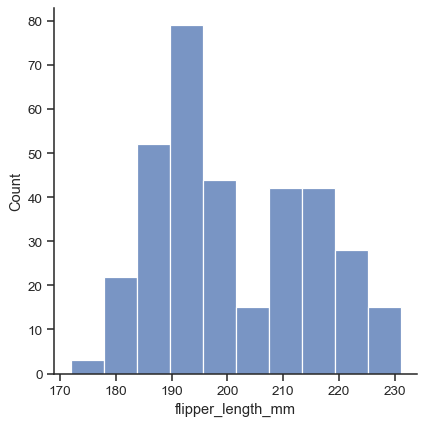
The default plot kind is a histogram:
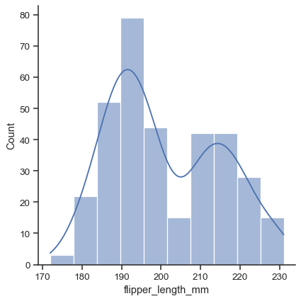
penguins = sns.load_dataset("penguins")
sns.displot(data=penguins, x="flipper_length_mm")
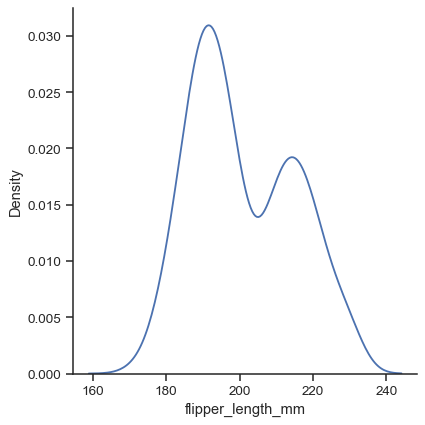
Use the
kindparameter to select a different representation:sns.displot(data=penguins, x="flipper_length_mm", kind="kde")
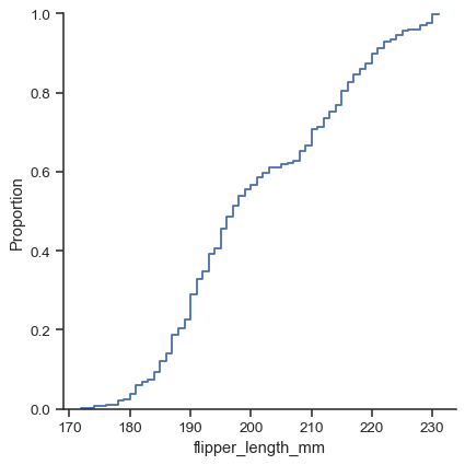
There are three main plot kinds; in addition to histograms and kernel density estimates (KDEs), you can also draw empirical cumulative distribution functions (ECDFs):
sns.displot(data=penguins, x="flipper_length_mm", kind="ecdf")
While in histogram mode, it is also possible to add a KDE curve:
sns.displot(data=penguins, x="flipper_length_mm", kde=True)
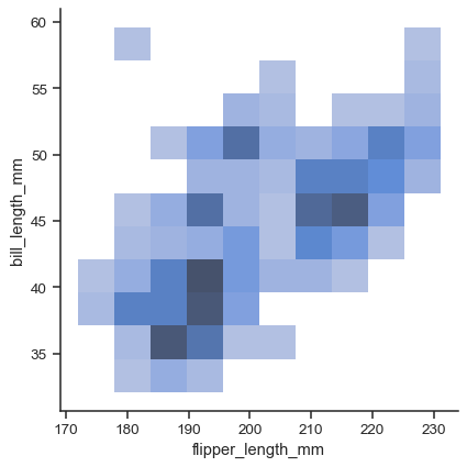
To draw a bivariate plot, assign both
xandy:sns.displot(data=penguins, x="flipper_length_mm", y="bill_length_mm")
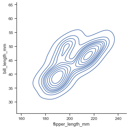
Currently, bivariate plots are available only for histograms and KDEs:
sns.displot(data=penguins, x="flipper_length_mm", y="bill_length_mm", kind="kde")
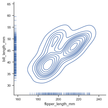
For each kind of plot, you can also show individual observations with a marginal “rug”:
g = sns.displot(data=penguins, x="flipper_length_mm", y="bill_length_mm", kind="kde", rug=True)
Each kind of plot can be drawn separately for subsets of data using
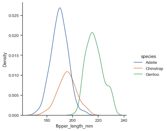
huemapping:sns.displot(data=penguins, x="flipper_length_mm", hue="species", kind="kde")
Additional keyword arguments are passed to the appropriate underlying plotting function, allowing for further customization:
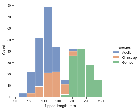
sns.displot(data=penguins, x="flipper_length_mm", hue="species", multiple="stack")
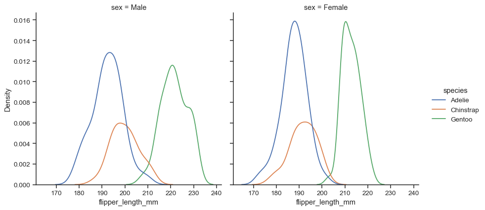
The figure is constructed using a
FacetGrid, meaning that you can also show subsets on distinct subplots, or “facets”:sns.displot(data=penguins, x="flipper_length_mm", hue="species", col="sex", kind="kde")
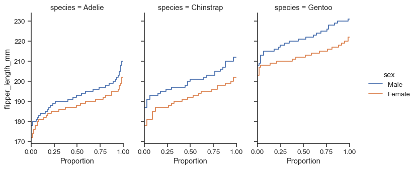
Because the figure is drawn with a
FacetGrid, you control its size and shape with theheightandaspectparameters:sns.displot( data=penguins, y="flipper_length_mm", hue="sex", col="species", kind="ecdf", height=4, aspect=.7, )
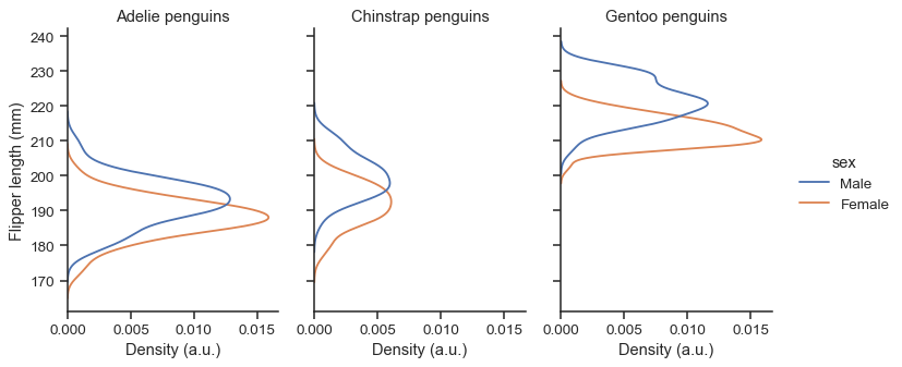
The function returns the
FacetGridobject with the plot, and you can use the methods on this object to customize it further:g = sns.displot( data=penguins, y="flipper_length_mm", hue="sex", col="species", kind="kde", height=4, aspect=.7, ) g.set_axis_labels("Density (a.u.)", "Flipper length (mm)") g.set_titles("{col_name} penguins")