seaborn.JointGrid.__init__#
- JointGrid.__init__(data=None, *, x=None, y=None, hue=None, height=6, ratio=5, space=0.2, palette=None, hue_order=None, hue_norm=None, dropna=False, xlim=None, ylim=None, marginal_ticks=False)#
Set up the grid of subplots and store data internally for easy plotting.
- Parameters:
- data
pandas.DataFrame,numpy.ndarray, mapping, or sequence Input data structure. Either a long-form collection of vectors that can be assigned to named variables or a wide-form dataset that will be internally reshaped.
- x, yvectors or keys in
data Variables that specify positions on the x and y axes.
- heightnumber
Size of each side of the figure in inches (it will be square).
- rationumber
Ratio of joint axes height to marginal axes height.
- spacenumber
Space between the joint and marginal axes
- dropnabool
If True, remove missing observations before plotting.
- {x, y}limpairs of numbers
Set axis limits to these values before plotting.
- marginal_ticksbool
If False, suppress ticks on the count/density axis of the marginal plots.
- huevector or key in
data Semantic variable that is mapped to determine the color of plot elements. Note: unlike in
FacetGridorPairGrid, the axes-level functions must supporthueto use it inJointGrid.- palettestring, list, dict, or
matplotlib.colors.Colormap Method for choosing the colors to use when mapping the
huesemantic. String values are passed tocolor_palette(). List or dict values imply categorical mapping, while a colormap object implies numeric mapping.- hue_ordervector of strings
Specify the order of processing and plotting for categorical levels of the
huesemantic.- hue_normtuple or
matplotlib.colors.Normalize Either a pair of values that set the normalization range in data units or an object that will map from data units into a [0, 1] interval. Usage implies numeric mapping.
- data
See also
Examples
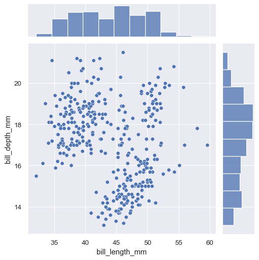
Calling the constructor initializes the figure, but it does not plot anything:
penguins = sns.load_dataset("penguins")
sns.JointGrid(data=penguins, x="bill_length_mm", y="bill_depth_mm")
The simplest plotting method,
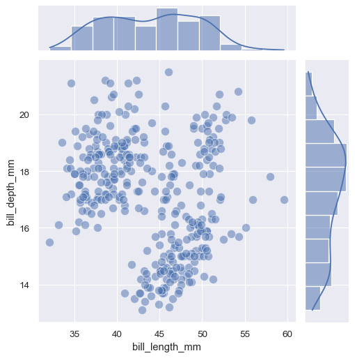
JointGrid.plot()accepts a pair of functions (one for the joint axes and one for both marginal axes):g = sns.JointGrid(data=penguins, x="bill_length_mm", y="bill_depth_mm") g.plot(sns.scatterplot, sns.histplot)
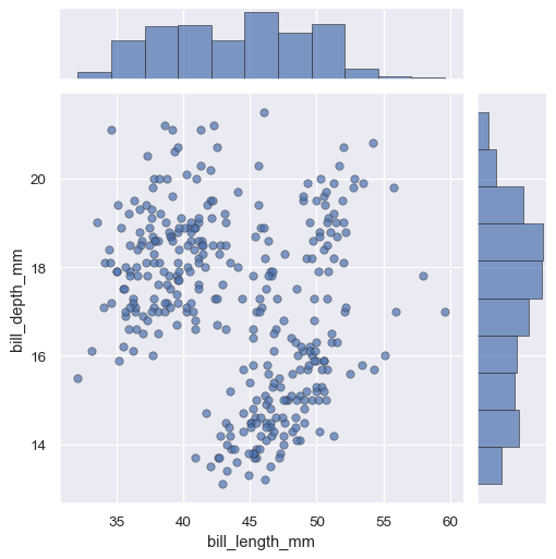
The
JointGrid.plot()function also accepts additional keyword arguments, but it passes them to both functions:g = sns.JointGrid(data=penguins, x="bill_length_mm", y="bill_depth_mm") g.plot(sns.scatterplot, sns.histplot, alpha=.7, edgecolor=".2", linewidth=.5)
If you need to pass different keyword arguments to each function, you’ll have to invoke
JointGrid.plot_joint()andJointGrid.plot_marginals():g = sns.JointGrid(data=penguins, x="bill_length_mm", y="bill_depth_mm") g.plot_joint(sns.scatterplot, s=100, alpha=.5) g.plot_marginals(sns.histplot, kde=True)
You can also set up the grid without assigning any data:
g = sns.JointGrid()
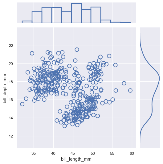
You can then plot by accessing the
ax_joint,ax_marg_x, andax_marg_yattributes, which arematplotlib.axes.Axesobjects:g = sns.JointGrid() x, y = penguins["bill_length_mm"], penguins["bill_depth_mm"] sns.scatterplot(x=x, y=y, ec="b", fc="none", s=100, linewidth=1.5, ax=g.ax_joint) sns.histplot(x=x, fill=False, linewidth=2, ax=g.ax_marg_x) sns.kdeplot(y=y, linewidth=2, ax=g.ax_marg_y)
The plotting methods can use any seaborn functions that accept
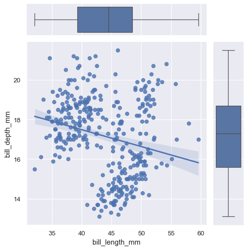
xandyvariables:g = sns.JointGrid(data=penguins, x="bill_length_mm", y="bill_depth_mm") g.plot(sns.regplot, sns.boxplot)
If the functions accept a
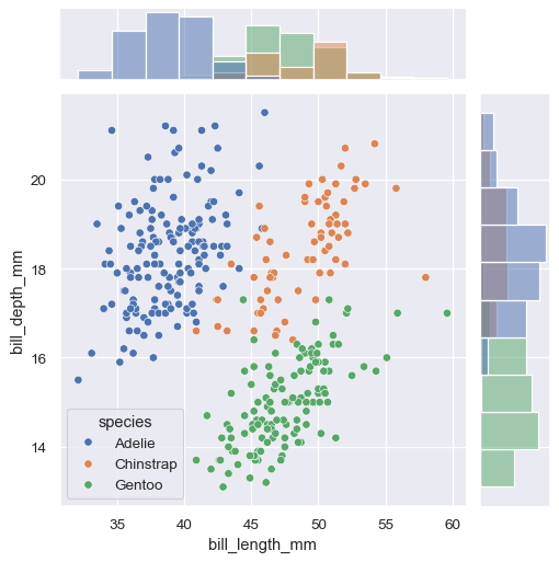
huevariable, you can use it by assigninghuewhen you call the constructor:g = sns.JointGrid(data=penguins, x="bill_length_mm", y="bill_depth_mm", hue="species") g.plot(sns.scatterplot, sns.histplot)
Horizontal and/or vertical reference lines can be added to the joint and/or marginal axes using :meth:
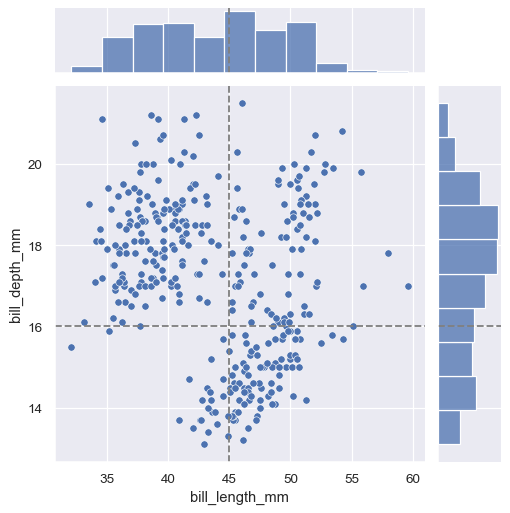
JointGrid.refline:g = sns.JointGrid(data=penguins, x="bill_length_mm", y="bill_depth_mm") g.plot(sns.scatterplot, sns.histplot) g.refline(x=45, y=16)
The figure will always be square (unless you resize it at the matplotlib layer), but its overall size and layout are configurable. The size is controlled by the
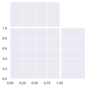
heightparameter. The relative ratio between the joint and marginal axes is controlled byratio, and the amount of space between the plots is controlled byspace:sns.JointGrid(height=4, ratio=2, space=.05)
By default, the ticks on the density axis of the marginal plots are turned off, but this is configurable:
sns.JointGrid(marginal_ticks=True)
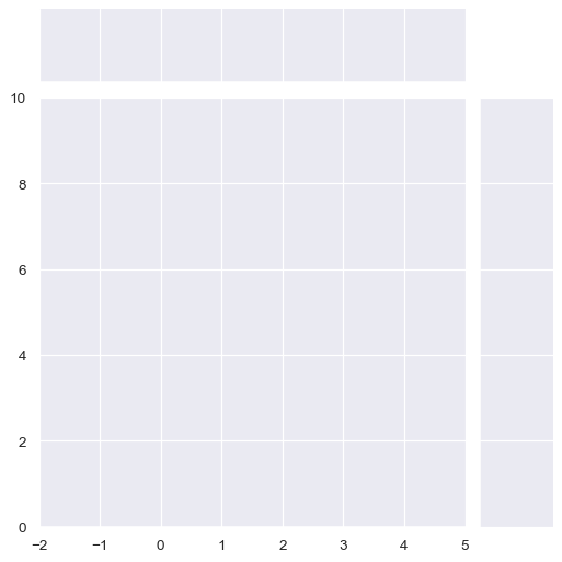
Limits on the two data axes (which are shared across plots) can also be defined when setting up the figure:
sns.JointGrid(xlim=(-2, 5), ylim=(0, 10))