seaborn.pointplot#
- seaborn.pointplot(data=None, *, x=None, y=None, hue=None, order=None, hue_order=None, estimator='mean', errorbar=('ci', 95), n_boot=1000, seed=None, units=None, weights=None, color=None, palette=None, hue_norm=None, markers=<default>, linestyles=<default>, dodge=False, log_scale=None, native_scale=False, orient=None, capsize=0, formatter=None, legend='auto', err_kws=None, ci=<deprecated>, errwidth=<deprecated>, join=<deprecated>, scale=<deprecated>, ax=None, **kwargs)#
Show point estimates and errors using lines with markers.
A point plot represents an estimate of central tendency for a numeric variable by the position of the dot and provides some indication of the uncertainty around that estimate using error bars.
Point plots can be more useful than bar plots for focusing comparisons between different levels of one or more categorical variables. They are particularly adept at showing interactions: how the relationship between levels of one categorical variable changes across levels of a second categorical variable. The lines that join each point from the same
huelevel allow interactions to be judged by differences in slope, which is easier for the eyes than comparing the heights of several groups of points or bars.See the tutorial for more information.
Note
By default, this function treats one of the variables as categorical and draws data at ordinal positions (0, 1, … n) on the relevant axis. As of version 0.13.0, this can be disabled by setting
native_scale=True.- Parameters:
- dataDataFrame, Series, dict, array, or list of arrays
Dataset for plotting. If
xandyare absent, this is interpreted as wide-form. Otherwise it is expected to be long-form.- x, y, huenames of variables in
dataor vector data Inputs for plotting long-form data. See examples for interpretation.
- order, hue_orderlists of strings
Order to plot the categorical levels in; otherwise the levels are inferred from the data objects.
- estimatorstring or callable that maps vector -> scalar
Statistical function to estimate within each categorical bin.
- errorbarstring, (string, number) tuple, callable or None
Name of errorbar method (either “ci”, “pi”, “se”, or “sd”), or a tuple with a method name and a level parameter, or a function that maps from a vector to a (min, max) interval, or None to hide errorbar. See the errorbar tutorial for more information.
New in version v0.12.0.
- n_bootint
Number of bootstrap samples used to compute confidence intervals.
- seedint,
numpy.random.Generator, ornumpy.random.RandomState Seed or random number generator for reproducible bootstrapping.
- unitsname of variable in
dataor vector data Identifier of sampling units; used by the errorbar function to perform a multilevel bootstrap and account for repeated measures
- weightsname of variable in
dataor vector data Data values or column used to compute weighted statistics. Note that the use of weights may limit other statistical options.
New in version v0.13.1.
- colormatplotlib color
Single color for the elements in the plot.
- palettepalette name, list, or dict
Colors to use for the different levels of the
huevariable. Should be something that can be interpreted bycolor_palette(), or a dictionary mapping hue levels to matplotlib colors.- markersstring or list of strings
Markers to use for each of the
huelevels.- linestylesstring or list of strings
Line styles to use for each of the
huelevels.- dodgebool or float
Amount to separate the points for each level of the
huevariable along the categorical axis. Setting toTruewill apply a small default.- log_scalebool or number, or pair of bools or numbers
Set axis scale(s) to log. A single value sets the data axis for any numeric axes in the plot. A pair of values sets each axis independently. Numeric values are interpreted as the desired base (default 10). When
NoneorFalse, seaborn defers to the existing Axes scale.New in version v0.13.0.
- native_scalebool
When True, numeric or datetime values on the categorical axis will maintain their original scaling rather than being converted to fixed indices.
New in version v0.13.0.
- orient“v” | “h” | “x” | “y”
Orientation of the plot (vertical or horizontal). This is usually inferred based on the type of the input variables, but it can be used to resolve ambiguity when both
xandyare numeric or when plotting wide-form data.Changed in version v0.13.0: Added ‘x’/’y’ as options, equivalent to ‘v’/’h’.
- capsizefloat
Width of the “caps” on error bars, relative to bar spacing.
- formattercallable
Function for converting categorical data into strings. Affects both grouping and tick labels.
New in version v0.13.0.
- legend“auto”, “brief”, “full”, or False
How to draw the legend. If “brief”, numeric
hueandsizevariables will be represented with a sample of evenly spaced values. If “full”, every group will get an entry in the legend. If “auto”, choose between brief or full representation based on number of levels. IfFalse, no legend data is added and no legend is drawn.New in version v0.13.0.
- err_kwsdict
Parameters of
matplotlib.lines.Line2D, for the error bar artists.New in version v0.13.0.
- cifloat
Level of the confidence interval to show, in [0, 100].
Deprecated since version v0.12.0: Use
errorbar=("ci", ...).- errwidthfloat
Thickness of error bar lines (and caps), in points.
Deprecated since version 0.13.0: Use
err_kws={'linewidth': ...}.- joinbool
If
True, connect point estimates with a line.Deprecated since version v0.13.0: Set
linestyle="none"to remove the lines between the points.- scalefloat
Scale factor for the plot elements.
Deprecated since version v0.13.0: Control element sizes with
matplotlib.lines.Line2Dparameters.- axmatplotlib Axes
Axes object to draw the plot onto, otherwise uses the current Axes.
- kwargskey, value mappings
Other parameters are passed through to
matplotlib.lines.Line2D.New in version v0.13.0.
- Returns:
- axmatplotlib Axes
Returns the Axes object with the plot drawn onto it.
See also
Notes
It is important to keep in mind that a point plot shows only the mean (or other estimator) value, but in many cases it may be more informative to show the distribution of values at each level of the categorical variables. In that case, other approaches such as a box or violin plot may be more appropriate.
Examples
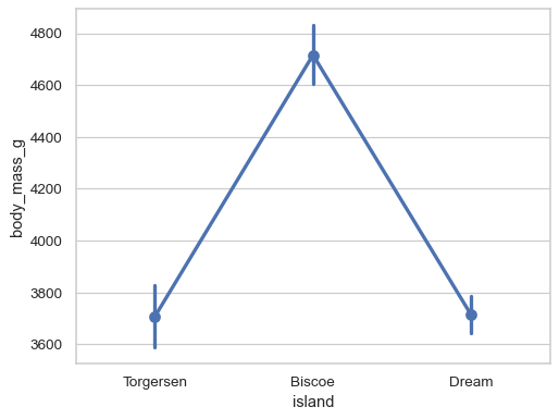
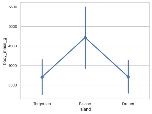
Group by a categorical variable and plot aggregated values, with confidence intervals:
sns.pointplot(data=penguins, x="island", y="body_mass_g")
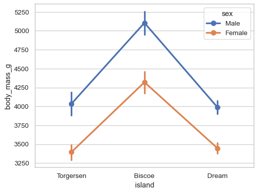
Add a second layer of grouping and differentiate with color:
sns.pointplot(data=penguins, x="island", y="body_mass_g", hue="sex")
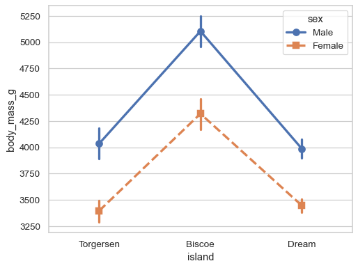
Redundantly code the
huevariable using the markers and linestyles for better accessibility:sns.pointplot( data=penguins, x="island", y="body_mass_g", hue="sex", markers=["o", "s"], linestyles=["-", "--"], )
Use the error bars to represent the standard deviation of each distribution:
sns.pointplot(data=penguins, x="island", y="body_mass_g", errorbar="sd")
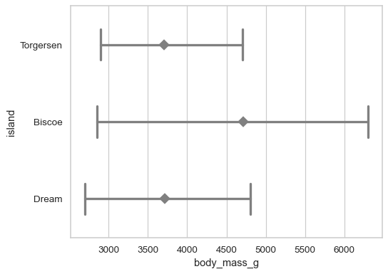
Customize the appearance of the plot:
sns.pointplot(
    data=penguins, x="body_mass_g", y="island",
    errorbar=("pi", 100), capsize=.4,
    color=".5", linestyle="none", marker="D",
)
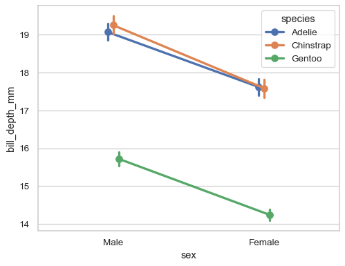
“Dodge” the artists along the categorical axis to reduce overplotting:
sns.pointplot(data=penguins, x="sex", y="bill_depth_mm", hue="species", dodge=True)
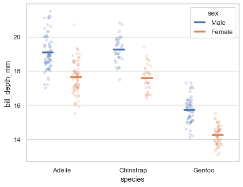
Dodge by a specific amount, relative to the width allotted for each level:
sns.stripplot(
    data=penguins, x="species", y="bill_depth_mm", hue="sex",
    dodge=True, alpha=.2, legend=False,
)
sns.pointplot(
    data=penguins, x="species", y="bill_depth_mm", hue="sex",
    dodge=.4, linestyle="none", errorbar=None,
    marker="_", markersize=20, markeredgewidth=3,
)
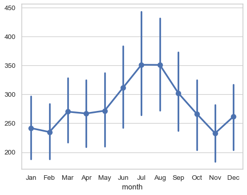
When variables are not explicitly assigned and the dataset is two-dimensional, the plot will aggregate over each column:
flights_wide = flights.pivot(index="year", columns="month", values="passengers")
sns.pointplot(flights_wide)
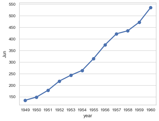
With one-dimensional data, each value is plotted (relative to its key or index when available):
sns.pointplot(flights_wide["Jun"])
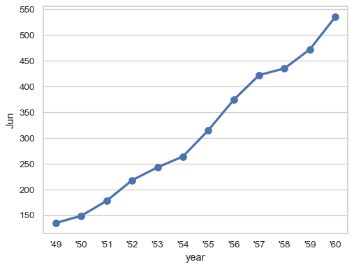
Control the formatting of the categorical variable as it appears in the tick labels:
sns.pointplot(flights_wide["Jun"], formatter=lambda x: f"'{x % 1900}")
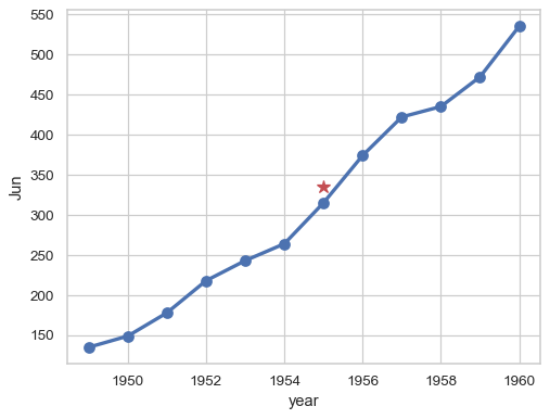
Or preserve the native scale of the grouping variable:
ax = sns.pointplot(flights_wide["Jun"], native_scale=True)
ax.plot(1955, 335, marker="*", color="r", markersize=10)