seaborn.boxplot#
- seaborn.boxplot(data=None, *, x=None, y=None, hue=None, order=None, hue_order=None, orient=None, color=None, palette=None, saturation=0.75, fill=True, dodge='auto', width=0.8, gap=0, whis=1.5, linecolor='auto', linewidth=None, fliersize=None, hue_norm=None, native_scale=False, log_scale=None, formatter=None, legend='auto', ax=None, **kwargs)#
Draw a box plot to show distributions with respect to categories.
A box plot (or box-and-whisker plot) shows the distribution of quantitative data in a way that facilitates comparisons between variables or across levels of a categorical variable. The box shows the quartiles of the dataset while the whiskers extend to show the rest of the distribution, except for points that are determined to be “outliers” using a method that is a function of the inter-quartile range.
See the tutorial for more information.
Note
By default, this function treats one of the variables as categorical and draws data at ordinal positions (0, 1, … n) on the relevant axis. As of version 0.13.0, this can be disabled by setting
native_scale=True.- Parameters:
- dataDataFrame, Series, dict, array, or list of arrays
Dataset for plotting. If
xandyare absent, this is interpreted as wide-form. Otherwise it is expected to be long-form.- x, y, huenames of variables in
dataor vector data Inputs for plotting long-form data. See examples for interpretation.
- order, hue_orderlists of strings
Order to plot the categorical levels in; otherwise the levels are inferred from the data objects.
- orient“v” | “h” | “x” | “y”
Orientation of the plot (vertical or horizontal). This is usually inferred based on the type of the input variables, but it can be used to resolve ambiguity when both
xandyare numeric or when plotting wide-form data.Changed in version v0.13.0: Added ‘x’/’y’ as options, equivalent to ‘v’/’h’.
- colormatplotlib color
Single color for the elements in the plot.
- palettepalette name, list, or dict
Colors to use for the different levels of the
huevariable. Should be something that can be interpreted bycolor_palette(), or a dictionary mapping hue levels to matplotlib colors.- saturationfloat
Proportion of the original saturation to draw fill colors in. Large patches often look better with desaturated colors, but set this to
1if you want the colors to perfectly match the input values.- fillbool
If True, use a solid patch. Otherwise, draw as line art.
New in version v0.13.0.
- dodge“auto” or bool
When hue mapping is used, whether elements should be narrowed and shifted along the orient axis to eliminate overlap. If
"auto", set toTruewhen the orient variable is crossed with the categorical variable orFalseotherwise.Changed in version 0.13.0: Added
"auto"mode as a new default.- widthfloat
Width allotted to each element on the orient axis. When
native_scale=True, it is relative to the minimum distance between two values in the native scale.- gapfloat
Shrink on the orient axis by this factor to add a gap between dodged elements.
New in version 0.13.0.
- whisfloat or pair of floats
Paramater that controls whisker length. If scalar, whiskers are drawn to the farthest datapoint within whis * IQR from the nearest hinge. If a tuple, it is interpreted as percentiles that whiskers represent.
- linecolorcolor
Color to use for line elements, when
fillis True.New in version v0.13.0.
- linewidthfloat
Width of the lines that frame the plot elements.
- fliersizefloat
Size of the markers used to indicate outlier observations.
- hue_normtuple or
matplotlib.colors.Normalizeobject Normalization in data units for colormap applied to the
huevariable when it is numeric. Not relevant ifhueis categorical.New in version v0.12.0.
- log_scalebool or number, or pair of bools or numbers
Set axis scale(s) to log. A single value sets the data axis for any numeric axes in the plot. A pair of values sets each axis independently. Numeric values are interpreted as the desired base (default 10). When
NoneorFalse, seaborn defers to the existing Axes scale.New in version v0.13.0.
- native_scalebool
When True, numeric or datetime values on the categorical axis will maintain their original scaling rather than being converted to fixed indices.
New in version v0.13.0.
- formattercallable
Function for converting categorical data into strings. Affects both grouping and tick labels.
New in version v0.13.0.
- legend“auto”, “brief”, “full”, or False
How to draw the legend. If “brief”, numeric
hueandsizevariables will be represented with a sample of evenly spaced values. If “full”, every group will get an entry in the legend. If “auto”, choose between brief or full representation based on number of levels. IfFalse, no legend data is added and no legend is drawn.New in version v0.13.0.
- axmatplotlib Axes
Axes object to draw the plot onto, otherwise uses the current Axes.
- kwargskey, value mappings
Other keyword arguments are passed through to
matplotlib.axes.Axes.boxplot().
- Returns:
- axmatplotlib Axes
Returns the Axes object with the plot drawn onto it.
See also
violinplotA combination of boxplot and kernel density estimation.
stripplotA scatterplot where one variable is categorical. Can be used in conjunction with other plots to show each observation.
swarmplotA categorical scatterplot where the points do not overlap. Can be used with other plots to show each observation.
catplotCombine a categorical plot with a
FacetGrid.
Examples
Draw a single horizontal boxplot, assigning the data directly to the coordinate variable:
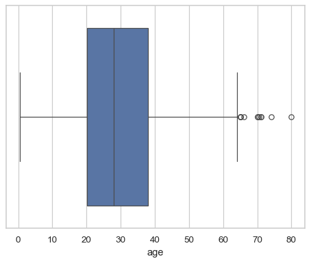
sns.boxplot(x=titanic["age"])
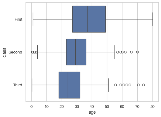
Group by a categorical variable, referencing columns in a dataframe:
sns.boxplot(data=titanic, x="age", y="class")
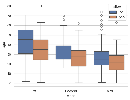
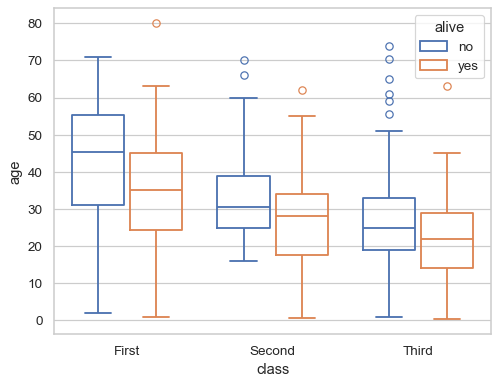
Draw a vertical boxplot with nested grouping by two variables:
sns.boxplot(data=titanic, x="class", y="age", hue="alive")
Draw the boxes as line art and add a small gap between them:
sns.boxplot(data=titanic, x="class", y="age", hue="alive", fill=False, gap=.1)
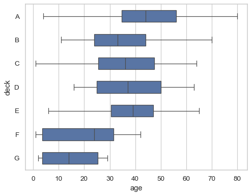
Cover the full range of the data with the whiskers:
sns.boxplot(data=titanic, x="age", y="deck", whis=(0, 100))

Draw narrower boxes:
sns.boxplot(data=titanic, x="age", y="deck", width=.5)
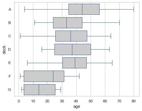
Modify the color and width of all the line artists:
sns.boxplot(data=titanic, x="age", y="deck", color=".8", linecolor="#137", linewidth=.75)
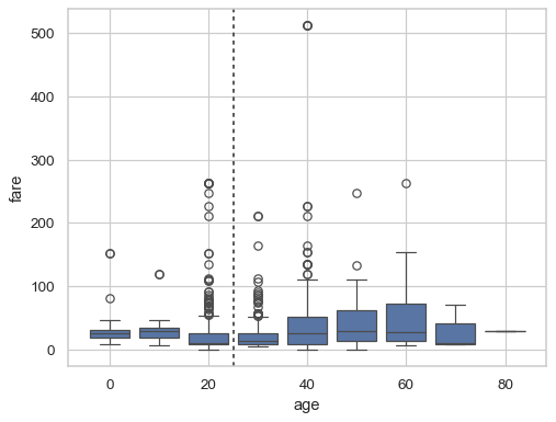
Group by a numeric variable and preserve its native scaling:
ax = sns.boxplot(x=titanic["age"].round(-1), y=titanic["fare"], native_scale=True)
ax.axvline(25, color=".3", dashes=(2, 2))
Customize the plot using parameters of the underlying matplotlib function:
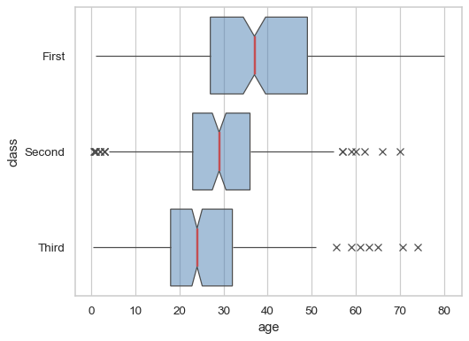
sns.boxplot(
    data=titanic, x="age", y="class",
    notch=True, showcaps=False,
    flierprops={"marker": "x"},
    boxprops={"facecolor": (.3, .5, .7, .5)},
    medianprops={"color": "r", "linewidth": 2},
)