seaborn.PairGrid#
- class seaborn.PairGrid(data, *, hue=None, vars=None, x_vars=None, y_vars=None, hue_order=None, palette=None, hue_kws=None, corner=False, diag_sharey=True, height=2.5, aspect=1, layout_pad=0.5, despine=True, dropna=False)#
Subplot grid for plotting pairwise relationships in a dataset.
This object maps each variable in a dataset onto a column and row in a grid of multiple axes. Different axes-level plotting functions can be used to draw bivariate plots in the upper and lower triangles, and the marginal distribution of each variable can be shown on the diagonal.
Several different common plots can be generated in a single line using
pairplot(). UsePairGridwhen you need more flexibility.See the tutorial for more information.
- __init__(data, *, hue=None, vars=None, x_vars=None, y_vars=None, hue_order=None, palette=None, hue_kws=None, corner=False, diag_sharey=True, height=2.5, aspect=1, layout_pad=0.5, despine=True, dropna=False)#
Initialize the plot figure and PairGrid object.
- Parameters:
- dataDataFrame
Tidy (long-form) dataframe where each column is a variable and each row is an observation.
- huestring (variable name)
Variable in
datato map plot aspects to different colors. This variable will be excluded from the default x and y variables.- varslist of variable names
Variables within
datato use, otherwise use every column with a numeric datatype.- {x, y}_varslists of variable names
Variables within
datato use separately for the rows and columns of the figure; i.e. to make a non-square plot.- hue_orderlist of strings
Order for the levels of the hue variable in the palette
- palettedict or seaborn color palette
Set of colors for mapping the
huevariable. If a dict, keys should be values in thehuevariable.- hue_kwsdictionary of param -> list of values mapping
Other keyword arguments to insert into the plotting call to let other plot attributes vary across levels of the hue variable (e.g. the markers in a scatterplot).
- cornerbool
If True, don’t add axes to the upper (off-diagonal) triangle of the grid, making this a “corner” plot.
- heightscalar
Height (in inches) of each facet.
- aspectscalar
Aspect * height gives the width (in inches) of each facet.
- layout_padscalar
Padding between axes; passed to
fig.tight_layout.- despineboolean
Remove the top and right spines from the plots.
- dropnaboolean
Drop missing values from the data before plotting.
See also
Examples
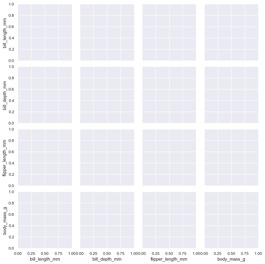
Calling the constructor sets up a blank grid of subplots with each row and one column corresponding to a numeric variable in the dataset:
penguins = sns.load_dataset("penguins")
g = sns.PairGrid(penguins)
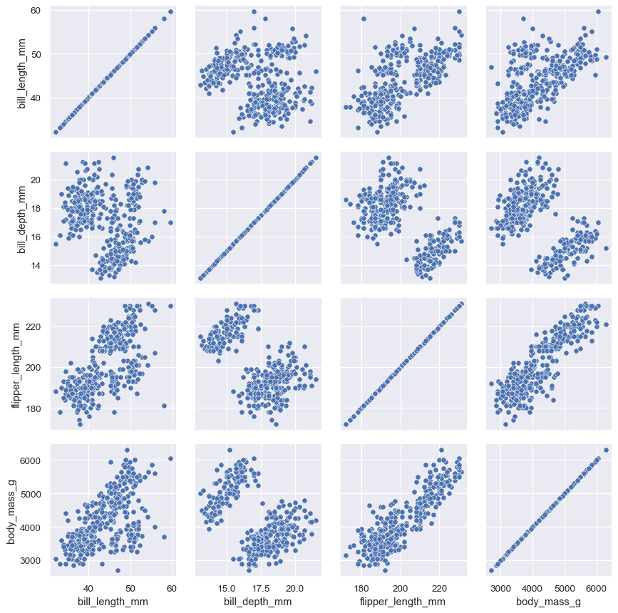
Passing a bivariate function to
PairGrid.map()will draw a bivariate plot on every axes:g = sns.PairGrid(penguins) g.map(sns.scatterplot)
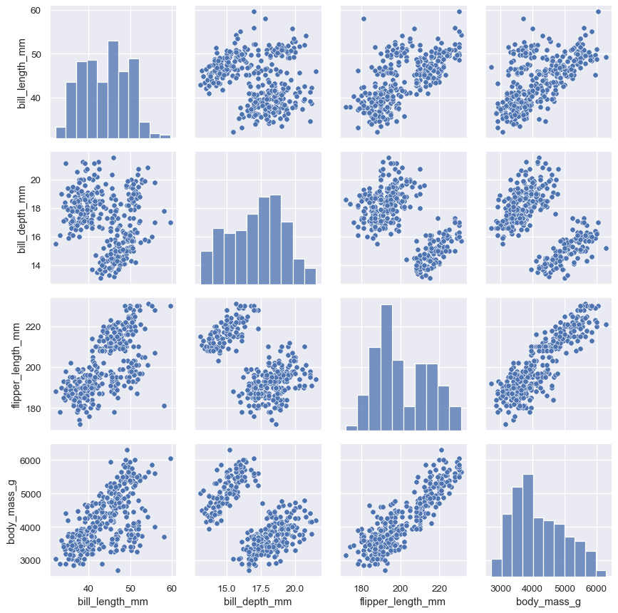
Passing separate functions to
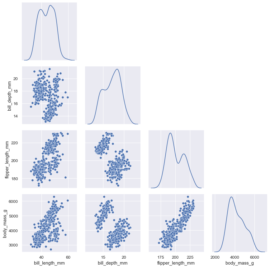
PairGrid.map_diag()andPairGrid.map_offdiag()will show each variable’s marginal distribution on the diagonal:g = sns.PairGrid(penguins) g.map_diag(sns.histplot) g.map_offdiag(sns.scatterplot)
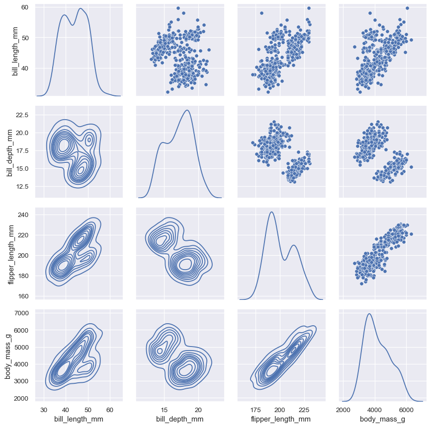
It’s also possible to use different functions on the upper and lower triangles of the plot (which are otherwise redundant):
g = sns.PairGrid(penguins, diag_sharey=False)
g.map_upper(sns.scatterplot)
g.map_lower(sns.kdeplot)
g.map_diag(sns.kdeplot)
Or to avoid the redundancy altogether:
g = sns.PairGrid(penguins, diag_sharey=False, corner=True)
g.map_lower(sns.scatterplot)
g.map_diag(sns.kdeplot)
The
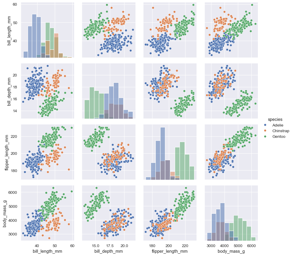
PairGridconstructor accepts ahuevariable. This variable is passed directly to functions that understand it:g = sns.PairGrid(penguins, hue="species") g.map_diag(sns.histplot) g.map_offdiag(sns.scatterplot) g.add_legend()
But you can also pass matplotlib functions, in which case a groupby is performed internally and a separate plot is drawn for each level:
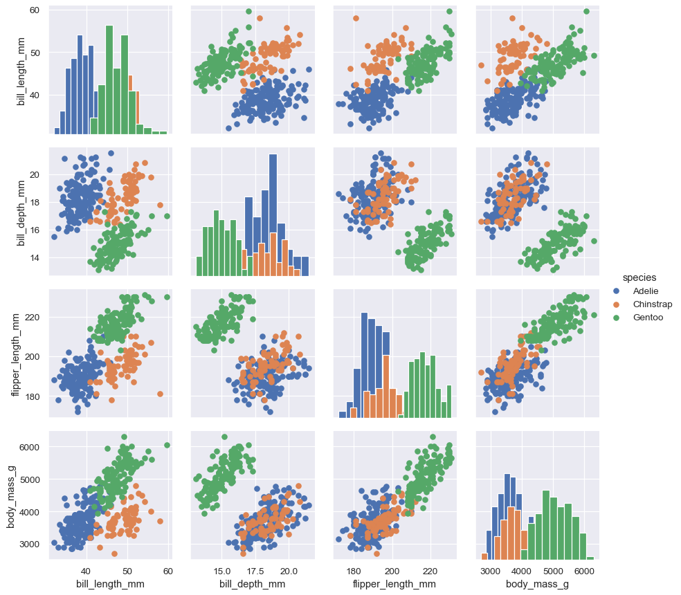
g = sns.PairGrid(penguins, hue="species")
g.map_diag(plt.hist)
g.map_offdiag(plt.scatter)
g.add_legend()
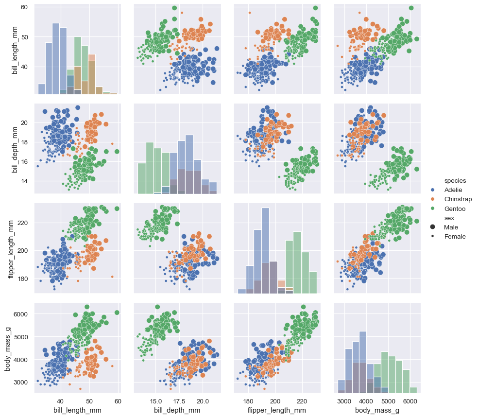
Additional semantic variables can be assigned by passing data vectors directly while mapping the function:
g = sns.PairGrid(penguins, hue="species")
g.map_diag(sns.histplot)
g.map_offdiag(sns.scatterplot, size=penguins["sex"])
g.add_legend(title="", adjust_subtitles=True)
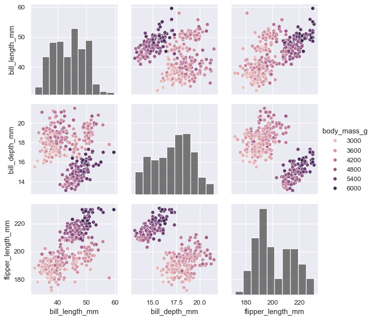
When using seaborn functions that can implement a numeric hue mapping, you will want to disable mapping of the variable on the diagonal axes. Note that the
huevariable is excluded from the list of variables shown by default:g = sns.PairGrid(penguins, hue="body_mass_g") g.map_diag(sns.histplot, hue=None, color=".3") g.map_offdiag(sns.scatterplot) g.add_legend()
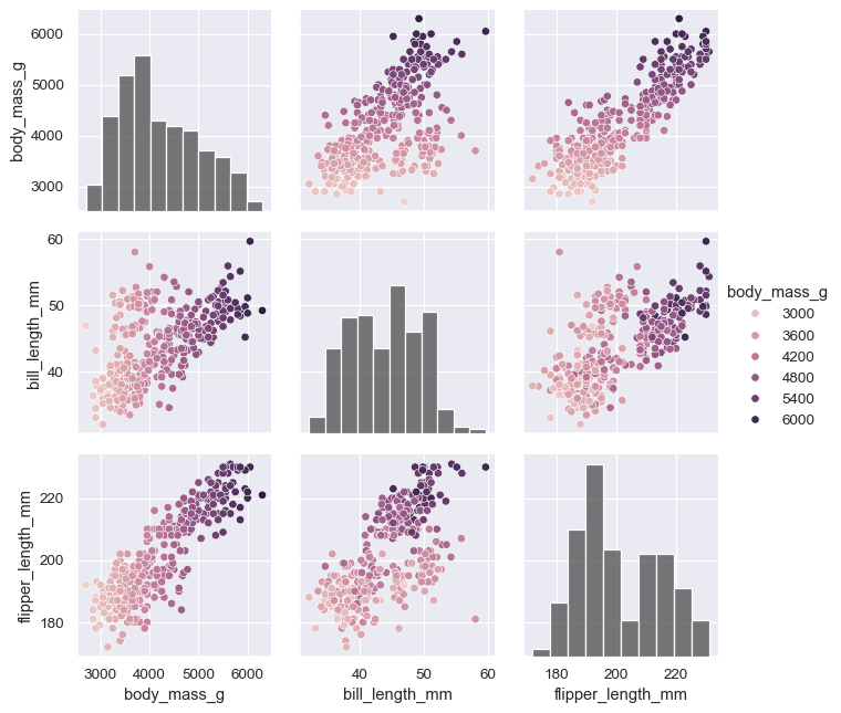
The
varsparameter can be used to control exactly which variables are used:variables = ["body_mass_g", "bill_length_mm", "flipper_length_mm"] g = sns.PairGrid(penguins, hue="body_mass_g", vars=variables) g.map_diag(sns.histplot, hue=None, color=".3") g.map_offdiag(sns.scatterplot) g.add_legend()
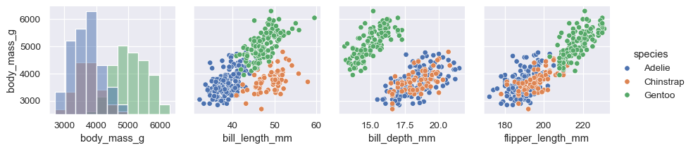
The plot need not be square: separate variables can be used to define the rows and columns:
x_vars = ["body_mass_g", "bill_length_mm", "bill_depth_mm", "flipper_length_mm"]
y_vars = ["body_mass_g"]
g = sns.PairGrid(penguins, hue="species", x_vars=x_vars, y_vars=y_vars)
g.map_diag(sns.histplot, color=".3")
g.map_offdiag(sns.scatterplot)
g.add_legend()
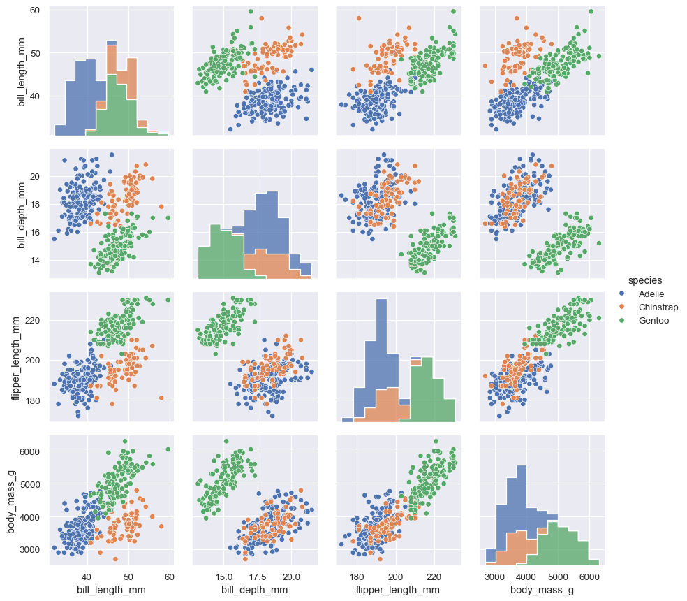
It can be useful to explore different approaches to resolving multiple distributions on the diagonal axes:
g = sns.PairGrid(penguins, hue="species")
g.map_diag(sns.histplot, multiple="stack", element="step")
g.map_offdiag(sns.scatterplot)
g.add_legend()
Methods
__init__(data, *[, hue, vars, x_vars, ...])Initialize the plot figure and PairGrid object.
add_legend([legend_data, title, ...])Draw a legend, maybe placing it outside axes and resizing the figure.
apply(func, *args, **kwargs)Pass the grid to a user-supplied function and return self.
map(func, **kwargs)Plot with the same function in every subplot.
map_diag(func, **kwargs)Plot with a univariate function on each diagonal subplot.
map_lower(func, **kwargs)Plot with a bivariate function on the lower diagonal subplots.
map_offdiag(func, **kwargs)Plot with a bivariate function on the off-diagonal subplots.
map_upper(func, **kwargs)Plot with a bivariate function on the upper diagonal subplots.
pipe(func, *args, **kwargs)Pass the grid to a user-supplied function and return its value.
savefig(*args, **kwargs)Save an image of the plot.
set(**kwargs)Set attributes on each subplot Axes.
tick_params([axis])Modify the ticks, tick labels, and gridlines.
tight_layout(*args, **kwargs)Call fig.tight_layout within rect that exclude the legend.
Attributes
figDEPRECATED: prefer the
figureproperty.figureAccess the
matplotlib.figure.Figureobject underlying the grid.legendThe
matplotlib.legend.Legendobject, if present.