seaborn.stripplot#
- seaborn.stripplot(data=None, *, x=None, y=None, hue=None, order=None, hue_order=None, jitter=True, dodge=False, orient=None, color=None, palette=None, size=5, edgecolor=<default>, linewidth=0, hue_norm=None, log_scale=None, native_scale=False, formatter=None, legend='auto', ax=None, **kwargs)#
Draw a categorical scatterplot using jitter to reduce overplotting.
A strip plot can be drawn on its own, but it is also a good complement to a box or violin plot in cases where you want to show all observations along with some representation of the underlying distribution.
See the tutorial for more information.
Note
By default, this function treats one of the variables as categorical and draws data at ordinal positions (0, 1, … n) on the relevant axis. As of version 0.13.0, this can be disabled by setting
native_scale=True.- Parameters:
- dataDataFrame, Series, dict, array, or list of arrays
Dataset for plotting. If
xandyare absent, this is interpreted as wide-form. Otherwise it is expected to be long-form.- x, y, huenames of variables in
dataor vector data Inputs for plotting long-form data. See examples for interpretation.
- order, hue_orderlists of strings
Order to plot the categorical levels in; otherwise the levels are inferred from the data objects.
- jitterfloat,
True/1is special-cased Amount of jitter (only along the categorical axis) to apply. This can be useful when you have many points and they overlap, so that it is easier to see the distribution. You can specify the amount of jitter (half the width of the uniform random variable support), or use
Truefor a good default.- dodgebool
When a
huevariable is assigned, setting this toTruewill separate the strips for different hue levels along the categorical axis and narrow the amount of space allotedto each strip. Otherwise, the points for each level will be plotted in the same strip.- orient“v” | “h” | “x” | “y”
Orientation of the plot (vertical or horizontal). This is usually inferred based on the type of the input variables, but it can be used to resolve ambiguity when both
xandyare numeric or when plotting wide-form data.Changed in version v0.13.0: Added ‘x’/’y’ as options, equivalent to ‘v’/’h’.
- colormatplotlib color
Single color for the elements in the plot.
- palettepalette name, list, or dict
Colors to use for the different levels of the
huevariable. Should be something that can be interpreted bycolor_palette(), or a dictionary mapping hue levels to matplotlib colors.- sizefloat
Radius of the markers, in points.
- edgecolormatplotlib color, “gray” is special-cased
Color of the lines around each point. If you pass
"gray", the brightness is determined by the color palette used for the body of the points. Note thatstripplothaslinewidth=0by default, so edge colors are only visible with nonzero line width.- linewidthfloat
Width of the lines that frame the plot elements.
- hue_normtuple or
matplotlib.colors.Normalizeobject Normalization in data units for colormap applied to the
huevariable when it is numeric. Not relevant ifhueis categorical.New in version v0.12.0.
- log_scalebool or number, or pair of bools or numbers
Set axis scale(s) to log. A single value sets the data axis for any numeric axes in the plot. A pair of values sets each axis independently. Numeric values are interpreted as the desired base (default 10). When
NoneorFalse, seaborn defers to the existing Axes scale.New in version v0.13.0.
- native_scalebool
When True, numeric or datetime values on the categorical axis will maintain their original scaling rather than being converted to fixed indices.
New in version v0.13.0.
- formattercallable
Function for converting categorical data into strings. Affects both grouping and tick labels.
New in version v0.13.0.
- legend“auto”, “brief”, “full”, or False
How to draw the legend. If “brief”, numeric
hueandsizevariables will be represented with a sample of evenly spaced values. If “full”, every group will get an entry in the legend. If “auto”, choose between brief or full representation based on number of levels. IfFalse, no legend data is added and no legend is drawn.New in version v0.13.0.
- axmatplotlib Axes
Axes object to draw the plot onto, otherwise uses the current Axes.
- kwargskey, value mappings
Other keyword arguments are passed through to
matplotlib.axes.Axes.scatter().
- Returns:
- axmatplotlib Axes
Returns the Axes object with the plot drawn onto it.
See also
swarmplotA categorical scatterplot where the points do not overlap. Can be used with other plots to show each observation.
boxplotA traditional box-and-whisker plot with a similar API.
violinplotA combination of boxplot and kernel density estimation.
catplotCombine a categorical plot with a
FacetGrid.
Examples
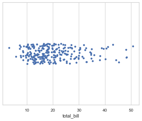
Assigning a single numeric variable shows its univariate distribution with points randomly “jittered” on the other axis:
tips = sns.load_dataset("tips")
sns.stripplot(data=tips, x="total_bill")
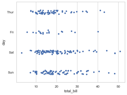
Assigning a second variable splits the strips of points to compare categorical levels of that variable:
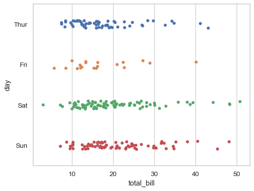
sns.stripplot(data=tips, x="total_bill", y="day")
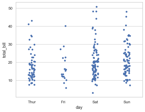
Show vertically-oriented strips by swapping the assignment of the categorical and numerical variables:
sns.stripplot(data=tips, x="day", y="total_bill")
Prior to version 0.12, the levels of the categorical variable had different colors by default. To get the same effect, assign the
huevariable explicitly:sns.stripplot(data=tips, x="total_bill", y="day", hue="day", legend=False)
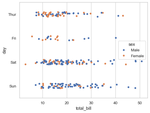
Or you can assign a distinct variable to
hueto show a multidimensional relationship:sns.stripplot(data=tips, x="total_bill", y="day", hue="sex")
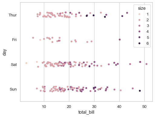
If the
huevariable is numeric, it will be mapped with a quantitative palette by default (note that this was not the case prior to version 0.12):sns.stripplot(data=tips, x="total_bill", y="day", hue="size")
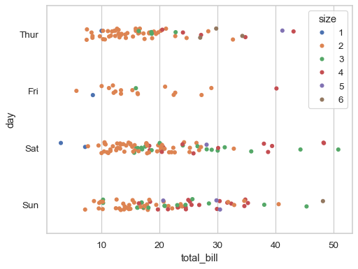
Use
paletteto control the color mapping, including forcing a categorical mapping by passing the name of a qualitative palette:sns.stripplot(data=tips, x="total_bill", y="day", hue="size", palette="deep")
By default, the different levels of the
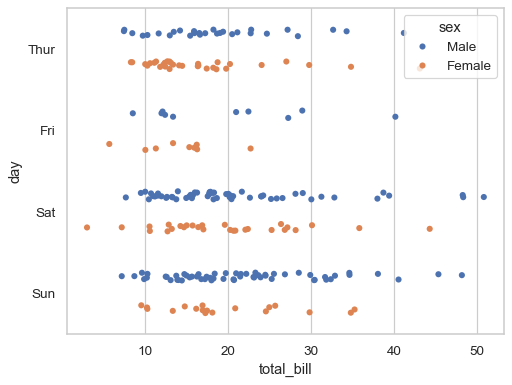
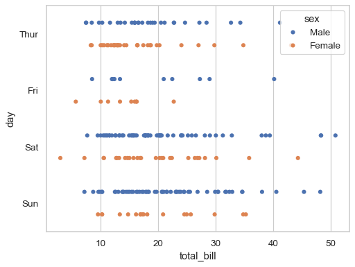
huevariable are intermingled in each strip, but settingdodge=Truewill split them:sns.stripplot(data=tips, x="total_bill", y="day", hue="sex", dodge=True)
The random jitter can be disabled by setting
jitter=False:sns.stripplot(data=tips, x="total_bill", y="day", hue="sex", dodge=True, jitter=False)
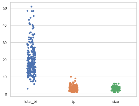
If plotting in wide-form mode, each numeric column of the dataframe will be mapped to both
xandhue:sns.stripplot(data=tips)
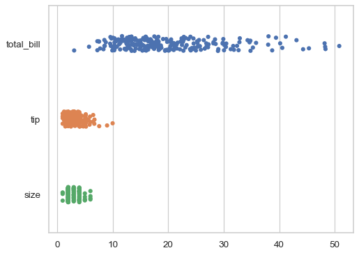
To change the orientation while in wide-form mode, pass
orientexplicitly:sns.stripplot(data=tips, orient="h")
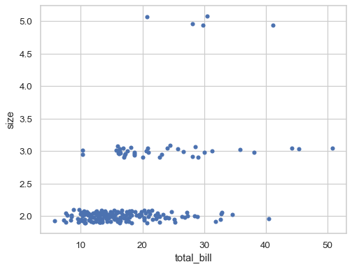
The
orientparameter is also useful when both axis variables are numeric, as it will resolve ambiguity about which dimension to group (and jitter) along:sns.stripplot(data=tips, x="total_bill", y="size", orient="h")
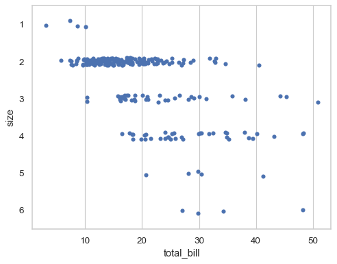
By default, the categorical variable will be mapped to discrete indices with a fixed scale (0, 1, …), even when it is numeric:
sns.stripplot(
    data=tips.query("size in [2, 3, 5]"),
    x="total_bill", y="size", orient="h",
)
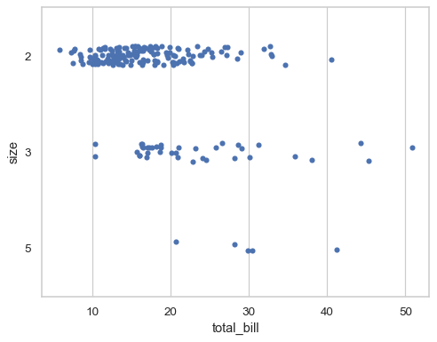
To disable this behavior and use the original scale of the variable, set
native_scale=True:sns.stripplot( data=tips.query("size in [2, 3, 5]"), x="total_bill", y="size", orient="h", native_scale=True, )
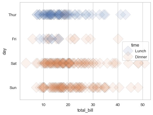
Further visual customization can be achieved by passing keyword arguments for
matplotlib.axes.Axes.scatter():sns.stripplot( data=tips, x="total_bill", y="day", hue="time", jitter=False, s=20, marker="D", linewidth=1, alpha=.1, )
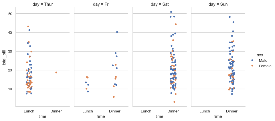
To make a plot with multiple facets, it is safer to use
catplot()than to work withFacetGriddirectly, becausecatplot()will ensure that the categorical and hue variables are properly synchronized in each facet:sns.catplot(data=tips, x="time", y="total_bill", hue="sex", col="day", aspect=.5)