seaborn.lineplot#
- seaborn.lineplot(data=None, *, x=None, y=None, hue=None, size=None, style=None, units=None, weights=None, palette=None, hue_order=None, hue_norm=None, sizes=None, size_order=None, size_norm=None, dashes=True, markers=None, style_order=None, estimator='mean', errorbar=('ci', 95), n_boot=1000, seed=None, orient='x', sort=True, err_style='band', err_kws=None, legend='auto', ci='deprecated', ax=None, **kwargs)#
Draw a line plot with possibility of several semantic groupings.
The relationship between
xandycan be shown for different subsets of the data using thehue,size, andstyleparameters. These parameters control what visual semantics are used to identify the different subsets. It is possible to show up to three dimensions independently by using all three semantic types, but this style of plot can be hard to interpret and is often ineffective. Using redundant semantics (i.e. bothhueandstylefor the same variable) can be helpful for making graphics more accessible.See the tutorial for more information.
The default treatment of the
hue(and to a lesser extent,size) semantic, if present, depends on whether the variable is inferred to represent “numeric” or “categorical” data. In particular, numeric variables are represented with a sequential colormap by default, and the legend entries show regular “ticks” with values that may or may not exist in the data. This behavior can be controlled through various parameters, as described and illustrated below.By default, the plot aggregates over multiple
yvalues at each value ofxand shows an estimate of the central tendency and a confidence interval for that estimate.- Parameters:
- data
pandas.DataFrame,numpy.ndarray, mapping, or sequence Input data structure. Either a long-form collection of vectors that can be assigned to named variables or a wide-form dataset that will be internally reshaped.
- x, yvectors or keys in
data Variables that specify positions on the x and y axes.
- huevector or key in
data Grouping variable that will produce lines with different colors. Can be either categorical or numeric, although color mapping will behave differently in latter case.
- sizevector or key in
data Grouping variable that will produce lines with different widths. Can be either categorical or numeric, although size mapping will behave differently in latter case.
- stylevector or key in
data Grouping variable that will produce lines with different dashes and/or markers. Can have a numeric dtype but will always be treated as categorical.
- unitsvector or key in
data Grouping variable identifying sampling units. When used, a separate line will be drawn for each unit with appropriate semantics, but no legend entry will be added. Useful for showing distribution of experimental replicates when exact identities are not needed.
- weightsvector or key in
data Data values or column used to compute weighted estimation. Note that use of weights currently limits the choice of statistics to a ‘mean’ estimator and ‘ci’ errorbar.
- palettestring, list, dict, or
matplotlib.colors.Colormap Method for choosing the colors to use when mapping the
huesemantic. String values are passed tocolor_palette(). List or dict values imply categorical mapping, while a colormap object implies numeric mapping.- hue_ordervector of strings
Specify the order of processing and plotting for categorical levels of the
huesemantic.- hue_normtuple or
matplotlib.colors.Normalize Either a pair of values that set the normalization range in data units or an object that will map from data units into a [0, 1] interval. Usage implies numeric mapping.
- sizeslist, dict, or tuple
An object that determines how sizes are chosen when
sizeis used. List or dict arguments should provide a size for each unique data value, which forces a categorical interpretation. The argument may also be a min, max tuple.- size_orderlist
Specified order for appearance of the
sizevariable levels, otherwise they are determined from the data. Not relevant when thesizevariable is numeric.- size_normtuple or Normalize object
Normalization in data units for scaling plot objects when the
sizevariable is numeric.- dashesboolean, list, or dictionary
Object determining how to draw the lines for different levels of the
stylevariable. Setting toTruewill use default dash codes, or you can pass a list of dash codes or a dictionary mapping levels of thestylevariable to dash codes. Setting toFalsewill use solid lines for all subsets. Dashes are specified as in matplotlib: a tuple of(segment, gap)lengths, or an empty string to draw a solid line.- markersboolean, list, or dictionary
Object determining how to draw the markers for different levels of the
stylevariable. Setting toTruewill use default markers, or you can pass a list of markers or a dictionary mapping levels of thestylevariable to markers. Setting toFalsewill draw marker-less lines. Markers are specified as in matplotlib.- style_orderlist
Specified order for appearance of the
stylevariable levels otherwise they are determined from the data. Not relevant when thestylevariable is numeric.- estimatorname of pandas method or callable or None
Method for aggregating across multiple observations of the
yvariable at the samexlevel. IfNone, all observations will be drawn.- errorbarstring, (string, number) tuple, or callable
Name of errorbar method (either “ci”, “pi”, “se”, or “sd”), or a tuple with a method name and a level parameter, or a function that maps from a vector to a (min, max) interval, or None to hide errorbar. See the errorbar tutorial for more information.
- n_bootint
Number of bootstraps to use for computing the confidence interval.
- seedint, numpy.random.Generator, or numpy.random.RandomState
Seed or random number generator for reproducible bootstrapping.
- orient“x” or “y”
Dimension along which the data are sorted / aggregated. Equivalently, the “independent variable” of the resulting function.
- sortboolean
If True, the data will be sorted by the x and y variables, otherwise lines will connect points in the order they appear in the dataset.
- err_style“band” or “bars”
Whether to draw the confidence intervals with translucent error bands or discrete error bars.
- err_kwsdict of keyword arguments
Additional parameters to control the aesthetics of the error bars. The kwargs are passed either to
matplotlib.axes.Axes.fill_between()ormatplotlib.axes.Axes.errorbar(), depending onerr_style.- legend“auto”, “brief”, “full”, or False
How to draw the legend. If “brief”, numeric
hueandsizevariables will be represented with a sample of evenly spaced values. If “full”, every group will get an entry in the legend. If “auto”, choose between brief or full representation based on number of levels. IfFalse, no legend data is added and no legend is drawn.- ciint or “sd” or None
Size of the confidence interval to draw when aggregating.
Deprecated since version 0.12.0: Use the new
errorbarparameter for more flexibility.- ax
matplotlib.axes.Axes Pre-existing axes for the plot. Otherwise, call
matplotlib.pyplot.gca()internally.- kwargskey, value mappings
Other keyword arguments are passed down to
matplotlib.axes.Axes.plot().
- data
- Returns:
matplotlib.axes.AxesThe matplotlib axes containing the plot.
See also
scatterplotPlot data using points.
pointplotPlot point estimates and CIs using markers and lines.
Examples
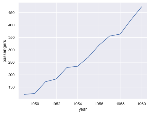
The
flightsdataset has 10 years of monthly airline passenger data:flights = sns.load_dataset("flights") flights.head()
year month passengers 0 1949 Jan 112 1 1949 Feb 118 2 1949 Mar 132 3 1949 Apr 129 4 1949 May 121 To draw a line plot using long-form data, assign the
xandyvariables:may_flights = flights.query("month == 'May'") sns.lineplot(data=may_flights, x="year", y="passengers")
Pivot the dataframe to a wide-form representation:
flights_wide = flights.pivot(index="year", columns="month", values="passengers")
flights_wide.head()
month Jan Feb Mar Apr May Jun Jul Aug Sep Oct Nov Dec year 1949 112 118 132 129 121 135 148 148 136 119 104 118 1950 115 126 141 135 125 149 170 170 158 133 114 140 1951 145 150 178 163 172 178 199 199 184 162 146 166 1952 171 180 193 181 183 218 230 242 209 191 172 194 1953 196 196 236 235 229 243 264 272 237 211 180 201 To plot a single vector, pass it to
data. If the vector is apandas.Series, it will be plotted against its index:sns.lineplot(data=flights_wide["May"])
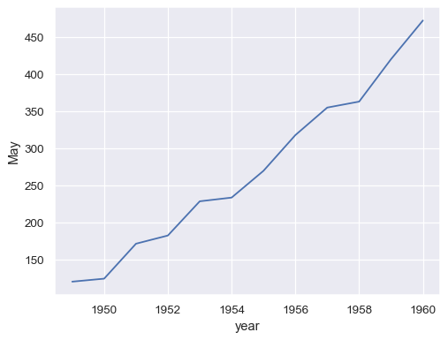
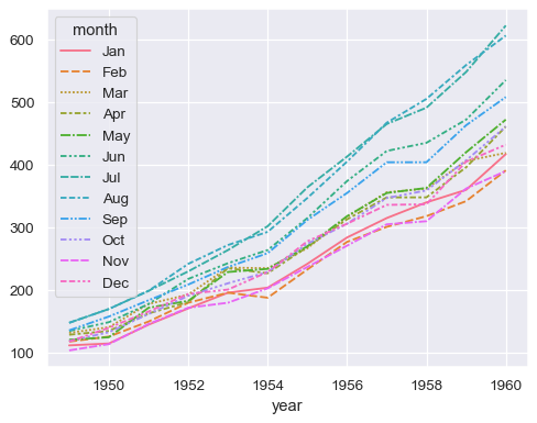
Passing the entire wide-form dataset to
dataplots a separate line for each column:sns.lineplot(data=flights_wide)
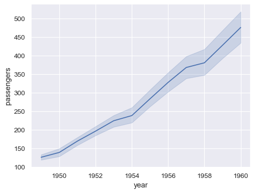
Passing the entire dataset in long-form mode will aggregate over repeated values (each year) to show the mean and 95% confidence interval:
sns.lineplot(data=flights, x="year", y="passengers")
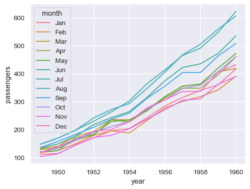
Assign a grouping semantic (
hue,size, orstyle) to plot separate linessns.lineplot(data=flights, x="year", y="passengers", hue="month")
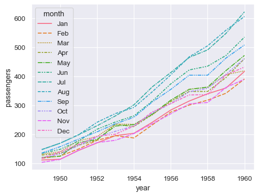
The same column can be assigned to multiple semantic variables, which can increase the accessibility of the plot:
sns.lineplot(data=flights, x="year", y="passengers", hue="month", style="month")
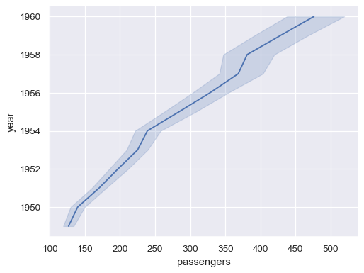
Use the
orientparameter to aggregate and sort along the vertical dimension of the plot:sns.lineplot(data=flights, x="passengers", y="year", orient="y")
Each semantic variable can also represent a different column. For that, we’ll need a more complex dataset:
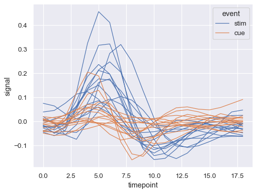
fmri = sns.load_dataset("fmri")
fmri.head()
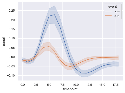
subject timepoint event region signal 0 s13 18 stim parietal -0.017552 1 s5 14 stim parietal -0.080883 2 s12 18 stim parietal -0.081033 3 s11 18 stim parietal -0.046134 4 s10 18 stim parietal -0.037970 Repeated observations are aggregated even when semantic grouping is used:
sns.lineplot(data=fmri, x="timepoint", y="signal", hue="event")
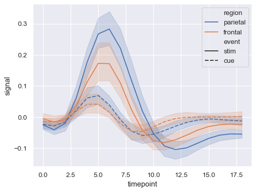
Assign both
hueandstyleto represent two different grouping variables:sns.lineplot(data=fmri, x="timepoint", y="signal", hue="region", style="event")
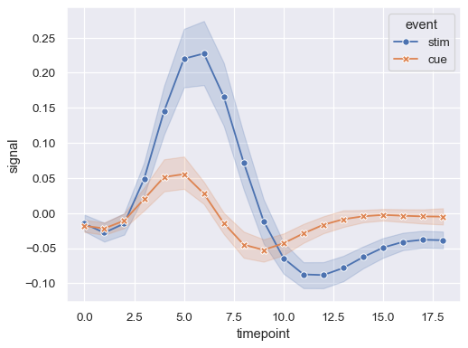
When assigning a
stylevariable, markers can be used instead of (or along with) dashes to distinguish the groups:sns.lineplot( data=fmri, x="timepoint", y="signal", hue="event", style="event", markers=True, dashes=False )
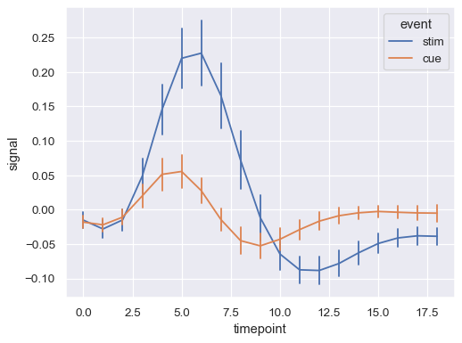
Show error bars instead of error bands and extend them to two standard error widths:
sns.lineplot(
    data=fmri, x="timepoint", y="signal", hue="event", err_style="bars", errorbar=("se", 2),
)
Assigning the
unitsvariable will plot multiple lines without applying a semantic mapping:sns.lineplot( data=fmri.query("region == 'frontal'"), x="timepoint", y="signal", hue="event", units="subject", estimator=None, lw=1, )
Load another dataset with a numeric grouping variable:
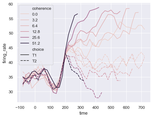
dots = sns.load_dataset("dots").query("align == 'dots'")
dots.head()
align choice time coherence firing_rate 0 dots T1 -80 0.0 33.189967 1 dots T1 -80 3.2 31.691726 2 dots T1 -80 6.4 34.279840 3 dots T1 -80 12.8 32.631874 4 dots T1 -80 25.6 35.060487 Assigning a numeric variable to
huemaps it differently, using a different default palette and a quantitative color mapping:sns.lineplot( data=dots, x="time", y="firing_rate", hue="coherence", style="choice", )
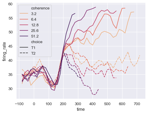
Control the color mapping by setting the
paletteand passing amatplotlib.colors.Normalizeobject:sns.lineplot( data=dots.query("coherence > 0"), x="time", y="firing_rate", hue="coherence", style="choice", palette="flare", hue_norm=mpl.colors.LogNorm(), )
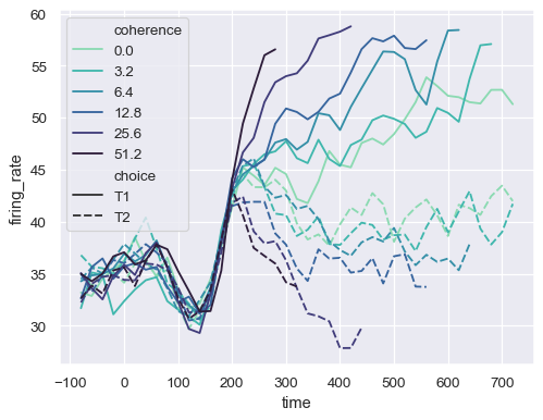
Or pass specific colors, either as a Python list or dictionary:
palette = sns.color_palette("mako_r", 6)
sns.lineplot(
    data=dots, x="time", y="firing_rate",
    hue="coherence", style="choice",
    palette=palette
)
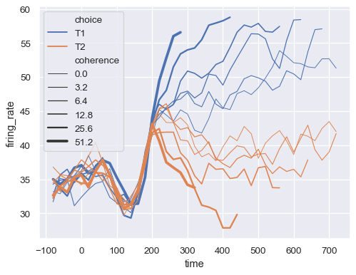
Assign the
sizesemantic to map the width of the lines with a numeric variable:sns.lineplot( data=dots, x="time", y="firing_rate", size="coherence", hue="choice", legend="full" )
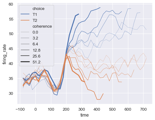
Pass a a tuple,
sizes=(smallest, largest), to control the range of linewidths used to map thesizesemantic:sns.lineplot( data=dots, x="time", y="firing_rate", size="coherence", hue="choice", sizes=(.25, 2.5) )
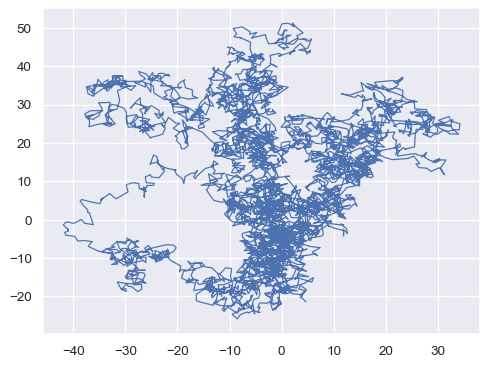
By default, the observations are sorted by
x. Disable this to plot a line with the order that observations appear in the dataset:x, y = np.random.normal(size=(2, 5000)).cumsum(axis=1) sns.lineplot(x=x, y=y, sort=False, lw=1)
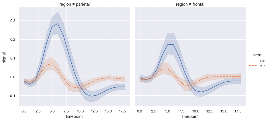
Use
relplot()to combinelineplot()andFacetGrid. This allows grouping within additional categorical variables. Usingrelplot()is safer than usingFacetGriddirectly, as it ensures synchronization of the semantic mappings across facets:sns.relplot( data=fmri, x="timepoint", y="signal", col="region", hue="event", style="event", kind="line" )