seaborn.countplot#
- seaborn.countplot(data=None, *, x=None, y=None, hue=None, order=None, hue_order=None, orient=None, color=None, palette=None, saturation=0.75, fill=True, hue_norm=None, stat='count', width=0.8, dodge='auto', gap=0, log_scale=None, native_scale=False, formatter=None, legend='auto', ax=None, **kwargs)#
Show the counts of observations in each categorical bin using bars.
A count plot can be thought of as a histogram across a categorical, instead of quantitative, variable. The basic API and options are identical to those for
barplot(), so you can compare counts across nested variables.Note that
histplot()function offers similar functionality with additional features (e.g. bar stacking), although its default behavior is somewhat different.See the tutorial for more information.
Note
By default, this function treats one of the variables as categorical and draws data at ordinal positions (0, 1, … n) on the relevant axis. As of version 0.13.0, this can be disabled by setting
native_scale=True.- Parameters:
- dataDataFrame, Series, dict, array, or list of arrays
Dataset for plotting. If
xandyare absent, this is interpreted as wide-form. Otherwise it is expected to be long-form.- x, y, huenames of variables in
dataor vector data Inputs for plotting long-form data. See examples for interpretation.
- order, hue_orderlists of strings
Order to plot the categorical levels in; otherwise the levels are inferred from the data objects.
- orient“v” | “h” | “x” | “y”
Orientation of the plot (vertical or horizontal). This is usually inferred based on the type of the input variables, but it can be used to resolve ambiguity when both
xandyare numeric or when plotting wide-form data.Changed in version v0.13.0: Added ‘x’/’y’ as options, equivalent to ‘v’/’h’.
- colormatplotlib color
Single color for the elements in the plot.
- palettepalette name, list, or dict
Colors to use for the different levels of the
huevariable. Should be something that can be interpreted bycolor_palette(), or a dictionary mapping hue levels to matplotlib colors.- saturationfloat
Proportion of the original saturation to draw fill colors in. Large patches often look better with desaturated colors, but set this to
1if you want the colors to perfectly match the input values.- hue_normtuple or
matplotlib.colors.Normalizeobject Normalization in data units for colormap applied to the
huevariable when it is numeric. Not relevant ifhueis categorical.New in version v0.12.0.
- stat{‘count’, ‘percent’, ‘proportion’, ‘probability’}
Statistic to compute; when not
'count', bar heights will be normalized so that they sum to 100 (for'percent') or 1 (otherwise) across the plot.New in version v0.13.0.
- widthfloat
Width allotted to each element on the orient axis. When
native_scale=True, it is relative to the minimum distance between two values in the native scale.- dodge“auto” or bool
When hue mapping is used, whether elements should be narrowed and shifted along the orient axis to eliminate overlap. If
"auto", set toTruewhen the orient variable is crossed with the categorical variable orFalseotherwise.Changed in version 0.13.0: Added
"auto"mode as a new default.- log_scalebool or number, or pair of bools or numbers
Set axis scale(s) to log. A single value sets the data axis for any numeric axes in the plot. A pair of values sets each axis independently. Numeric values are interpreted as the desired base (default 10). When
NoneorFalse, seaborn defers to the existing Axes scale.New in version v0.13.0.
- native_scalebool
When True, numeric or datetime values on the categorical axis will maintain their original scaling rather than being converted to fixed indices.
New in version v0.13.0.
- formattercallable
Function for converting categorical data into strings. Affects both grouping and tick labels.
New in version v0.13.0.
- legend“auto”, “brief”, “full”, or False
How to draw the legend. If “brief”, numeric
hueandsizevariables will be represented with a sample of evenly spaced values. If “full”, every group will get an entry in the legend. If “auto”, choose between brief or full representation based on number of levels. IfFalse, no legend data is added and no legend is drawn.New in version v0.13.0.
- axmatplotlib Axes
Axes object to draw the plot onto, otherwise uses the current Axes.
- kwargskey, value mappings
Other parameters are passed through to
matplotlib.patches.Rectangle.
- Returns:
- axmatplotlib Axes
Returns the Axes object with the plot drawn onto it.
See also
Examples
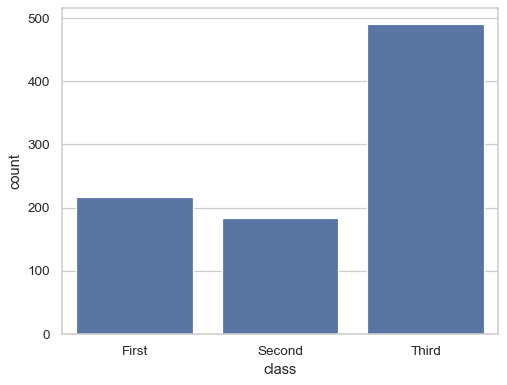
Show the count of value for a single categorical variable:
sns.countplot(titanic, x="class")
Group by a second variable:
sns.countplot(titanic, x="class", hue="survived")

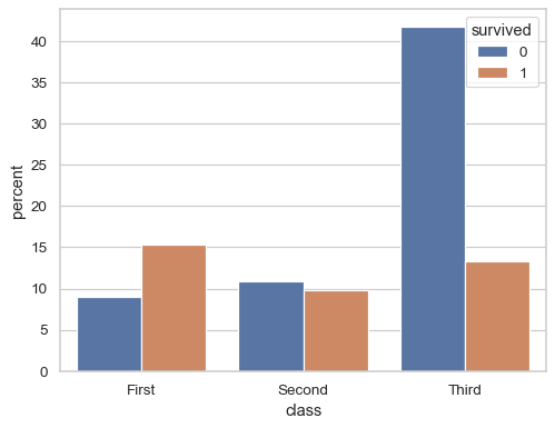
Normalize the counts to show percentages:
sns.countplot(titanic, x="class", hue="survived", stat="percent")