seaborn.pointplot#
- seaborn.pointplot(data=None, *, x=None, y=None, hue=None, order=None, hue_order=None, estimator='mean', errorbar=('ci', 95), n_boot=1000, units=None, seed=None, markers='o', linestyles='-', dodge=False, join=True, scale=1, orient=None, color=None, palette=None, errwidth=None, ci='deprecated', capsize=None, label=None, ax=None)#
Show point estimates and errors using dot marks.
A point plot represents an estimate of central tendency for a numeric variable by the position of the dot and provides some indication of the uncertainty around that estimate using error bars.
Point plots can be more useful than bar plots for focusing comparisons between different levels of one or more categorical variables. They are particularly adept at showing interactions: how the relationship between levels of one categorical variable changes across levels of a second categorical variable. The lines that join each point from the same
huelevel allow interactions to be judged by differences in slope, which is easier for the eyes than comparing the heights of several groups of points or bars.It is important to keep in mind that a point plot shows only the mean (or other estimator) value, but in many cases it may be more informative to show the distribution of values at each level of the categorical variables. In that case, other approaches such as a box or violin plot may be more appropriate.
Note
This function always treats one of the variables as categorical and draws data at ordinal positions (0, 1, … n) on the relevant axis, even when the data has a numeric or date type.
See the tutorial for more information.
- Parameters:
- dataDataFrame, array, or list of arrays, optional
Dataset for plotting. If
xandyare absent, this is interpreted as wide-form. Otherwise it is expected to be long-form.- x, y, huenames of variables in
dataor vector data, optional Inputs for plotting long-form data. See examples for interpretation.
- order, hue_orderlists of strings, optional
Order to plot the categorical levels in; otherwise the levels are inferred from the data objects.
- estimatorstring or callable that maps vector -> scalar, optional
Statistical function to estimate within each categorical bin.
- errorbarstring, (string, number) tuple, callable or None
Name of errorbar method (either “ci”, “pi”, “se”, or “sd”), or a tuple with a method name and a level parameter, or a function that maps from a vector to a (min, max) interval, or None to hide errorbar.
- n_bootint, optional
Number of bootstrap samples used to compute confidence intervals.
- unitsname of variable in
dataor vector data, optional Identifier of sampling units, which will be used to perform a multilevel bootstrap and account for repeated measures design.
- seedint, numpy.random.Generator, or numpy.random.RandomState, optional
Seed or random number generator for reproducible bootstrapping.
- markersstring or list of strings, optional
Markers to use for each of the
huelevels.- linestylesstring or list of strings, optional
Line styles to use for each of the
huelevels.- dodgebool or float, optional
Amount to separate the points for each level of the
huevariable along the categorical axis.- joinbool, optional
If
True, lines will be drawn between point estimates at the samehuelevel.- scalefloat, optional
Scale factor for the plot elements.
- orient“v” | “h”, optional
Orientation of the plot (vertical or horizontal). This is usually inferred based on the type of the input variables, but it can be used to resolve ambiguity when both
xandyare numeric or when plotting wide-form data.- colormatplotlib color, optional
Single color for the elements in the plot.
- palettepalette name, list, or dict
Colors to use for the different levels of the
huevariable. Should be something that can be interpreted bycolor_palette(), or a dictionary mapping hue levels to matplotlib colors.- errwidthfloat, optional
Thickness of error bar lines (and caps).
- capsizefloat, optional
Width of the “caps” on error bars.
- labelstring, optional
Label to represent the plot in a legend, only relevant when not using
hue.- axmatplotlib Axes, optional
Axes object to draw the plot onto, otherwise uses the current Axes.
- Returns:
- axmatplotlib Axes
Returns the Axes object with the plot drawn onto it.
See also
Examples
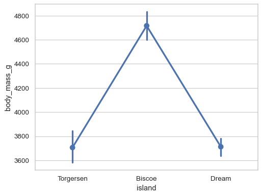
Group by a categorical varaible and plot aggregated values, with confidence intervals:
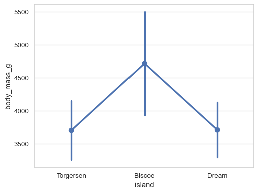
df = sns.load_dataset("penguins")
sns.pointplot(data=df, x="island", y="body_mass_g")
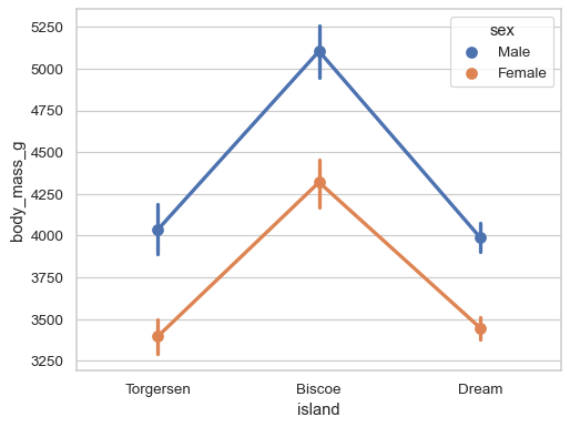
Add a second layer of grouping:
sns.pointplot(data=df, x="island", y="body_mass_g", hue="sex")
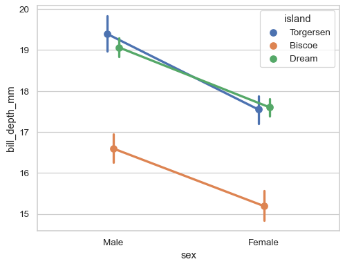
Adjust the artists along the categorical axis to reduce overplotting:
sns.pointplot(data=df, x="sex", y="bill_depth_mm", hue="island", dodge=True)
Use the error bars to show the standard deviation rather than a confidence interval:
sns.pointplot(data=df, x="island", y="body_mass_g", errorbar="sd")
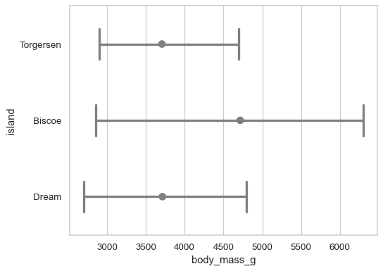
Customize the appearance of the plot:
sns.pointplot(
    data=df, x="body_mass_g", y="island",
    errorbar=("pi", 100), capsize=.4, join=False, color=".5",
)