seaborn.boxenplot#
- seaborn.boxenplot(data=None, *, x=None, y=None, hue=None, order=None, hue_order=None, orient=None, color=None, palette=None, saturation=0.75, width=0.8, dodge=True, k_depth='tukey', linewidth=None, scale='exponential', outlier_prop=0.007, trust_alpha=0.05, showfliers=True, ax=None, box_kws=None, flier_kws=None, line_kws=None)#
Draw an enhanced box plot for larger datasets.
This style of plot was originally named a “letter value” plot because it shows a large number of quantiles that are defined as “letter values”. It is similar to a box plot in plotting a nonparametric representation of a distribution in which all features correspond to actual observations. By plotting more quantiles, it provides more information about the shape of the distribution, particularly in the tails. For a more extensive explanation, you can read the paper that introduced the plot: https://vita.had.co.nz/papers/letter-value-plot.html
Note
This function always treats one of the variables as categorical and draws data at ordinal positions (0, 1, … n) on the relevant axis, even when the data has a numeric or date type.
See the tutorial for more information.
- Parameters:
- dataDataFrame, array, or list of arrays, optional
Dataset for plotting. If
xandyare absent, this is interpreted as wide-form. Otherwise it is expected to be long-form.- x, y, huenames of variables in
dataor vector data, optional Inputs for plotting long-form data. See examples for interpretation.
- order, hue_orderlists of strings, optional
Order to plot the categorical levels in; otherwise the levels are inferred from the data objects.
- orient“v” | “h”, optional
Orientation of the plot (vertical or horizontal). This is usually inferred based on the type of the input variables, but it can be used to resolve ambiguity when both
xandyare numeric or when plotting wide-form data.- colormatplotlib color, optional
Single color for the elements in the plot.
- palettepalette name, list, or dict
Colors to use for the different levels of the
huevariable. Should be something that can be interpreted bycolor_palette(), or a dictionary mapping hue levels to matplotlib colors.- saturationfloat, optional
Proportion of the original saturation to draw colors at. Large patches often look better with slightly desaturated colors, but set this to
1if you want the plot colors to perfectly match the input color.- widthfloat, optional
Width of a full element when not using hue nesting, or width of all the elements for one level of the major grouping variable.
- dodgebool, optional
When hue nesting is used, whether elements should be shifted along the categorical axis.
- k_depth{“tukey”, “proportion”, “trustworthy”, “full”} or scalar
The number of boxes, and by extension number of percentiles, to draw. All methods are detailed in Wickham’s paper. Each makes different assumptions about the number of outliers and leverages different statistical properties. If “proportion”, draw no more than
outlier_propextreme observations. If “full”, drawlog(n)+1boxes.- linewidthfloat, optional
Width of the gray lines that frame the plot elements.
- scale{“exponential”, “linear”, “area”}, optional
Method to use for the width of the letter value boxes. All give similar results visually. “linear” reduces the width by a constant linear factor, “exponential” uses the proportion of data not covered, “area” is proportional to the percentage of data covered.
- outlier_propfloat, optional
Proportion of data believed to be outliers. Must be in the range (0, 1]. Used to determine the number of boxes to plot when
k_depth="proportion".- trust_alphafloat, optional
Confidence level for a box to be plotted. Used to determine the number of boxes to plot when
k_depth="trustworthy". Must be in the range (0, 1).- showfliersbool, optional
If False, suppress the plotting of outliers.
- axmatplotlib Axes, optional
Axes object to draw the plot onto, otherwise uses the current Axes.
- box_kws: dict, optional
Keyword arguments for the box artists; passed to
matplotlib.patches.Rectangle.- line_kws: dict, optional
Keyword arguments for the line denoting the median; passed to
matplotlib.axes.Axes.plot().- flier_kws: dict, optional
Keyword arguments for the scatter denoting the outlier observations; passed to
matplotlib.axes.Axes.scatter().
- Returns:
- axmatplotlib Axes
Returns the Axes object with the plot drawn onto it.
See also
violinplotA combination of boxplot and kernel density estimation.
boxplotA traditional box-and-whisker plot with a similar API.
catplotCombine a categorical plot with a
FacetGrid.
Examples
df = sns.load_dataset("diamonds")
Draw a single horizontal plot, assigning the data directly to the coordinate variable:
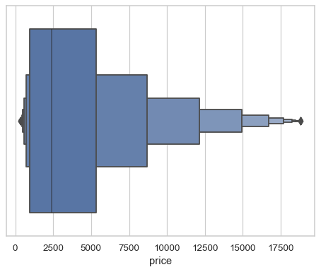
sns.boxenplot(x=df["price"])
Group by a categorical variable, referencing columns in a datafame
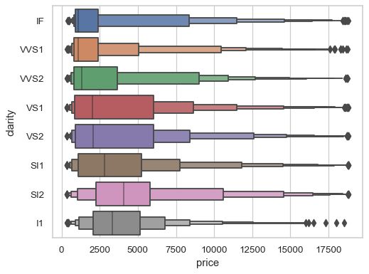
sns.boxenplot(data=df, x="price", y="clarity")
Use a different scaling rule to control the width of each box:
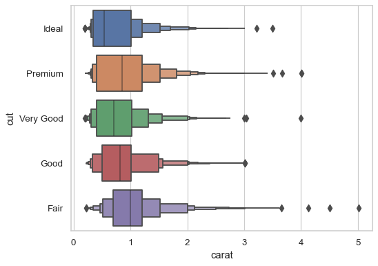
sns.boxenplot(data=df, x="carat", y="cut", scale="linear")
Use a different method to determine the number of boxes:
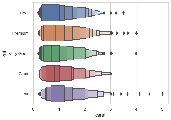
sns.boxenplot(data=df, x="carat", y="cut", k_depth="trustworthy")