seaborn.kdeplot#
- seaborn.kdeplot(data=None, *, x=None, y=None, hue=None, weights=None, palette=None, hue_order=None, hue_norm=None, color=None, fill=None, multiple='layer', common_norm=True, common_grid=False, cumulative=False, bw_method='scott', bw_adjust=1, warn_singular=True, log_scale=None, levels=10, thresh=0.05, gridsize=200, cut=3, clip=None, legend=True, cbar=False, cbar_ax=None, cbar_kws=None, ax=None, **kwargs)#
Plot univariate or bivariate distributions using kernel density estimation.
A kernel density estimate (KDE) plot is a method for visualizing the distribution of observations in a dataset, analogous to a histogram. KDE represents the data using a continuous probability density curve in one or more dimensions.
The approach is explained further in the user guide.
Relative to a histogram, KDE can produce a plot that is less cluttered and more interpretable, especially when drawing multiple distributions. But it has the potential to introduce distortions if the underlying distribution is bounded or not smooth. Like a histogram, the quality of the representation also depends on the selection of good smoothing parameters.
- Parameters:
- data
pandas.DataFrame,numpy.ndarray, mapping, or sequence Input data structure. Either a long-form collection of vectors that can be assigned to named variables or a wide-form dataset that will be internally reshaped.
- x, yvectors or keys in
data Variables that specify positions on the x and y axes.
- huevector or key in
data Semantic variable that is mapped to determine the color of plot elements.
- weightsvector or key in
data If provided, weight the kernel density estimation using these values.
- palettestring, list, dict, or
matplotlib.colors.Colormap Method for choosing the colors to use when mapping the
huesemantic. String values are passed tocolor_palette(). List or dict values imply categorical mapping, while a colormap object implies numeric mapping.- hue_ordervector of strings
Specify the order of processing and plotting for categorical levels of the
huesemantic.- hue_normtuple or
matplotlib.colors.Normalize Either a pair of values that set the normalization range in data units or an object that will map from data units into a [0, 1] interval. Usage implies numeric mapping.
- color
matplotlib color Single color specification for when hue mapping is not used. Otherwise, the plot will try to hook into the matplotlib property cycle.
- fillbool or None
If True, fill in the area under univariate density curves or between bivariate contours. If None, the default depends on
multiple.- multiple{{“layer”, “stack”, “fill”}}
Method for drawing multiple elements when semantic mapping creates subsets. Only relevant with univariate data.
- common_normbool
If True, scale each conditional density by the number of observations such that the total area under all densities sums to 1. Otherwise, normalize each density independently.
- common_gridbool
If True, use the same evaluation grid for each kernel density estimate. Only relevant with univariate data.
- cumulativebool, optional
If True, estimate a cumulative distribution function. Requires scipy.
- bw_methodstring, scalar, or callable, optional
Method for determining the smoothing bandwidth to use; passed to
scipy.stats.gaussian_kde.- bw_adjustnumber, optional
Factor that multiplicatively scales the value chosen using
bw_method. Increasing will make the curve smoother. See Notes.- warn_singularbool
If True, issue a warning when trying to estimate the density of data with zero variance.
- log_scalebool or number, or pair of bools or numbers
Set axis scale(s) to log. A single value sets the data axis for univariate distributions and both axes for bivariate distributions. A pair of values sets each axis independently. Numeric values are interpreted as the desired base (default 10). If
False, defer to the existing Axes scale.- levelsint or vector
Number of contour levels or values to draw contours at. A vector argument must have increasing values in [0, 1]. Levels correspond to iso-proportions of the density: e.g., 20% of the probability mass will lie below the contour drawn for 0.2. Only relevant with bivariate data.
- threshnumber in [0, 1]
Lowest iso-proportion level at which to draw a contour line. Ignored when
levelsis a vector. Only relevant with bivariate data.- gridsizeint
Number of points on each dimension of the evaluation grid.
- cutnumber, optional
Factor, multiplied by the smoothing bandwidth, that determines how far the evaluation grid extends past the extreme datapoints. When set to 0, truncate the curve at the data limits.
- clippair of numbers or None, or a pair of such pairs
Do not evaluate the density outside of these limits.
- legendbool
If False, suppress the legend for semantic variables.
- cbarbool
If True, add a colorbar to annotate the color mapping in a bivariate plot. Note: Does not currently support plots with a
huevariable well.- cbar_ax
matplotlib.axes.Axes Pre-existing axes for the colorbar.
- cbar_kwsdict
Additional parameters passed to
matplotlib.figure.Figure.colorbar().- ax
matplotlib.axes.Axes Pre-existing axes for the plot. Otherwise, call
matplotlib.pyplot.gca()internally.- kwargs
Other keyword arguments are passed to one of the following matplotlib functions:
matplotlib.axes.Axes.plot()(univariate,fill=False),matplotlib.axes.Axes.fill_between()(univariate,fill=True),matplotlib.axes.Axes.contour()(bivariate,fill=False),matplotlib.axes.contourf()(bivariate,fill=True).
- data
- Returns:
matplotlib.axes.AxesThe matplotlib axes containing the plot.
See also
displotFigure-level interface to distribution plot functions.
histplotPlot a histogram of binned counts with optional normalization or smoothing.
ecdfplotPlot empirical cumulative distribution functions.
jointplotDraw a bivariate plot with univariate marginal distributions.
violinplotDraw an enhanced boxplot using kernel density estimation.
Notes
The bandwidth, or standard deviation of the smoothing kernel, is an important parameter. Misspecification of the bandwidth can produce a distorted representation of the data. Much like the choice of bin width in a histogram, an over-smoothed curve can erase true features of a distribution, while an under-smoothed curve can create false features out of random variability. The rule-of-thumb that sets the default bandwidth works best when the true distribution is smooth, unimodal, and roughly bell-shaped. It is always a good idea to check the default behavior by using
bw_adjustto increase or decrease the amount of smoothing.Because the smoothing algorithm uses a Gaussian kernel, the estimated density curve can extend to values that do not make sense for a particular dataset. For example, the curve may be drawn over negative values when smoothing data that are naturally positive. The
cutandclipparameters can be used to control the extent of the curve, but datasets that have many observations close to a natural boundary may be better served by a different visualization method.Similar considerations apply when a dataset is naturally discrete or “spiky” (containing many repeated observations of the same value). Kernel density estimation will always produce a smooth curve, which would be misleading in these situations.
The units on the density axis are a common source of confusion. While kernel density estimation produces a probability distribution, the height of the curve at each point gives a density, not a probability. A probability can be obtained only by integrating the density across a range. The curve is normalized so that the integral over all possible values is 1, meaning that the scale of the density axis depends on the data values.
Examples
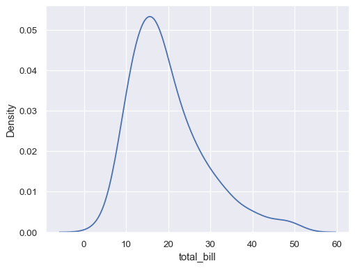
Plot a univariate distribution along the x axis:
tips = sns.load_dataset("tips")
sns.kdeplot(data=tips, x="total_bill")
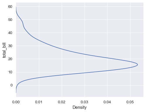
Flip the plot by assigning the data variable to the y axis:
sns.kdeplot(data=tips, y="total_bill")
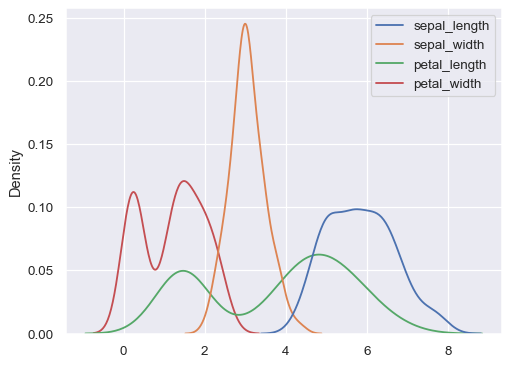
Plot distributions for each column of a wide-form dataset:
iris = sns.load_dataset("iris")
sns.kdeplot(data=iris)
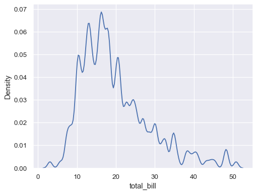
Use less smoothing:
sns.kdeplot(data=tips, x="total_bill", bw_adjust=.2)
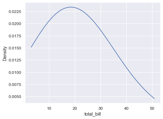
Use more smoothing, but don’t smooth past the extreme data points:
ax= sns.kdeplot(data=tips, x="total_bill", bw_adjust=5, cut=0)
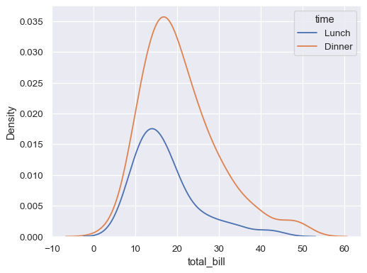
Plot conditional distributions with hue mapping of a second variable:
sns.kdeplot(data=tips, x="total_bill", hue="time")
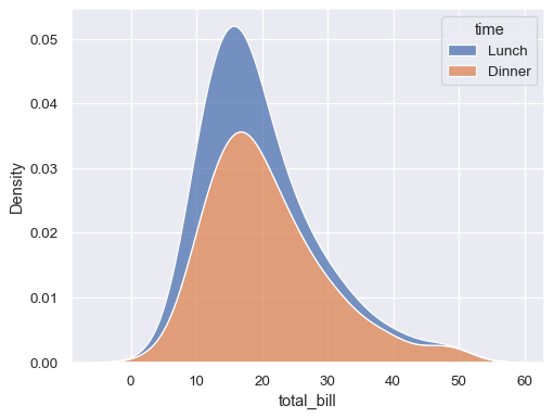
“Stack” the conditional distributions:
sns.kdeplot(data=tips, x="total_bill", hue="time", multiple="stack")
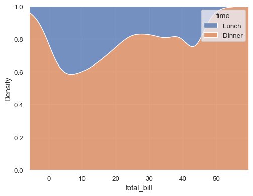
Normalize the stacked distribution at each value in the grid:
sns.kdeplot(data=tips, x="total_bill", hue="time", multiple="fill")
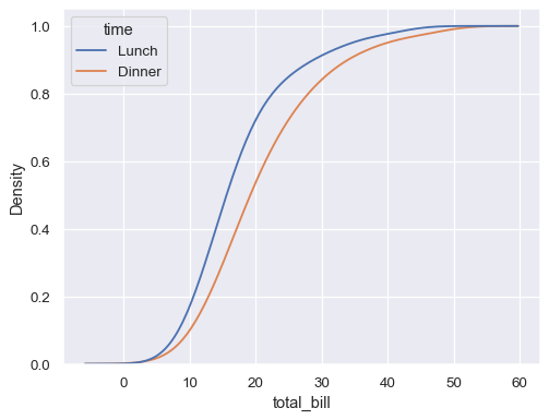
Estimate the cumulative distribution function(s), normalizing each subset:
sns.kdeplot(
    data=tips, x="total_bill", hue="time",
    cumulative=True, common_norm=False, common_grid=True,
)
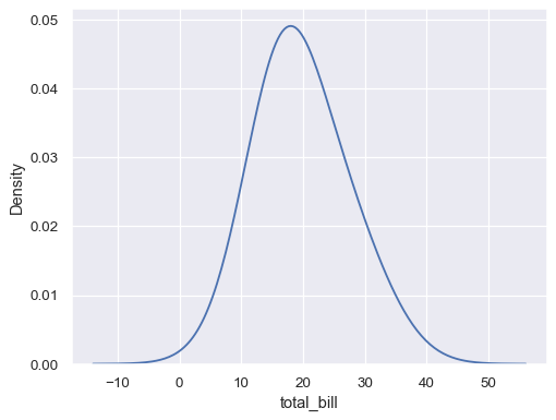
Estimate distribution from aggregated data, using weights:
tips_agg = (tips
    .groupby("size")
    .agg(total_bill=("total_bill", "mean"), n=("total_bill", "count"))
)
sns.kdeplot(data=tips_agg, x="total_bill", weights="n")
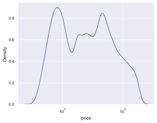
Map the data variable with log scaling:
diamonds = sns.load_dataset("diamonds")
sns.kdeplot(data=diamonds, x="price", log_scale=True)
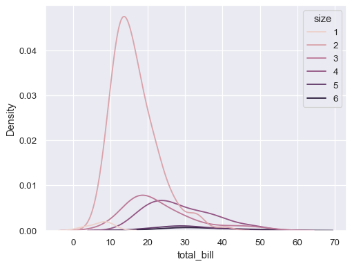
Use numeric hue mapping:
sns.kdeplot(data=tips, x="total_bill", hue="size")
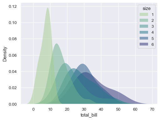
Modify the appearance of the plot:
sns.kdeplot(
   data=tips, x="total_bill", hue="size",
   fill=True, common_norm=False, palette="crest",
   alpha=.5, linewidth=0,
)
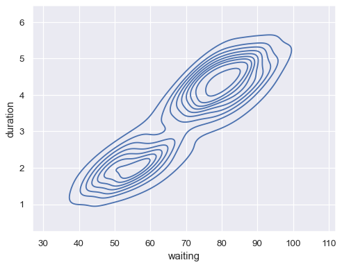
Plot a bivariate distribution:
geyser = sns.load_dataset("geyser")
sns.kdeplot(data=geyser, x="waiting", y="duration")
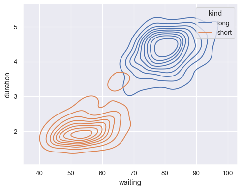
Map a third variable with a hue semantic to show conditional distributions:
sns.kdeplot(data=geyser, x="waiting", y="duration", hue="kind")
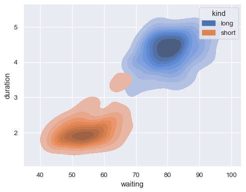
Show filled contours:
sns.kdeplot(
    data=geyser, x="waiting", y="duration", hue="kind", fill=True,
)
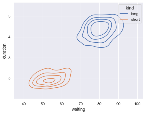
Show fewer contour levels, covering less of the distribution:
sns.kdeplot(
    data=geyser, x="waiting", y="duration", hue="kind",
    levels=5, thresh=.2,
)
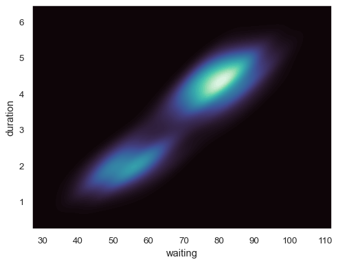
Fill the axes extent with a smooth distribution, using a different colormap:
sns.kdeplot(
    data=geyser, x="waiting", y="duration",
    fill=True, thresh=0, levels=100, cmap="mako",
)
