seaborn.catplot#
- seaborn.catplot(data=None, *, x=None, y=None, hue=None, row=None, col=None, col_wrap=None, estimator='mean', errorbar=('ci', 95), n_boot=1000, units=None, seed=None, order=None, hue_order=None, row_order=None, col_order=None, height=5, aspect=1, kind='strip', native_scale=False, formatter=None, orient=None, color=None, palette=None, hue_norm=None, legend='auto', legend_out=True, sharex=True, sharey=True, margin_titles=False, facet_kws=None, ci='deprecated', **kwargs)#
Figure-level interface for drawing categorical plots onto a FacetGrid.
This function provides access to several axes-level functions that show the relationship between a numerical and one or more categorical variables using one of several visual representations. The
kindparameter selects the underlying axes-level function to use:Categorical scatterplots:
stripplot()(withkind="strip"; the default)swarmplot()(withkind="swarm")
Categorical distribution plots:
boxplot()(withkind="box")violinplot()(withkind="violin")boxenplot()(withkind="boxen")
Categorical estimate plots:
pointplot()(withkind="point")barplot()(withkind="bar")countplot()(withkind="count")
Extra keyword arguments are passed to the underlying function, so you should refer to the documentation for each to see kind-specific options.
Note that unlike when using the axes-level functions directly, data must be passed in a long-form DataFrame with variables specified by passing strings to
x,y,hue, etc.Note
This function always treats one of the variables as categorical and draws data at ordinal positions (0, 1, … n) on the relevant axis, even when the data has a numeric or date type.
See the tutorial for more information.
After plotting, the
FacetGridwith the plot is returned and can be used directly to tweak supporting plot details or add other layers.- Parameters:
- dataDataFrame
Long-form (tidy) dataset for plotting. Each column should correspond to a variable, and each row should correspond to an observation.
- x, y, huenames of variables in
data Inputs for plotting long-form data. See examples for interpretation.
- row, colnames of variables in
data, optional Categorical variables that will determine the faceting of the grid.
- col_wrapint
“Wrap” the column variable at this width, so that the column facets span multiple rows. Incompatible with a
rowfacet.- estimatorstring or callable that maps vector -> scalar, optional
Statistical function to estimate within each categorical bin.
- errorbarstring, (string, number) tuple, callable or None
Name of errorbar method (either “ci”, “pi”, “se”, or “sd”), or a tuple with a method name and a level parameter, or a function that maps from a vector to a (min, max) interval, or None to hide errorbar.
- n_bootint, optional
Number of bootstrap samples used to compute confidence intervals.
- unitsname of variable in
dataor vector data, optional Identifier of sampling units, which will be used to perform a multilevel bootstrap and account for repeated measures design.
- seedint, numpy.random.Generator, or numpy.random.RandomState, optional
Seed or random number generator for reproducible bootstrapping.
- order, hue_orderlists of strings, optional
Order to plot the categorical levels in; otherwise the levels are inferred from the data objects.
- row_order, col_orderlists of strings, optional
Order to organize the rows and/or columns of the grid in, otherwise the orders are inferred from the data objects.
- heightscalar
Height (in inches) of each facet. See also:
aspect.- aspectscalar
Aspect ratio of each facet, so that
aspect * heightgives the width of each facet in inches.- kindstr, optional
The kind of plot to draw, corresponds to the name of a categorical axes-level plotting function. Options are: “strip”, “swarm”, “box”, “violin”, “boxen”, “point”, “bar”, or “count”.
- native_scalebool, optional
When True, numeric or datetime values on the categorical axis will maintain their original scaling rather than being converted to fixed indices.
- formattercallable, optional
Function for converting categorical data into strings. Affects both grouping and tick labels.
- orient“v” | “h”, optional
Orientation of the plot (vertical or horizontal). This is usually inferred based on the type of the input variables, but it can be used to resolve ambiguity when both
xandyare numeric or when plotting wide-form data.- colormatplotlib color, optional
Single color for the elements in the plot.
- palettepalette name, list, or dict
Colors to use for the different levels of the
huevariable. Should be something that can be interpreted bycolor_palette(), or a dictionary mapping hue levels to matplotlib colors.- hue_normtuple or
matplotlib.colors.Normalizeobject Normalization in data units for colormap applied to the
huevariable when it is numeric. Not relevant ifhueis categorical.- legendstr or bool, optional
Set to
Falseto disable the legend. Withstriporswarmplots, this also accepts a string, as described in the axes-level docstrings.- legend_outbool
If
True, the figure size will be extended, and the legend will be drawn outside the plot on the center right.- share{x,y}bool, ‘col’, or ‘row’ optional
If true, the facets will share y axes across columns and/or x axes across rows.
- margin_titlesbool
If
True, the titles for the row variable are drawn to the right of the last column. This option is experimental and may not work in all cases.- facet_kwsdict, optional
Dictionary of other keyword arguments to pass to
FacetGrid.- kwargskey, value pairings
Other keyword arguments are passed through to the underlying plotting function.
- Returns:
Examples
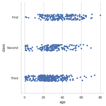
By default, the visual representation will be a jittered strip plot:
df = sns.load_dataset("titanic")
sns.catplot(data=df, x="age", y="class")
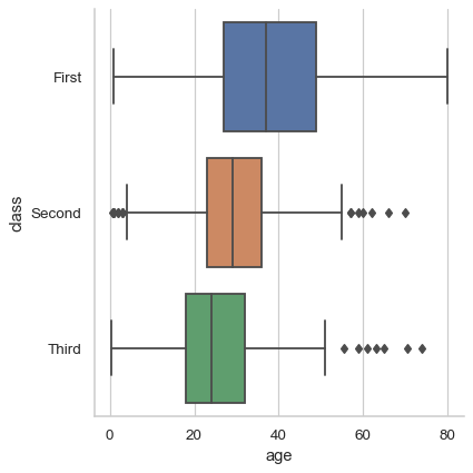
Use
kindto select a different representation:sns.catplot(data=df, x="age", y="class", kind="box")
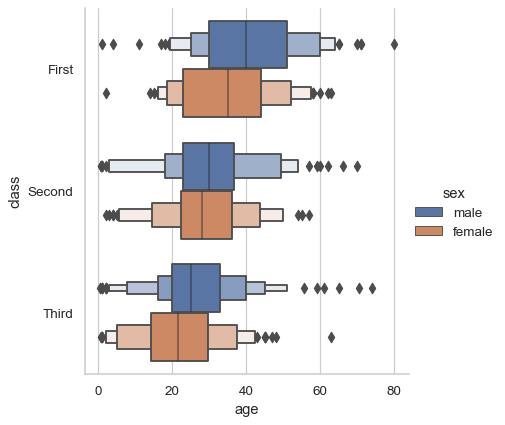
One advantage is that the legend will be automatically placed outside the plot:
sns.catplot(data=df, x="age", y="class", hue="sex", kind="boxen")
Additional keyword arguments get passed through to the underlying seaborn function:
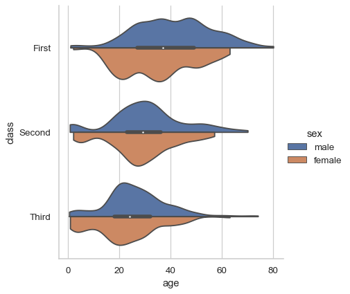
sns.catplot(
    data=df, x="age", y="class", hue="sex",
    kind="violin", bw=.25, cut=0, split=True,
)
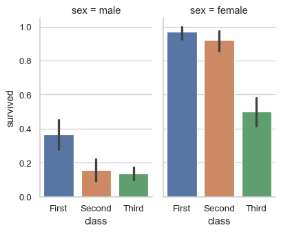
Assigning a variable to
colorrowwill automatically create subplots. Control figure size with theheightandaspectparameters:sns.catplot( data=df, x="class", y="survived", col="sex", kind="bar", height=4, aspect=.6, )
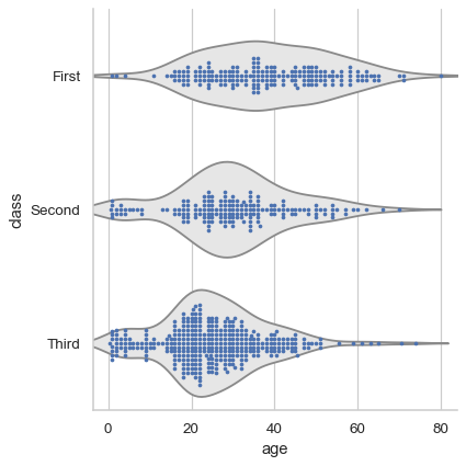
For single-subplot figures, it is easy to layer different representations:
sns.catplot(data=df, x="age", y="class", kind="violin", color=".9", inner=None)
sns.swarmplot(data=df, x="age", y="class", size=3)
Use methods on the returned
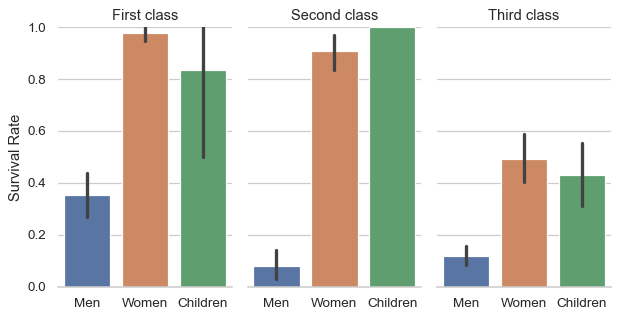
FacetGridto tweak the presentation:g = sns.catplot( data=df, x="who", y="survived", col="class", kind="bar", height=4, aspect=.6, ) g.set_axis_labels("", "Survival Rate") g.set_xticklabels(["Men", "Women", "Children"]) g.set_titles("{col_name} {col_var}") g.set(ylim=(0, 1)) g.despine(left=True)