seaborn.countplot#
- seaborn.countplot(data=None, *, x=None, y=None, hue=None, order=None, hue_order=None, orient=None, color=None, palette=None, saturation=0.75, width=0.8, dodge=True, ax=None, **kwargs)#
Show the counts of observations in each categorical bin using bars.
A count plot can be thought of as a histogram across a categorical, instead of quantitative, variable. The basic API and options are identical to those for
barplot(), so you can compare counts across nested variables.Note that the newer
histplot()function offers more functionality, although its default behavior is somewhat different.Note
This function always treats one of the variables as categorical and draws data at ordinal positions (0, 1, … n) on the relevant axis, even when the data has a numeric or date type.
See the tutorial for more information.
- Parameters:
- dataDataFrame, array, or list of arrays, optional
Dataset for plotting. If
xandyare absent, this is interpreted as wide-form. Otherwise it is expected to be long-form.- x, y, huenames of variables in
dataor vector data, optional Inputs for plotting long-form data. See examples for interpretation.
- order, hue_orderlists of strings, optional
Order to plot the categorical levels in; otherwise the levels are inferred from the data objects.
- orient“v” | “h”, optional
Orientation of the plot (vertical or horizontal). This is usually inferred based on the type of the input variables, but it can be used to resolve ambiguity when both
xandyare numeric or when plotting wide-form data.- colormatplotlib color, optional
Single color for the elements in the plot.
- palettepalette name, list, or dict
Colors to use for the different levels of the
huevariable. Should be something that can be interpreted bycolor_palette(), or a dictionary mapping hue levels to matplotlib colors.- saturationfloat, optional
Proportion of the original saturation to draw colors at. Large patches often look better with slightly desaturated colors, but set this to
1if you want the plot colors to perfectly match the input color.- dodgebool, optional
When hue nesting is used, whether elements should be shifted along the categorical axis.
- axmatplotlib Axes, optional
Axes object to draw the plot onto, otherwise uses the current Axes.
- kwargskey, value mappings
Other keyword arguments are passed through to
matplotlib.axes.Axes.bar().
- Returns:
- axmatplotlib Axes
Returns the Axes object with the plot drawn onto it.
See also
Examples
import seaborn as sns
sns.set_theme(style="whitegrid")
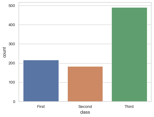
Show the number of datapoints with each value of a categorical variable:
df = sns.load_dataset("titanic")
sns.countplot(x=df["class"])
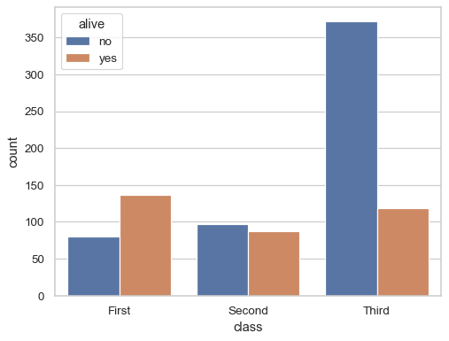
Group by a second variable:
sns.countplot(data=df, x="class", hue="alive")
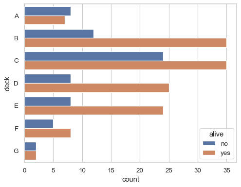
Plot horizontally to make more space for category labels:
sns.countplot(data=df, y="deck", hue="alive")