seaborn.boxplot#
- seaborn.boxplot(data=None, *, x=None, y=None, hue=None, order=None, hue_order=None, orient=None, color=None, palette=None, saturation=0.75, width=0.8, dodge=True, fliersize=5, linewidth=None, whis=1.5, ax=None, **kwargs)#
Draw a box plot to show distributions with respect to categories.
A box plot (or box-and-whisker plot) shows the distribution of quantitative data in a way that facilitates comparisons between variables or across levels of a categorical variable. The box shows the quartiles of the dataset while the whiskers extend to show the rest of the distribution, except for points that are determined to be “outliers” using a method that is a function of the inter-quartile range.
Note
This function always treats one of the variables as categorical and draws data at ordinal positions (0, 1, … n) on the relevant axis, even when the data has a numeric or date type.
See the tutorial for more information.
- Parameters:
- dataDataFrame, array, or list of arrays, optional
Dataset for plotting. If
xandyare absent, this is interpreted as wide-form. Otherwise it is expected to be long-form.- x, y, huenames of variables in
dataor vector data, optional Inputs for plotting long-form data. See examples for interpretation.
- order, hue_orderlists of strings, optional
Order to plot the categorical levels in; otherwise the levels are inferred from the data objects.
- orient“v” | “h”, optional
Orientation of the plot (vertical or horizontal). This is usually inferred based on the type of the input variables, but it can be used to resolve ambiguity when both
xandyare numeric or when plotting wide-form data.- colormatplotlib color, optional
Single color for the elements in the plot.
- palettepalette name, list, or dict
Colors to use for the different levels of the
huevariable. Should be something that can be interpreted bycolor_palette(), or a dictionary mapping hue levels to matplotlib colors.- saturationfloat, optional
Proportion of the original saturation to draw colors at. Large patches often look better with slightly desaturated colors, but set this to
1if you want the plot colors to perfectly match the input color.- widthfloat, optional
Width of a full element when not using hue nesting, or width of all the elements for one level of the major grouping variable.
- dodgebool, optional
When hue nesting is used, whether elements should be shifted along the categorical axis.
- fliersizefloat, optional
Size of the markers used to indicate outlier observations.
- linewidthfloat, optional
Width of the gray lines that frame the plot elements.
- whisfloat, optional
Maximum length of the plot whiskers as proportion of the interquartile range. Whiskers extend to the furthest datapoint within that range. More extreme points are marked as outliers.
- axmatplotlib Axes, optional
Axes object to draw the plot onto, otherwise uses the current Axes.
- kwargskey, value mappings
Other keyword arguments are passed through to
matplotlib.axes.Axes.boxplot().
- Returns:
- axmatplotlib Axes
Returns the Axes object with the plot drawn onto it.
See also
violinplotA combination of boxplot and kernel density estimation.
stripplotA scatterplot where one variable is categorical. Can be used in conjunction with other plots to show each observation.
swarmplotA categorical scatterplot where the points do not overlap. Can be used with other plots to show each observation.
catplotCombine a categorical plot with a
FacetGrid.
Examples
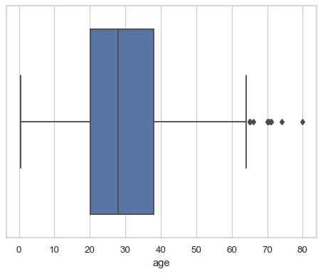
Draw a single horizontal boxplot, assigning the data directly to the coordinate variable:
df = sns.load_dataset("titanic")
sns.boxplot(x=df["age"])
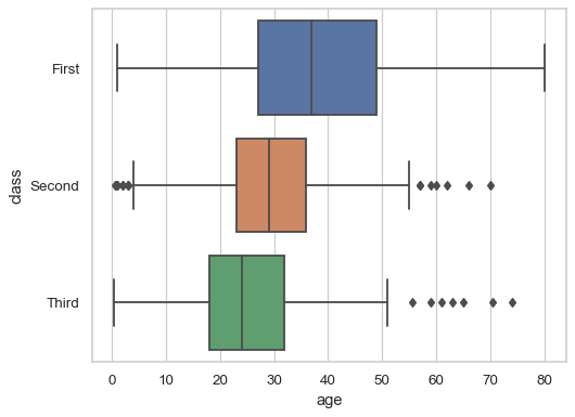
Group by a categorical variable, referencing columns in a dataframe:
sns.boxplot(data=df, x="age", y="class")
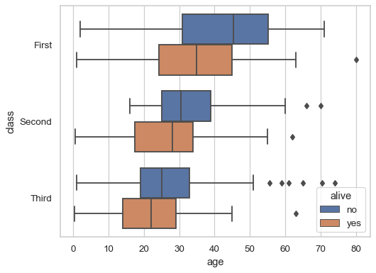
Draw a vertical boxplot with nested grouping by two variables:
sns.boxplot(data=df, x="age", y="class", hue="alive")
Control the order of the boxes:
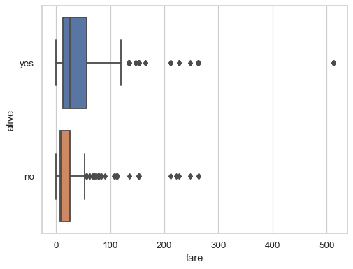
sns.boxplot(data=df, x="fare", y="alive", order=["yes", "no"])
Draw a box for multiple numeric columns:
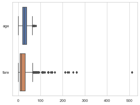
sns.boxplot(data=df[["age", "fare"]], orient="h")
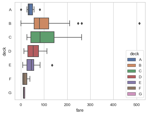
Use a
huevariable whithout changing the box width or position:sns.boxplot(data=df, x="fare", y="deck", hue="deck", dodge=False)
Pass additional keyword arguments to matplotlib:
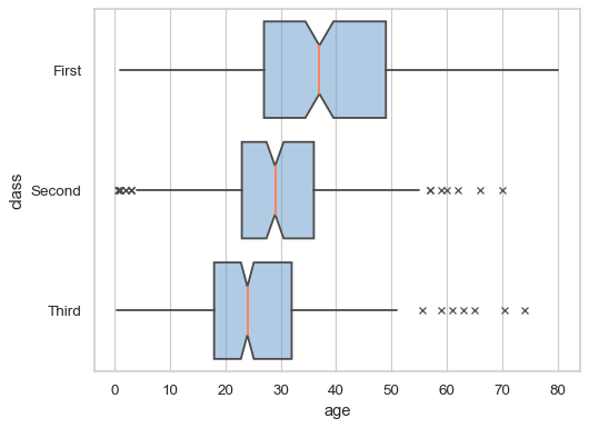
sns.boxplot(
    data=df, x="age", y="class",
    notch=True, showcaps=False,
    flierprops={"marker": "x"},
    boxprops={"facecolor": (.4, .6, .8, .5)},
    medianprops={"color": "coral"},
)