seaborn.barplot#
- seaborn.barplot(data=None, *, x=None, y=None, hue=None, order=None, hue_order=None, estimator='mean', errorbar=('ci', 95), n_boot=1000, units=None, seed=None, orient=None, color=None, palette=None, saturation=0.75, width=0.8, errcolor='.26', errwidth=None, capsize=None, dodge=True, ci='deprecated', ax=None, **kwargs)#
Show point estimates and errors as rectangular bars.
A bar plot represents an estimate of central tendency for a numeric variable with the height of each rectangle and provides some indication of the uncertainty around that estimate using error bars. Bar plots include 0 in the quantitative axis range, and they are a good choice when 0 is a meaningful value for the quantitative variable, and you want to make comparisons against it.
For datasets where 0 is not a meaningful value, a point plot will allow you to focus on differences between levels of one or more categorical variables.
It is also important to keep in mind that a bar plot shows only the mean (or other estimator) value, but in many cases it may be more informative to show the distribution of values at each level of the categorical variables. In that case, other approaches such as a box or violin plot may be more appropriate.
Note
This function always treats one of the variables as categorical and draws data at ordinal positions (0, 1, … n) on the relevant axis, even when the data has a numeric or date type.
See the tutorial for more information.
- Parameters:
- dataDataFrame, array, or list of arrays, optional
Dataset for plotting. If
xandyare absent, this is interpreted as wide-form. Otherwise it is expected to be long-form.- x, y, huenames of variables in
dataor vector data, optional Inputs for plotting long-form data. See examples for interpretation.
- order, hue_orderlists of strings, optional
Order to plot the categorical levels in; otherwise the levels are inferred from the data objects.
- estimatorstring or callable that maps vector -> scalar, optional
Statistical function to estimate within each categorical bin.
- errorbarstring, (string, number) tuple, callable or None
Name of errorbar method (either “ci”, “pi”, “se”, or “sd”), or a tuple with a method name and a level parameter, or a function that maps from a vector to a (min, max) interval, or None to hide errorbar.
- n_bootint, optional
Number of bootstrap samples used to compute confidence intervals.
- unitsname of variable in
dataor vector data, optional Identifier of sampling units, which will be used to perform a multilevel bootstrap and account for repeated measures design.
- seedint, numpy.random.Generator, or numpy.random.RandomState, optional
Seed or random number generator for reproducible bootstrapping.
- orient“v” | “h”, optional
Orientation of the plot (vertical or horizontal). This is usually inferred based on the type of the input variables, but it can be used to resolve ambiguity when both
xandyare numeric or when plotting wide-form data.- colormatplotlib color, optional
Single color for the elements in the plot.
- palettepalette name, list, or dict
Colors to use for the different levels of the
huevariable. Should be something that can be interpreted bycolor_palette(), or a dictionary mapping hue levels to matplotlib colors.- saturationfloat, optional
Proportion of the original saturation to draw colors at. Large patches often look better with slightly desaturated colors, but set this to
1if you want the plot colors to perfectly match the input color.- widthfloat, optional
Width of a full element when not using hue nesting, or width of all the elements for one level of the major grouping variable.
- errcolormatplotlib color
Color used for the error bar lines.
- errwidthfloat, optional
Thickness of error bar lines (and caps).
- capsizefloat, optional
Width of the “caps” on error bars.
- dodgebool, optional
When hue nesting is used, whether elements should be shifted along the categorical axis.
- axmatplotlib Axes, optional
Axes object to draw the plot onto, otherwise uses the current Axes.
- kwargskey, value mappings
Other keyword arguments are passed through to
matplotlib.axes.Axes.bar().
- Returns:
- axmatplotlib Axes
Returns the Axes object with the plot drawn onto it.
See also
Examples
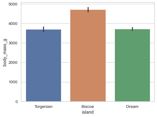
Group by a categorical varaible and plot aggregated values, with confidence intervals:
df = sns.load_dataset("penguins")
sns.barplot(data=df, x="island", y="body_mass_g")
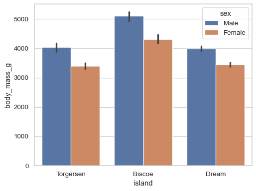
Add a second layer of grouping:
sns.barplot(data=df, x="island", y="body_mass_g", hue="sex")
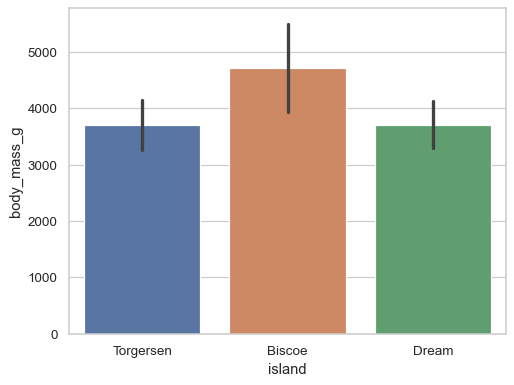
Use the error bars to show the standard deviation rather than a confidence interval:
sns.barplot(data=df, x="island", y="body_mass_g", errorbar="sd")
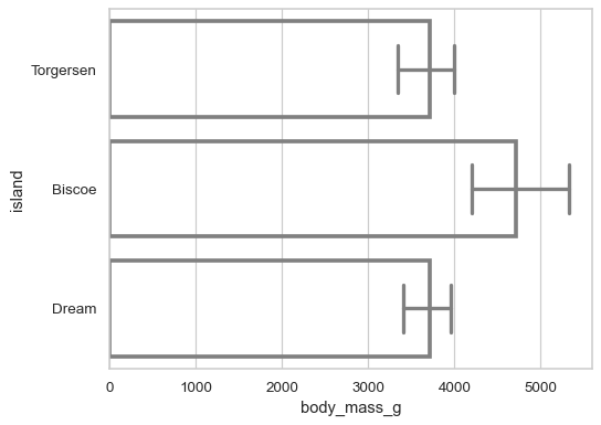
Customize the appearance of the plot:
sns.barplot(
    data=df, x="body_mass_g", y="island",
    errorbar=("pi", 50), capsize=.4, errcolor=".5",
    linewidth=3, edgecolor=".5", facecolor=(0, 0, 0, 0),
)