seaborn.pairplot(data, *, hue=None, hue_order=None, palette=None, vars=None, x_vars=None, y_vars=None, kind='scatter', diag_kind='auto', markers=None, height=2.5, aspect=1, corner=False, dropna=False, plot_kws=None, diag_kws=None, grid_kws=None, size=None)¶Plot pairwise relationships in a dataset.
By default, this function will create a grid of Axes such that each numeric
variable in data will by shared across the y-axes across a single row and
the x-axes across a single column. The diagonal plots are treated
differently: a univariate distribution plot is drawn to show the marginal
distribution of the data in each column.
It is also possible to show a subset of variables or plot different variables on the rows and columns.
This is a high-level interface for PairGrid that is intended to
make it easy to draw a few common styles. You should use PairGrid
directly if you need more flexibility.
pandas.DataFrameTidy (long-form) dataframe where each column is a variable and each row is an observation.
dataVariable in data to map plot aspects to different colors.
Order for the levels of the hue variable in the palette
Set of colors for mapping the hue variable. If a dict, keys
should be values in the hue variable.
Variables within data to use, otherwise use every column with
a numeric datatype.
Variables within data to use separately for the rows and
columns of the figure; i.e. to make a non-square plot.
Kind of plot to make.
Kind of plot for the diagonal subplots. If ‘auto’, choose based on
whether or not hue is used.
Either the marker to use for all scatterplot points or a list of markers with a length the same as the number of levels in the hue variable so that differently colored points will also have different scatterplot markers.
Height (in inches) of each facet.
Aspect * height gives the width (in inches) of each facet.
If True, don’t add axes to the upper (off-diagonal) triangle of the grid, making this a “corner” plot.
Drop missing values from the data before plotting.
Dictionaries of keyword arguments. plot_kws are passed to the
bivariate plotting function, diag_kws are passed to the univariate
plotting function, and grid_kws are passed to the PairGrid
constructor.
See also
Examples
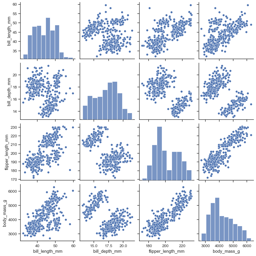
The simplest invocation uses scatterplot() for each pairing of the variables and histplot() for the marginal plots along the diagonal:
penguins = sns.load_dataset("penguins")
sns.pairplot(penguins)
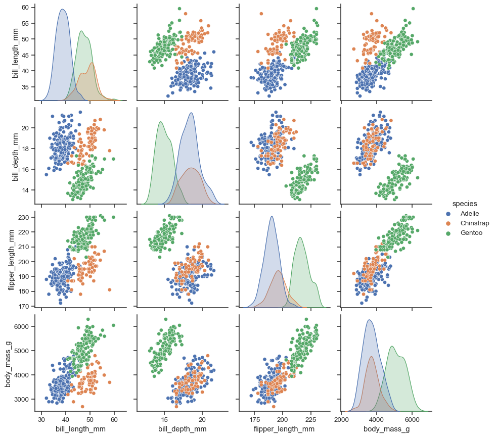
Assigning a hue variable adds a semantic mapping and changes the default marginal plot to a layered kernel density estimate (KDE):
sns.pairplot(penguins, hue="species")
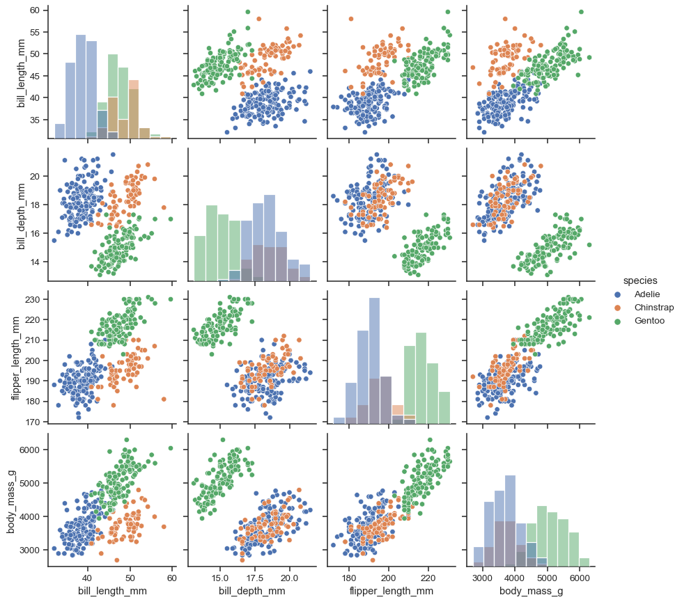
It’s possible to force marginal histograms:
sns.pairplot(penguins, hue="species", diag_kind="hist")
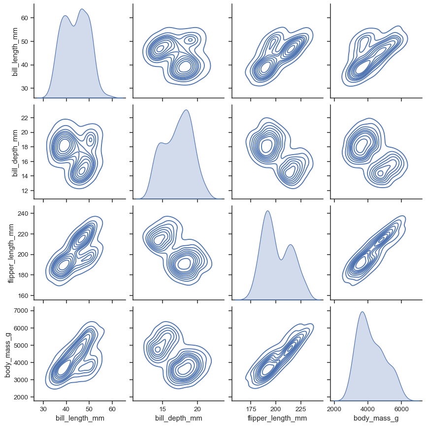
The kind parameter determines both the diagonal and off-diagonal plotting style. Several options are available, including using kdeplot() to draw KDEs:
sns.pairplot(penguins, kind="kde")
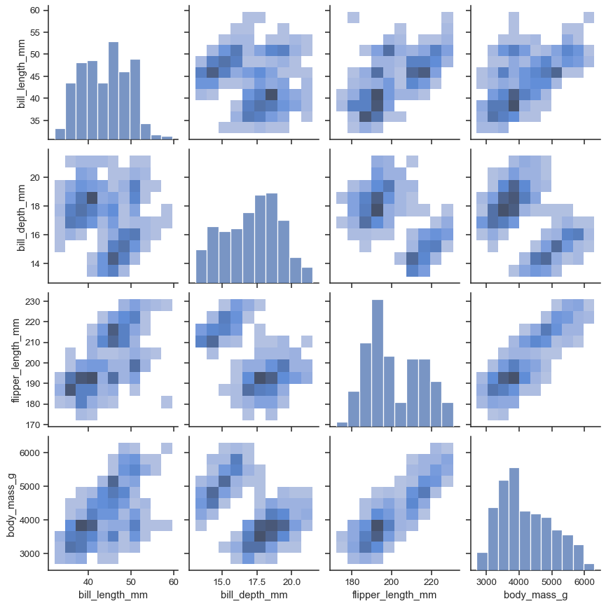
Or histplot() to draw both bivariate and univariate histograms:
sns.pairplot(penguins, kind="hist")
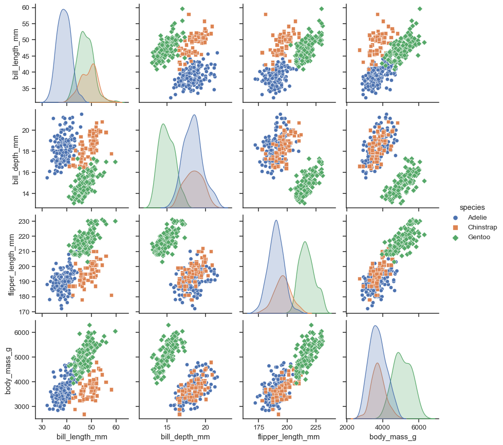
The markers parameter applies a style mapping on the off-diagonal axes. Currently, it will be redundant with the hue variable:
sns.pairplot(penguins, hue="species", markers=["o", "s", "D"])
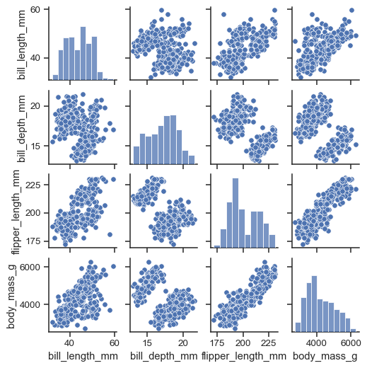
As with other figure-level functions, the size of the figure is controlled by setting the height of each individual subplot:
sns.pairplot(penguins, height=1.5)
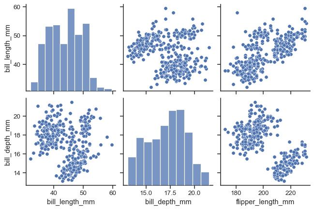
Use vars or x_vars and y_vars to select the variables to plot:
sns.pairplot(
    penguins,
    x_vars=["bill_length_mm", "bill_depth_mm", "flipper_length_mm"],
    y_vars=["bill_length_mm", "bill_depth_mm"],
)
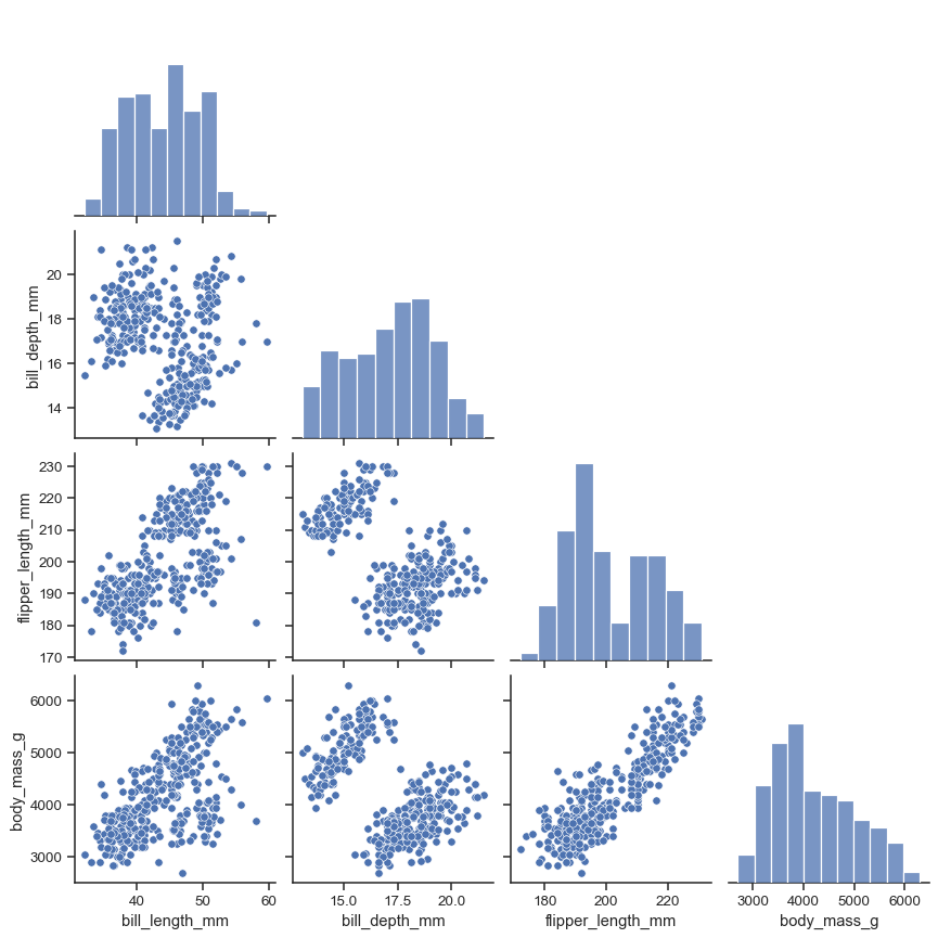
Set corner=True to plot only the lower triangle:
sns.pairplot(penguins, corner=True)
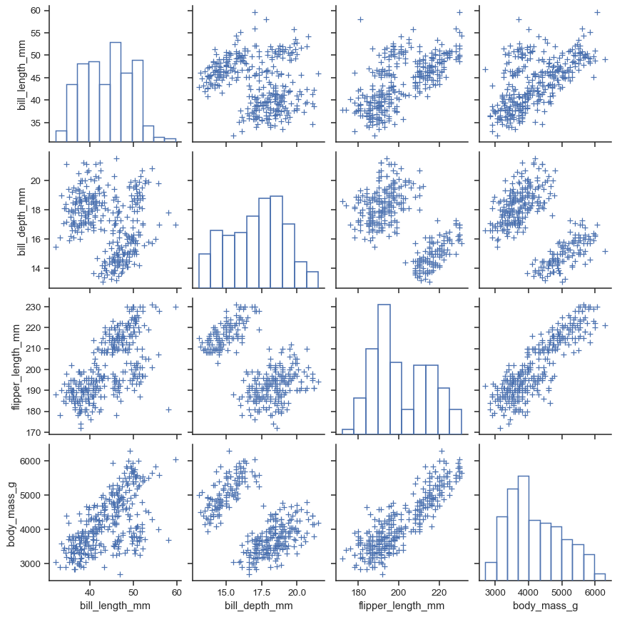
The plot_kws and diag_kws parameters accept dicts of keyword arguments to customize the off-diagonal and diagonal plots, respectively:
sns.pairplot(
    penguins,
    plot_kws=dict(marker="+", linewidth=1),
    diag_kws=dict(fill=False),
)
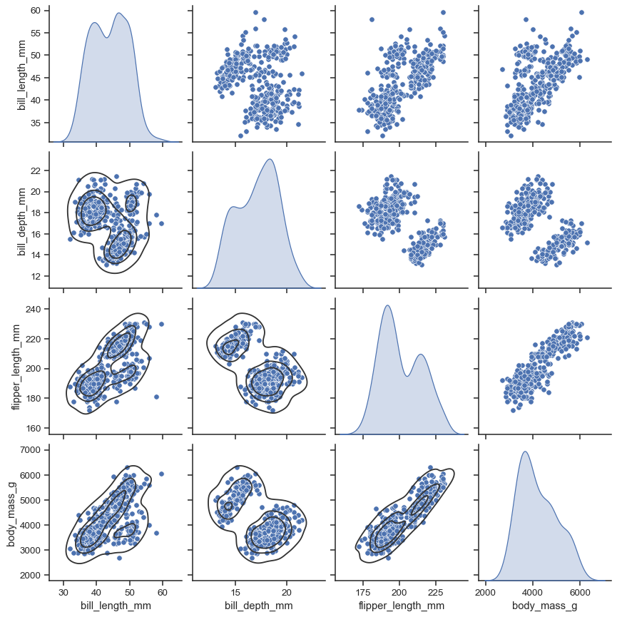
The return object is the underlying PairGrid, which can be used to further customize the plot:
g = sns.pairplot(penguins, diag_kind="kde")
g.map_lower(sns.kdeplot, levels=4, color=".2")
