seaborn.scatterplot(*, x=None, y=None, hue=None, style=None, size=None, data=None, palette=None, hue_order=None, hue_norm=None, sizes=None, size_order=None, size_norm=None, markers=True, style_order=None, x_bins=None, y_bins=None, units=None, estimator=None, ci=95, n_boot=1000, alpha=None, x_jitter=None, y_jitter=None, legend='auto', ax=None, **kwargs)¶Draw a scatter plot with possibility of several semantic groupings.
The relationship between x and y can be shown for different subsets
of the data using the hue, size, and style parameters. These
parameters control what visual semantics are used to identify the different
subsets. It is possible to show up to three dimensions independently by
using all three semantic types, but this style of plot can be hard to
interpret and is often ineffective. Using redundant semantics (i.e. both
hue and style for the same variable) can be helpful for making
graphics more accessible.
See the tutorial for more information.
The default treatment of the hue (and to a lesser extent, size)
semantic, if present, depends on whether the variable is inferred to
represent “numeric” or “categorical” data. In particular, numeric variables
are represented with a sequential colormap by default, and the legend
entries show regular “ticks” with values that may or may not exist in the
data. This behavior can be controlled through various parameters, as
described and illustrated below.
dataVariables that specify positions on the x and y axes.
dataGrouping variable that will produce points with different colors. Can be either categorical or numeric, although color mapping will behave differently in latter case.
dataGrouping variable that will produce points with different sizes. Can be either categorical or numeric, although size mapping will behave differently in latter case.
dataGrouping variable that will produce points with different markers. Can have a numeric dtype but will always be treated as categorical.
pandas.DataFrame, numpy.ndarray, mapping, or sequenceInput data structure. Either a long-form collection of vectors that can be assigned to named variables or a wide-form dataset that will be internally reshaped.
matplotlib.colors.ColormapMethod for choosing the colors to use when mapping the hue semantic.
String values are passed to color_palette(). List or dict values
imply categorical mapping, while a colormap object implies numeric mapping.
Specify the order of processing and plotting for categorical levels of the
hue semantic.
matplotlib.colors.NormalizeEither a pair of values that set the normalization range in data units or an object that will map from data units into a [0, 1] interval. Usage implies numeric mapping.
An object that determines how sizes are chosen when size is used.
It can always be a list of size values or a dict mapping levels of the
size variable to sizes. When size is numeric, it can also be
a tuple specifying the minimum and maximum size to use such that other
values are normalized within this range.
Specified order for appearance of the size variable levels,
otherwise they are determined from the data. Not relevant when the
size variable is numeric.
Normalization in data units for scaling plot objects when the
size variable is numeric.
Object determining how to draw the markers for different levels of the
style variable. Setting to True will use default markers, or
you can pass a list of markers or a dictionary mapping levels of the
style variable to markers. Setting to False will draw
marker-less lines. Markers are specified as in matplotlib.
Specified order for appearance of the style variable levels
otherwise they are determined from the data. Not relevant when the
style variable is numeric.
Currently non-functional.
dataGrouping variable identifying sampling units. When used, a separate line will be drawn for each unit with appropriate semantics, but no legend entry will be added. Useful for showing distribution of experimental replicates when exact identities are not needed. Currently non-functional.
Method for aggregating across multiple observations of the y
variable at the same x level. If None, all observations will
be drawn.
Currently non-functional.
Size of the confidence interval to draw when aggregating with an
estimator. “sd” means to draw the standard deviation of the data.
Setting to None will skip bootstrapping.
Currently non-functional.
Number of bootstraps to use for computing the confidence interval. Currently non-functional.
Proportional opacity of the points.
Currently non-functional.
How to draw the legend. If “brief”, numeric hue and size
variables will be represented with a sample of evenly spaced values.
If “full”, every group will get an entry in the legend. If “auto”,
choose between brief or full representation based on number of levels.
If False, no legend data is added and no legend is drawn.
matplotlib.axes.AxesPre-existing axes for the plot. Otherwise, call matplotlib.pyplot.gca()
internally.
Other keyword arguments are passed down to
matplotlib.axes.Axes.scatter().
matplotlib.axes.AxesThe matplotlib axes containing the plot.
See also
Examples
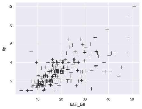
These examples will use the “tips” dataset, which has a mixture of numeric and categorical variables:
tips = sns.load_dataset("tips")
tips.head()
| total_bill | tip | sex | smoker | day | time | size | |
|---|---|---|---|---|---|---|---|
| 0 | 16.99 | 1.01 | Female | No | Sun | Dinner | 2 |
| 1 | 10.34 | 1.66 | Male | No | Sun | Dinner | 3 |
| 2 | 21.01 | 3.50 | Male | No | Sun | Dinner | 3 |
| 3 | 23.68 | 3.31 | Male | No | Sun | Dinner | 2 |
| 4 | 24.59 | 3.61 | Female | No | Sun | Dinner | 4 |
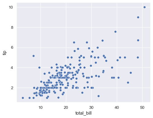
Passing long-form data and assigning x and y will draw a scatter plot between two variables:
sns.scatterplot(data=tips, x="total_bill", y="tip")
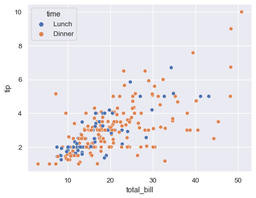
Assigning a variable to hue will map its levels to the color of the points:
sns.scatterplot(data=tips, x="total_bill", y="tip", hue="time")
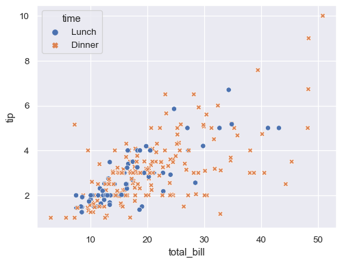
Assigning the same variable to style will also vary the markers and create a more accessible plot:
sns.scatterplot(data=tips, x="total_bill", y="tip", hue="time", style="time")
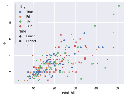
Assigning hue and style to different variables will vary colors and markers independently:
sns.scatterplot(data=tips, x="total_bill", y="tip", hue="day", style="time")
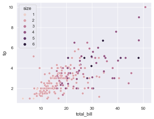
If the variable assigned to hue is numeric, the semantic mapping will be quantitative and use a different default palette:
sns.scatterplot(data=tips, x="total_bill", y="tip", hue="size")
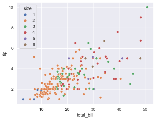
Pass the name of a categorical palette or explicit colors (as a Python list of dictionary) to force categorical mapping of the hue variable:
sns.scatterplot(data=tips, x="total_bill", y="tip", hue="size", palette="deep")
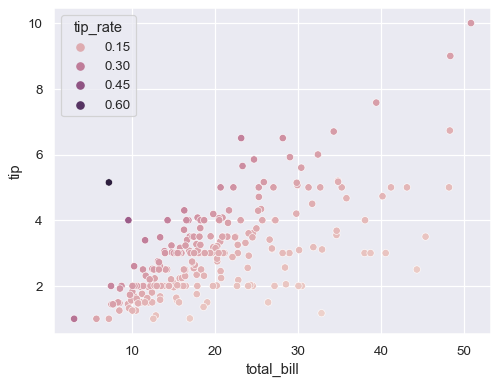
If there are a large number of unique numeric values, the legend will show a representative, evenly-spaced set:
tip_rate = tips.eval("tip / total_bill").rename("tip_rate")
sns.scatterplot(data=tips, x="total_bill", y="tip", hue=tip_rate)
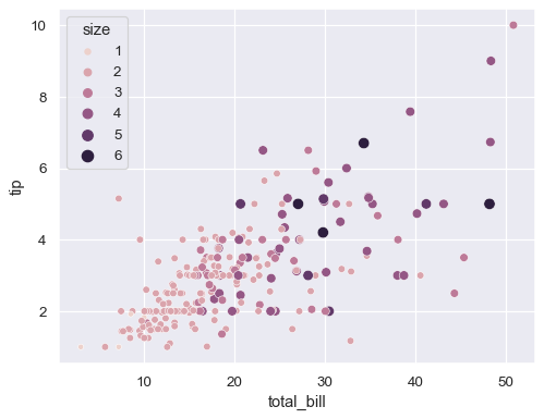
A numeric variable can also be assigned to size to apply a semantic mapping to the areas of the points:
sns.scatterplot(data=tips, x="total_bill", y="tip", hue="size", size="size")
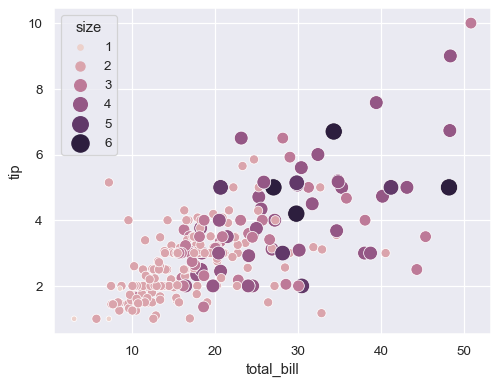
Control the range of marker areas with sizes, and set lengend="full" to force every unique value to appear in the legend:
sns.scatterplot(
    data=tips, x="total_bill", y="tip", hue="size", size="size",
    sizes=(20, 200), legend="full"
)
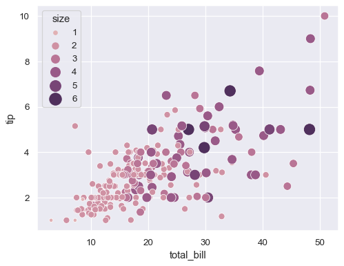
Pass a tuple of values or a matplotlib.colors.Normalize object to hue_norm to control the quantitative hue mapping:
sns.scatterplot(
    data=tips, x="total_bill", y="tip", hue="size", size="size",
    sizes=(20, 200), hue_norm=(0, 7), legend="full"
)
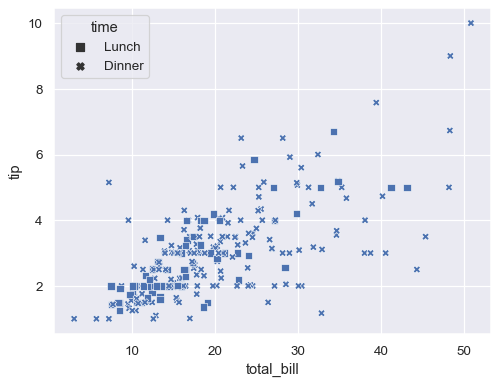
Control the specific markers used to map the style variable by passing a Python list or dictionary of marker codes:
markers = {"Lunch": "s", "Dinner": "X"}
sns.scatterplot(data=tips, x="total_bill", y="tip", style="time", markers=markers)
Additional keyword arguments are passed to matplotlib.axes.Axes.scatter(), allowing you to directly set the attributes of the plot that are not semantically mapped:
sns.scatterplot(data=tips, x="total_bill", y="tip", s=100, color=".2", marker="+")
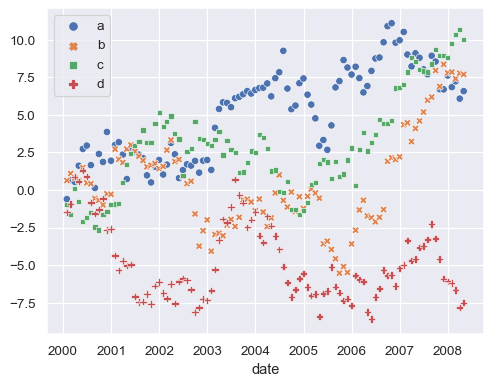
The previous examples used a long-form dataset. When working with wide-form data, each column will be plotted against its index using both hue and style mapping:
index = pd.date_range("1 1 2000", periods=100, freq="m", name="date")
data = np.random.randn(100, 4).cumsum(axis=0)
wide_df = pd.DataFrame(data, index, ["a", "b", "c", "d"])
sns.scatterplot(data=wide_df)
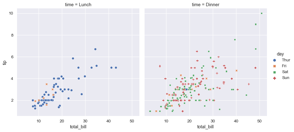
Use relplot() to combine scatterplot() and FacetGrid. This allows grouping within additional categorical variables, and plotting them across multiple subplots.
Using relplot() is safer than using FacetGrid directly, as it ensures synchronization of the semantic mappings across facets.
sns.relplot(
    data=tips, x="total_bill", y="tip",
    col="time", hue="day", style="day",
    kind="scatter"
)