seaborn.relplot(*, x=None, y=None, hue=None, size=None, style=None, data=None, row=None, col=None, col_wrap=None, row_order=None, col_order=None, palette=None, hue_order=None, hue_norm=None, sizes=None, size_order=None, size_norm=None, markers=None, dashes=None, style_order=None, legend='auto', kind='scatter', height=5, aspect=1, facet_kws=None, units=None, **kwargs)¶Figure-level interface for drawing relational plots onto a FacetGrid.
This function provides access to several different axes-level functions
that show the relationship between two variables with semantic mappings
of subsets. The kind parameter selects the underlying axes-level
function to use:
scatterplot() (with kind="scatter"; the default)
lineplot() (with kind="line")
Extra keyword arguments are passed to the underlying function, so you should refer to the documentation for each to see kind-specific options.
The relationship between x and y can be shown for different subsets
of the data using the hue, size, and style parameters. These
parameters control what visual semantics are used to identify the different
subsets. It is possible to show up to three dimensions independently by
using all three semantic types, but this style of plot can be hard to
interpret and is often ineffective. Using redundant semantics (i.e. both
hue and style for the same variable) can be helpful for making
graphics more accessible.
See the tutorial for more information.
The default treatment of the hue (and to a lesser extent, size)
semantic, if present, depends on whether the variable is inferred to
represent “numeric” or “categorical” data. In particular, numeric variables
are represented with a sequential colormap by default, and the legend
entries show regular “ticks” with values that may or may not exist in the
data. This behavior can be controlled through various parameters, as
described and illustrated below.
After plotting, the FacetGrid with the plot is returned and can
be used directly to tweak supporting plot details or add other layers.
Note that, unlike when using the underlying plotting functions directly,
data must be passed in a long-form DataFrame with variables specified by
passing strings to x, y, and other parameters.
dataVariables that specify positions on the x and y axes.
dataGrouping variable that will produce elements with different colors. Can be either categorical or numeric, although color mapping will behave differently in latter case.
dataGrouping variable that will produce elements with different sizes. Can be either categorical or numeric, although size mapping will behave differently in latter case.
dataGrouping variable that will produce elements with different styles. Can have a numeric dtype but will always be treated as categorical.
pandas.DataFrame, numpy.ndarray, mapping, or sequenceInput data structure. Either a long-form collection of vectors that can be assigned to named variables or a wide-form dataset that will be internally reshaped.
dataVariables that define subsets to plot on different facets.
“Wrap” the column variable at this width, so that the column facets
span multiple rows. Incompatible with a row facet.
Order to organize the rows and/or columns of the grid in, otherwise the orders are inferred from the data objects.
matplotlib.colors.ColormapMethod for choosing the colors to use when mapping the hue semantic.
String values are passed to color_palette(). List or dict values
imply categorical mapping, while a colormap object implies numeric mapping.
Specify the order of processing and plotting for categorical levels of the
hue semantic.
matplotlib.colors.NormalizeEither a pair of values that set the normalization range in data units or an object that will map from data units into a [0, 1] interval. Usage implies numeric mapping.
An object that determines how sizes are chosen when size is used.
It can always be a list of size values or a dict mapping levels of the
size variable to sizes. When size is numeric, it can also be
a tuple specifying the minimum and maximum size to use such that other
values are normalized within this range.
Specified order for appearance of the size variable levels,
otherwise they are determined from the data. Not relevant when the
size variable is numeric.
Normalization in data units for scaling plot objects when the
size variable is numeric.
Specified order for appearance of the style variable levels
otherwise they are determined from the data. Not relevant when the
style variable is numeric.
Object determining how to draw the lines for different levels of the
style variable. Setting to True will use default dash codes, or
you can pass a list of dash codes or a dictionary mapping levels of the
style variable to dash codes. Setting to False will use solid
lines for all subsets. Dashes are specified as in matplotlib: a tuple
of (segment, gap) lengths, or an empty string to draw a solid line.
Object determining how to draw the markers for different levels of the
style variable. Setting to True will use default markers, or
you can pass a list of markers or a dictionary mapping levels of the
style variable to markers. Setting to False will draw
marker-less lines. Markers are specified as in matplotlib.
How to draw the legend. If “brief”, numeric hue and size
variables will be represented with a sample of evenly spaced values.
If “full”, every group will get an entry in the legend. If “auto”,
choose between brief or full representation based on number of levels.
If False, no legend data is added and no legend is drawn.
Kind of plot to draw, corresponding to a seaborn relational plot.
Options are {scatter and line}.
Height (in inches) of each facet. See also: aspect.
Aspect ratio of each facet, so that aspect * height gives the width
of each facet in inches.
Dictionary of other keyword arguments to pass to FacetGrid.
dataGrouping variable identifying sampling units. When used, a separate line will be drawn for each unit with appropriate semantics, but no legend entry will be added. Useful for showing distribution of experimental replicates when exact identities are not needed.
Other keyword arguments are passed through to the underlying plotting function.
FacetGridAn object managing one or more subplots that correspond to conditional data subsets with convenient methods for batch-setting of axes attributes.
Examples
These examples will illustrate only some of the functionality that relplot() is capable of. For more information, consult the examples for scatterplot() and lineplot(), which are used when kind="scatter" or kind="line", respectively.
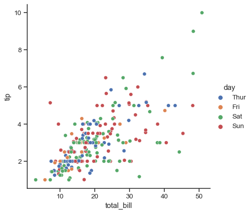
To illustrate kind="scatter" (the default style of plot), we will use the “tips” dataset:
tips = sns.load_dataset("tips")
tips.head()
| total_bill | tip | sex | smoker | day | time | size | |
|---|---|---|---|---|---|---|---|
| 0 | 16.99 | 1.01 | Female | No | Sun | Dinner | 2 |
| 1 | 10.34 | 1.66 | Male | No | Sun | Dinner | 3 |
| 2 | 21.01 | 3.50 | Male | No | Sun | Dinner | 3 |
| 3 | 23.68 | 3.31 | Male | No | Sun | Dinner | 2 |
| 4 | 24.59 | 3.61 | Female | No | Sun | Dinner | 4 |
Assigning x and y and any semantic mapping variables will draw a single plot:
sns.relplot(data=tips, x="total_bill", y="tip", hue="day")
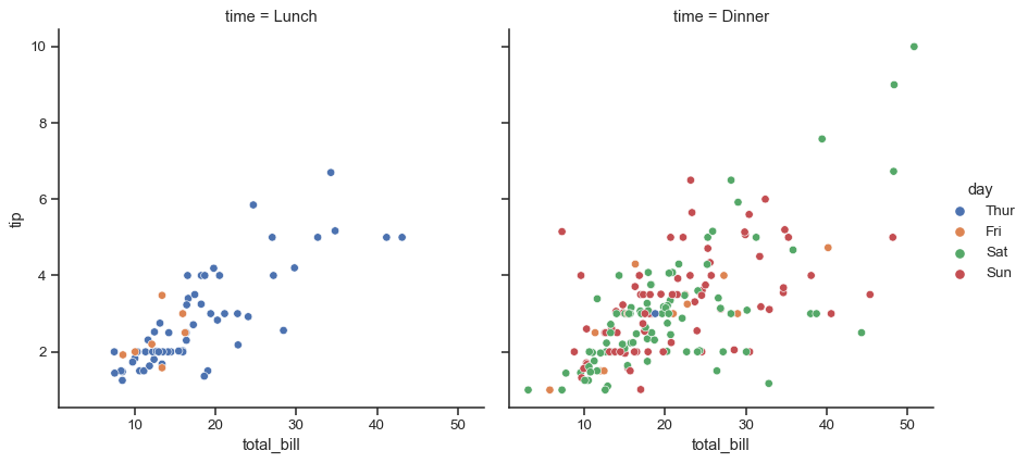
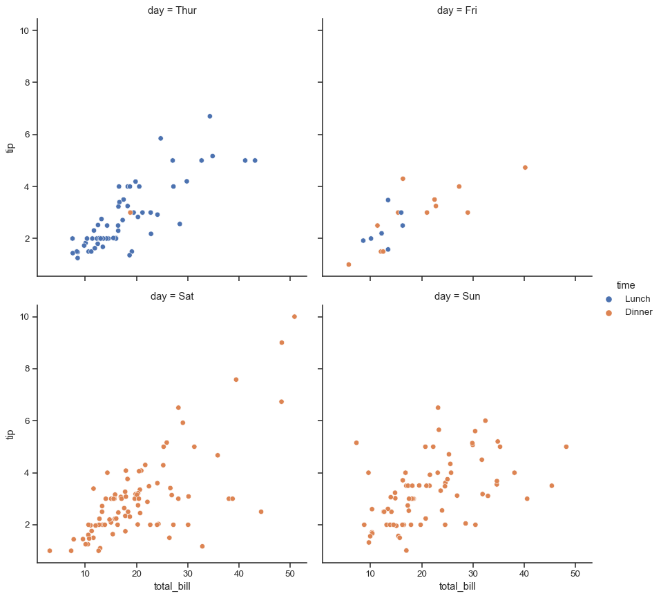
Assigning a col variable creates a faceted figure with multiple subplots arranged across the columns of the grid:
sns.relplot(data=tips, x="total_bill", y="tip", hue="day", col="time")
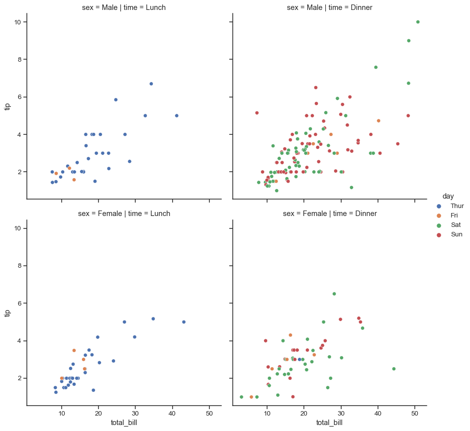
Different variables can be assigned to facet on both the columns and rows:
sns.relplot(data=tips, x="total_bill", y="tip", hue="day", col="time", row="sex")
When the variable assigned to col has many levels, it can be “wrapped” across multiple rows:
sns.relplot(data=tips, x="total_bill", y="tip", hue="time", col="day", col_wrap=2)
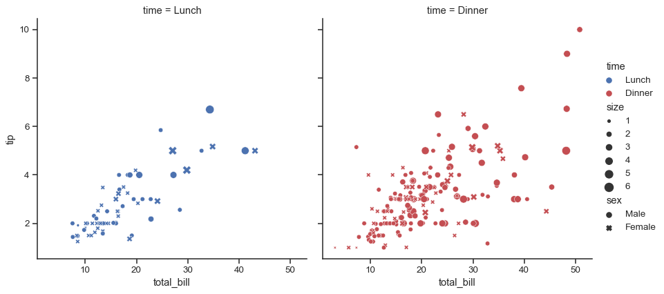
Assigning multiple semantic variables can show multi-dimensional relationships, but be mindful to avoid making an overly-complicated plot.
sns.relplot(
    data=tips, x="total_bill", y="tip", col="time",
    hue="time", size="size", style="sex",
    palette=["b", "r"], sizes=(10, 100)
)
When there is a natural continuity to one of the variables, it makes more sense to show lines instead of points. To draw the figure using lineplot(), set kind="line". We will illustrate this effect with the “fmri dataset:
fmri = sns.load_dataset("fmri")
fmri.head()
| subject | timepoint | event | region | signal | |
|---|---|---|---|---|---|
| 0 | s13 | 18 | stim | parietal | -0.017552 |
| 1 | s5 | 14 | stim | parietal | -0.080883 |
| 2 | s12 | 18 | stim | parietal | -0.081033 |
| 3 | s11 | 18 | stim | parietal | -0.046134 |
| 4 | s10 | 18 | stim | parietal | -0.037970 |
Using kind="line" offers the same flexibility for semantic mappings as kind="scatter", but lineplot() transforms the data more before plotting. Observations are sorted by their x value, and repeated observations are aggregated. By default, the resulting plot shows the mean and 95% CI for each unit
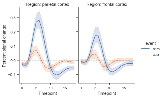
sns.relplot(
    data=fmri, x="timepoint", y="signal", col="region",
    hue="event", style="event", kind="line",
)
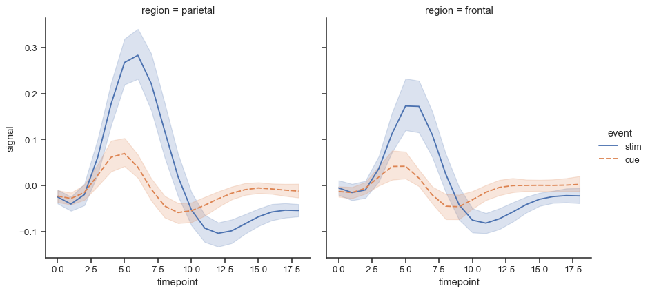
The size and shape of the figure is parametrized by the height and aspect ratio of each individual facet:
sns.relplot(
    data=fmri,
    x="timepoint", y="signal",
    hue="event", style="event", col="region",
    height=4, aspect=.7, kind="line"
)
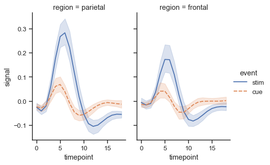
The object returned by relplot() is always a FacetGrid, which has several methods that allow you to quickly tweak the title, labels, and other aspects of the plot:
g = sns.relplot(
    data=fmri,
    x="timepoint", y="signal",
    hue="event", style="event", col="region",
    height=4, aspect=.7, kind="line"
)
(g.map(plt.axhline, y=0, color=".7", dashes=(2, 1), zorder=0)
  .set_axis_labels("Timepoint", "Percent signal change")
  .set_titles("Region: {col_name} cortex")
  .tight_layout(w_pad=0))
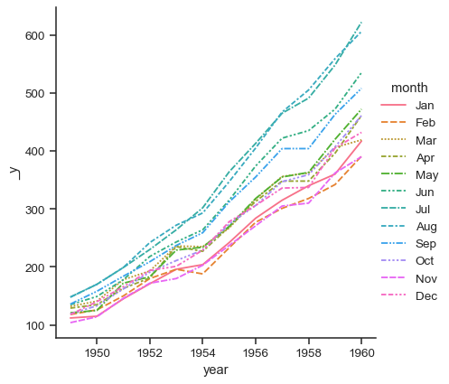
It is also possible to use wide-form data with relplot():
flights_wide = sns.load_dataset("flights").pivot("year", "month", "passengers")
Faceting is not an option in this case, but the plot will still take advantage of the external legend offered by FacetGrid:
sns.relplot(data=flights_wide, kind="line")