seaborn.jointplot(*, x=None, y=None, data=None, kind='scatter', color=None, height=6, ratio=5, space=0.2, dropna=False, xlim=None, ylim=None, marginal_ticks=False, joint_kws=None, marginal_kws=None, hue=None, palette=None, hue_order=None, hue_norm=None, **kwargs)¶Draw a plot of two variables with bivariate and univariate graphs.
This function provides a convenient interface to the JointGrid
class, with several canned plot kinds. This is intended to be a fairly
lightweight wrapper; if you need more flexibility, you should use
JointGrid directly.
dataVariables that specify positions on the x and y axes.
pandas.DataFrame, numpy.ndarray, mapping, or sequenceInput data structure. Either a long-form collection of vectors that can be assigned to named variables or a wide-form dataset that will be internally reshaped.
Kind of plot to draw. See the examples for references to the underlying functions.
matplotlib colorSingle color specification for when hue mapping is not used. Otherwise, the plot will try to hook into the matplotlib property cycle.
Size of the figure (it will be square).
Ratio of joint axes height to marginal axes height.
Space between the joint and marginal axes
If True, remove observations that are missing from x and y.
Axis limits to set before plotting.
If False, suppress ticks on the count/density axis of the marginal plots.
Additional keyword arguments for the plot components.
dataSemantic variable that is mapped to determine the color of plot elements. Semantic variable that is mapped to determine the color of plot elements.
matplotlib.colors.ColormapMethod for choosing the colors to use when mapping the hue semantic.
String values are passed to color_palette(). List or dict values
imply categorical mapping, while a colormap object implies numeric mapping.
Specify the order of processing and plotting for categorical levels of the
hue semantic.
matplotlib.colors.NormalizeEither a pair of values that set the normalization range in data units or an object that will map from data units into a [0, 1] interval. Usage implies numeric mapping.
Additional keyword arguments are passed to the function used to
draw the plot on the joint Axes, superseding items in the
joint_kws dictionary.
JointGridAn object managing multiple subplots that correspond to joint and marginal axes for plotting a bivariate relationship or distribution.
See also
Examples
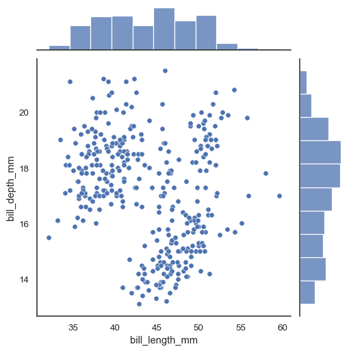
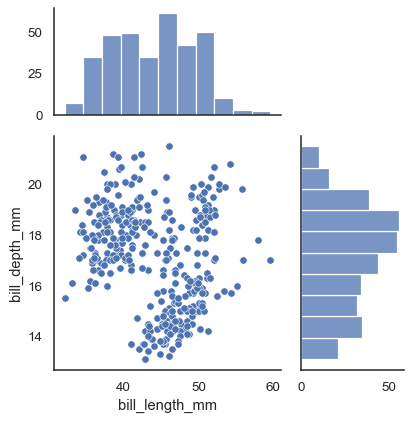
In the simplest invocation, assign x and y to create a scatterplot (using scatterplot()) with marginal histograms (using histplot()):
penguins = sns.load_dataset("penguins")
sns.jointplot(data=penguins, x="bill_length_mm", y="bill_depth_mm")
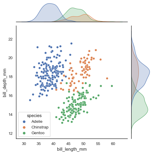
Assigning a hue variable will add conditional colors to the scatterplot and draw separate density curves (using kdeplot()) on the marginal axes:
sns.jointplot(data=penguins, x="bill_length_mm", y="bill_depth_mm", hue="species")
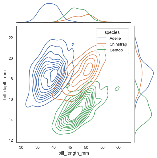
Several different approaches to plotting are available through the kind parameter. Setting kind="kde" will draw both bivariate and univariate KDEs:
sns.jointplot(data=penguins, x="bill_length_mm", y="bill_depth_mm", hue="species", kind="kde")
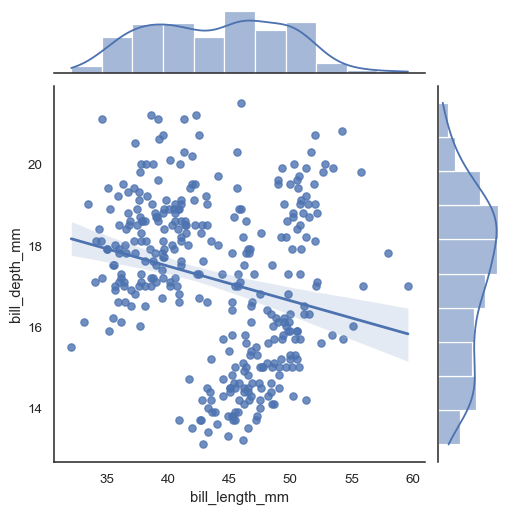
Set kind="reg" to add a linear regression fit (using regplot()) and univariate KDE curves:
sns.jointplot(data=penguins, x="bill_length_mm", y="bill_depth_mm", kind="reg")
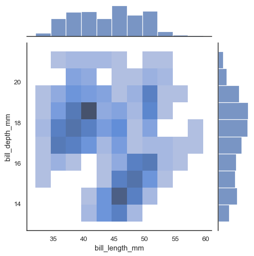
There are also two options for bin-based visualization of the joint distribution. The first, with kind="hist", uses histplot() on all of the axes:
sns.jointplot(data=penguins, x="bill_length_mm", y="bill_depth_mm", kind="hist")
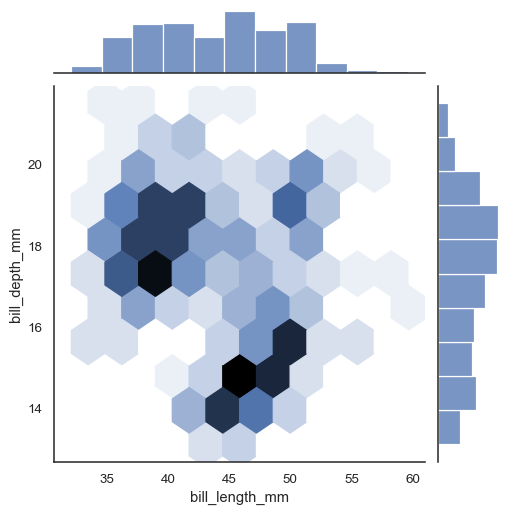
Alternatively, setting kind="hex" will use matplotlib.axes.Axes.hexbin() to compute a bivariate histogram using hexagonal bins:
sns.jointplot(data=penguins, x="bill_length_mm", y="bill_depth_mm", kind="hex")
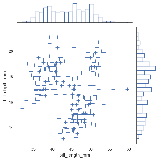
Additional keyword arguments can be passed down to the underlying plots:
sns.jointplot(
    data=penguins, x="bill_length_mm", y="bill_depth_mm",
    marker="+", s=100, marginal_kws=dict(bins=25, fill=False),
)
Use JointGrid parameters to control the size and layout of the figure:
sns.jointplot(data=penguins, x="bill_length_mm", y="bill_depth_mm", height=5, ratio=2, marginal_ticks=True)
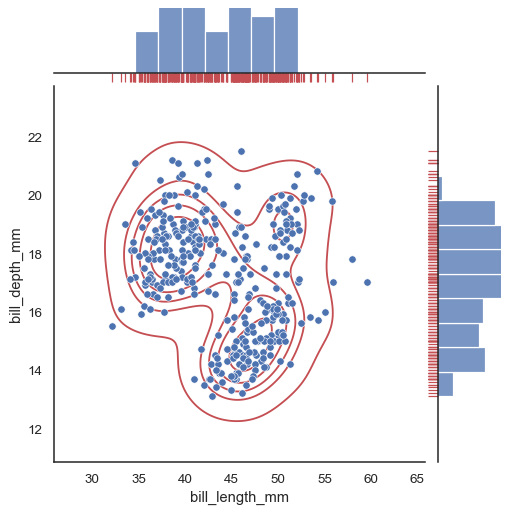
To add more layers onto the plot, use the methods on the JointGrid object that jointplot() returns:
g = sns.jointplot(data=penguins, x="bill_length_mm", y="bill_depth_mm")
g.plot_joint(sns.kdeplot, color="r", zorder=0, levels=6)
g.plot_marginals(sns.rugplot, color="r", height=-.15, clip_on=False)