seaborn.ecdfplot(data=None, *, x=None, y=None, hue=None, weights=None, stat='proportion', complementary=False, palette=None, hue_order=None, hue_norm=None, log_scale=None, legend=True, ax=None, **kwargs)¶Plot empirical cumulative distribution functions.
An ECDF represents the proportion or count of observations falling below each unique value in a dataset. Compared to a histogram or density plot, it has the advantage that each observation is visualized directly, meaning that there are no binning or smoothing parameters that need to be adjusted. It also aids direct comparisons between multiple distributions. A downside is that the relationship between the appearance of the plot and the basic properties of the distribution (such as its central tendency, variance, and the presence of any bimodality) may not be as intuitive.
More information is provided in the user guide.
pandas.DataFrame, numpy.ndarray, mapping, or sequenceInput data structure. Either a long-form collection of vectors that can be assigned to named variables or a wide-form dataset that will be internally reshaped.
dataVariables that specify positions on the x and y axes.
dataSemantic variable that is mapped to determine the color of plot elements.
dataIf provided, weight the contribution of the corresponding data points towards the cumulative distribution using these values.
Distribution statistic to compute.
If True, use the complementary CDF (1 - CDF)
matplotlib.colors.ColormapMethod for choosing the colors to use when mapping the hue semantic.
String values are passed to color_palette(). List or dict values
imply categorical mapping, while a colormap object implies numeric mapping.
Specify the order of processing and plotting for categorical levels of the
hue semantic.
matplotlib.colors.NormalizeEither a pair of values that set the normalization range in data units or an object that will map from data units into a [0, 1] interval. Usage implies numeric mapping.
Set axis scale(s) to log. A single value sets the data axis for univariate
distributions and both axes for bivariate distributions. A pair of values
sets each axis independently. Numeric values are interpreted as the desired
base (default 10). If False, defer to the existing Axes scale.
If False, suppress the legend for semantic variables.
matplotlib.axes.AxesPre-existing axes for the plot. Otherwise, call matplotlib.pyplot.gca()
internally.
Other keyword arguments are passed to matplotlib.axes.Axes.plot().
matplotlib.axes.AxesThe matplotlib axes containing the plot.
See also
displotFigure-level interface to distribution plot functions.
histplotPlot a histogram of binned counts with optional normalization or smoothing.
kdeplotPlot univariate or bivariate distributions using kernel density estimation.
rugplotPlot a tick at each observation value along the x and/or y axes.
Examples
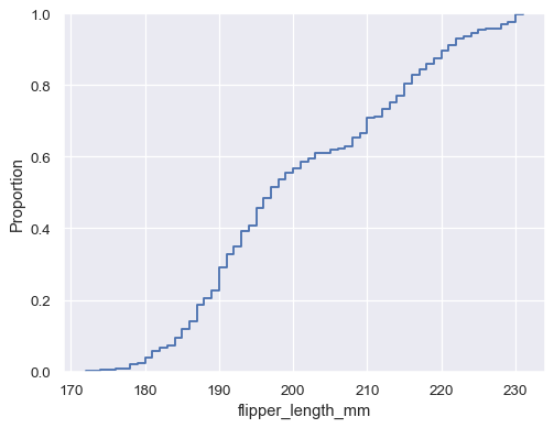
Plot a univariate distribution along the x axis:
penguins = sns.load_dataset("penguins")
sns.ecdfplot(data=penguins, x="flipper_length_mm")
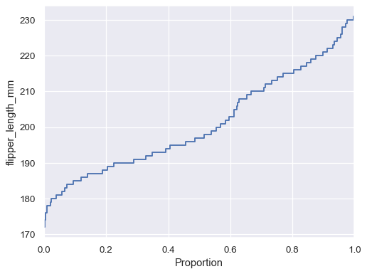
Flip the plot by assigning the data variable to the y axis:
sns.ecdfplot(data=penguins, y="flipper_length_mm")
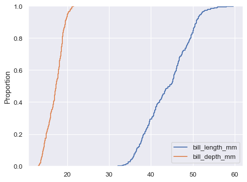
If neither x nor y is assigned, the dataset is treated as
wide-form, and a histogram is drawn for each numeric column:
sns.ecdfplot(data=penguins.filter(like="bill_", axis="columns"))
You can also draw multiple histograms from a long-form dataset with hue mapping:
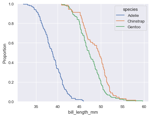
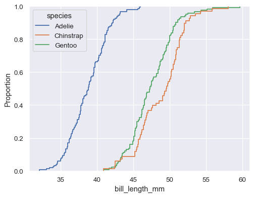
sns.ecdfplot(data=penguins, x="bill_length_mm", hue="species")
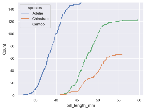
The default distribution statistic is normalized to show a proportion, but you can show absolute counts instead:
sns.ecdfplot(data=penguins, x="bill_length_mm", hue="species", stat="count")
It’s also possible to plot the empirical complementary CDF (1 - CDF):
sns.ecdfplot(data=penguins, x="bill_length_mm", hue="species", complementary=True)