seaborn.lineplot
-
seaborn.lineplot(x=None, y=None, hue=None, size=None, style=None, data=None, palette=None, hue_order=None, hue_norm=None, sizes=None, size_order=None, size_norm=None, dashes=True, markers=None, style_order=None, units=None, estimator='mean', ci=95, n_boot=1000, seed=None, sort=True, err_style='band', err_kws=None, legend='brief', ax=None, **kwargs)¶ Draw a line plot with possibility of several semantic groupings.
The relationship between
xandycan be shown for different subsets of the data using thehue,size, andstyleparameters. These parameters control what visual semantics are used to identify the different subsets. It is possible to show up to three dimensions independently by using all three semantic types, but this style of plot can be hard to interpret and is often ineffective. Using redundant semantics (i.e. bothhueandstylefor the same variable) can be helpful for making graphics more accessible.See the tutorial for more information.
The default treatment of the
hue(and to a lesser extent,size) semantic, if present, depends on whether the variable is inferred to represent “numeric” or “categorical” data. In particular, numeric variables are represented with a sequential colormap by default, and the legend entries show regular “ticks” with values that may or may not exist in the data. This behavior can be controlled through various parameters, as described and illustrated below.By default, the plot aggregates over multiple
yvalues at each value ofxand shows an estimate of the central tendency and a confidence interval for that estimate.- Parameters
- x, ynames of variables in
dataor vector data, optional Input data variables; must be numeric. Can pass data directly or reference columns in
data.- huename of variables in
dataor vector data, optional Grouping variable that will produce lines with different colors. Can be either categorical or numeric, although color mapping will behave differently in latter case.
- sizename of variables in
dataor vector data, optional Grouping variable that will produce lines with different widths. Can be either categorical or numeric, although size mapping will behave differently in latter case.
- stylename of variables in
dataor vector data, optional Grouping variable that will produce lines with different dashes and/or markers. Can have a numeric dtype but will always be treated as categorical.
- dataDataFrame
Tidy (“long-form”) dataframe where each column is a variable and each row is an observation.
- palettepalette name, list, or dict, optional
Colors to use for the different levels of the
huevariable. Should be something that can be interpreted bycolor_palette(), or a dictionary mapping hue levels to matplotlib colors.- hue_orderlist, optional
Specified order for the appearance of the
huevariable levels, otherwise they are determined from the data. Not relevant when thehuevariable is numeric.- hue_normtuple or Normalize object, optional
Normalization in data units for colormap applied to the
huevariable when it is numeric. Not relevant if it is categorical.- sizeslist, dict, or tuple, optional
An object that determines how sizes are chosen when
sizeis used. It can always be a list of size values or a dict mapping levels of thesizevariable to sizes. Whensizeis numeric, it can also be a tuple specifying the minimum and maximum size to use such that other values are normalized within this range.- size_orderlist, optional
Specified order for appearance of the
sizevariable levels, otherwise they are determined from the data. Not relevant when thesizevariable is numeric.- size_normtuple or Normalize object, optional
Normalization in data units for scaling plot objects when the
sizevariable is numeric.- dashesboolean, list, or dictionary, optional
Object determining how to draw the lines for different levels of the
stylevariable. Setting toTruewill use default dash codes, or you can pass a list of dash codes or a dictionary mapping levels of thestylevariable to dash codes. Setting toFalsewill use solid lines for all subsets. Dashes are specified as in matplotlib: a tuple of(segment, gap)lengths, or an empty string to draw a solid line.- markersboolean, list, or dictionary, optional
Object determining how to draw the markers for different levels of the
stylevariable. Setting toTruewill use default markers, or you can pass a list of markers or a dictionary mapping levels of thestylevariable to markers. Setting toFalsewill draw marker-less lines. Markers are specified as in matplotlib.- style_orderlist, optional
Specified order for appearance of the
stylevariable levels otherwise they are determined from the data. Not relevant when thestylevariable is numeric.- units{long_form_var}
Grouping variable identifying sampling units. When used, a separate line will be drawn for each unit with appropriate semantics, but no legend entry will be added. Useful for showing distribution of experimental replicates when exact identities are not needed.
- estimatorname of pandas method or callable or None, optional
Method for aggregating across multiple observations of the
yvariable at the samexlevel. IfNone, all observations will be drawn.- ciint or “sd” or None, optional
Size of the confidence interval to draw when aggregating with an estimator. “sd” means to draw the standard deviation of the data. Setting to
Nonewill skip bootstrapping.- n_bootint, optional
Number of bootstraps to use for computing the confidence interval.
- seedint, numpy.random.Generator, or numpy.random.RandomState, optional
Seed or random number generator for reproducible bootstrapping.
- sortboolean, optional
If True, the data will be sorted by the x and y variables, otherwise lines will connect points in the order they appear in the dataset.
- err_style“band” or “bars”, optional
Whether to draw the confidence intervals with translucent error bands or discrete error bars.
- err_kwsdict of keyword arguments
Additional paramters to control the aesthetics of the error bars. The kwargs are passed either to
matplotlib.axes.Axes.fill_between()ormatplotlib.axes.Axes.errorbar(), depending onerr_style.- legend“brief”, “full”, or False, optional
How to draw the legend. If “brief”, numeric
hueandsizevariables will be represented with a sample of evenly spaced values. If “full”, every group will get an entry in the legend. IfFalse, no legend data is added and no legend is drawn.- axmatplotlib Axes, optional
Axes object to draw the plot onto, otherwise uses the current Axes.
- kwargskey, value mappings
Other keyword arguments are passed down to
matplotlib.axes.Axes.plot().
- x, ynames of variables in
- Returns
- axmatplotlib Axes
Returns the Axes object with the plot drawn onto it.
See also
scatterplotShow the relationship between two variables without emphasizing continuity of the
xvariable.pointplotShow the relationship between two variables when one is categorical.
Examples
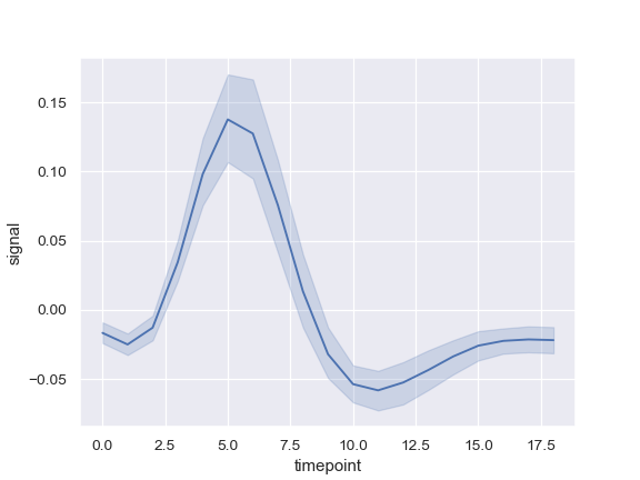
Draw a single line plot with error bands showing a confidence interval:
>>> import seaborn as sns; sns.set()
>>> import matplotlib.pyplot as plt
>>> fmri = sns.load_dataset("fmri")
>>> ax = sns.lineplot(x="timepoint", y="signal", data=fmri)
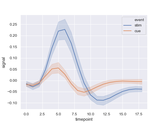
Group by another variable and show the groups with different colors:
>>> ax = sns.lineplot(x="timepoint", y="signal", hue="event",
...                   data=fmri)
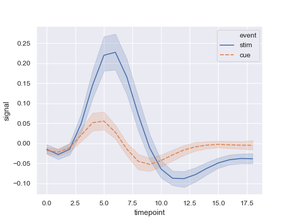
Show the grouping variable with both color and line dashing:
>>> ax = sns.lineplot(x="timepoint", y="signal",
...                   hue="event", style="event", data=fmri)
Use color and line dashing to represent two different grouping variables:
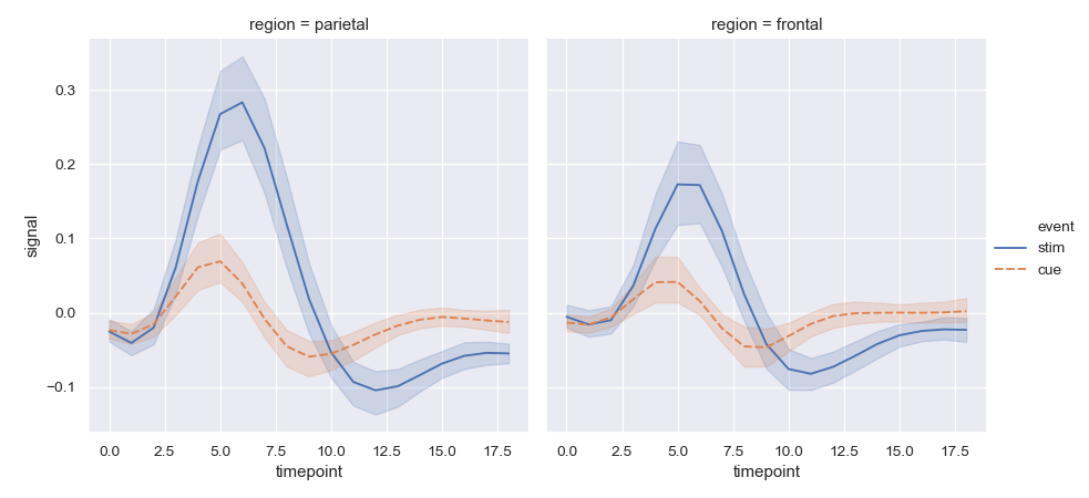
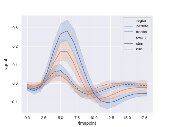
>>> ax = sns.lineplot(x="timepoint", y="signal",
...                   hue="region", style="event", data=fmri)
Use markers instead of the dashes to identify groups:
>>> ax = sns.lineplot(x="timepoint", y="signal",
...                   hue="event", style="event",
...                   markers=True, dashes=False, data=fmri)

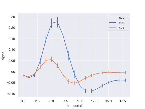
Show error bars instead of error bands and plot the standard error:
>>> ax = sns.lineplot(x="timepoint", y="signal", hue="event",
...                   err_style="bars", ci=68, data=fmri)
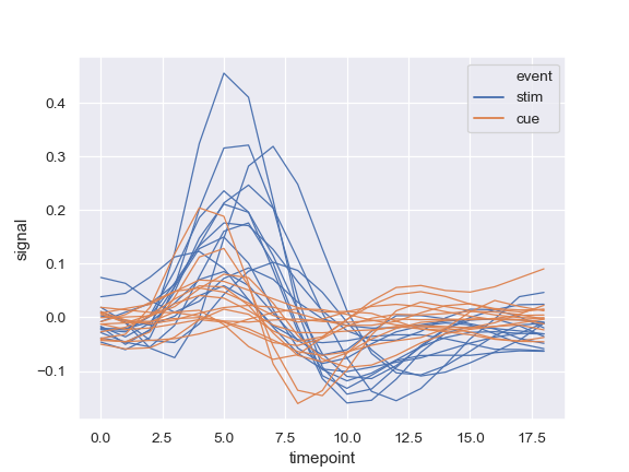
Show experimental replicates instead of aggregating:
>>> ax = sns.lineplot(x="timepoint", y="signal", hue="event",
...                   units="subject", estimator=None, lw=1,
...                   data=fmri.query("region == 'frontal'"))
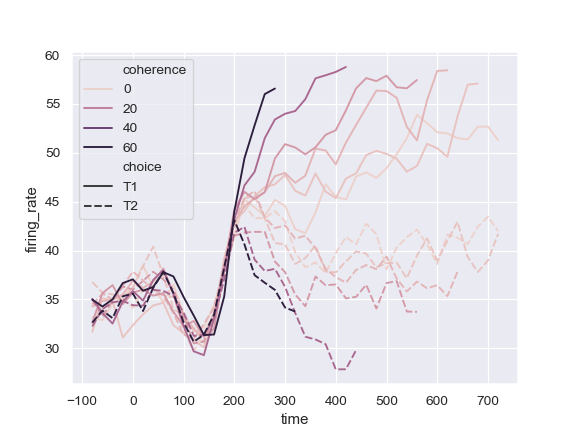
Use a quantitative color mapping:
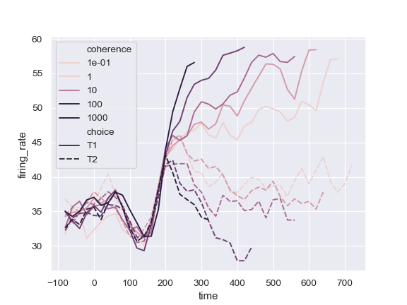
>>> dots = sns.load_dataset("dots").query("align == 'dots'")
>>> ax = sns.lineplot(x="time", y="firing_rate",
...                   hue="coherence", style="choice",
...                   data=dots)
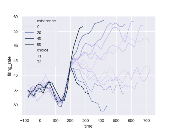
Use a different normalization for the colormap:
>>> from matplotlib.colors import LogNorm
>>> ax = sns.lineplot(x="time", y="firing_rate",
...                   hue="coherence", style="choice",
...                   hue_norm=LogNorm(), data=dots)
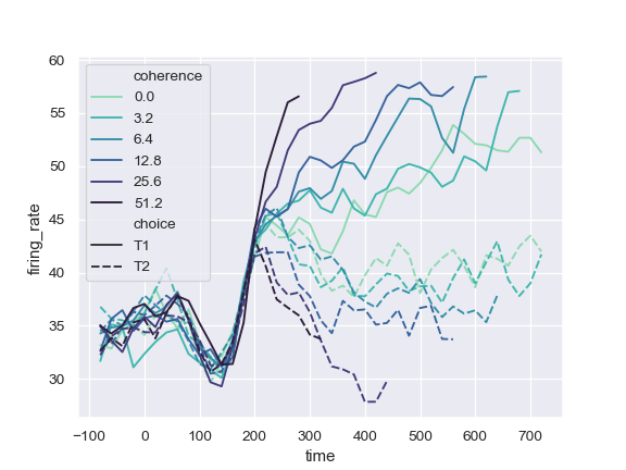
Use a different color palette:
>>> ax = sns.lineplot(x="time", y="firing_rate",
...                   hue="coherence", style="choice",
...                   palette="ch:2.5,.25", data=dots)
Use specific color values, treating the hue variable as categorical:
>>> palette = sns.color_palette("mako_r", 6)
>>> ax = sns.lineplot(x="time", y="firing_rate",
...                   hue="coherence", style="choice",
...                   palette=palette, data=dots)
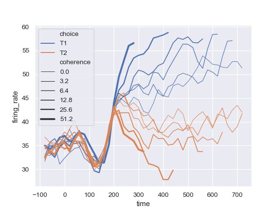
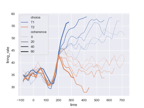
Change the width of the lines with a quantitative variable:
>>> ax = sns.lineplot(x="time", y="firing_rate",
...                   size="coherence", hue="choice",
...                   legend="full", data=dots)
Change the range of line widths used to normalize the size variable:
>>> ax = sns.lineplot(x="time", y="firing_rate",
...                   size="coherence", hue="choice",
...                   sizes=(.25, 2.5), data=dots)
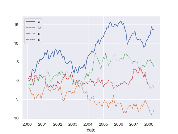
Plot from a wide-form DataFrame:
>>> import numpy as np, pandas as pd; plt.close("all")
>>> index = pd.date_range("1 1 2000", periods=100,
...                       freq="m", name="date")
>>> data = np.random.randn(100, 4).cumsum(axis=0)
>>> wide_df = pd.DataFrame(data, index, ["a", "b", "c", "d"])
>>> ax = sns.lineplot(data=wide_df)
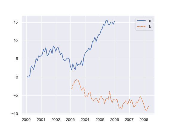
Plot from a list of Series:
>>> list_data = [wide_df.loc[:"2005", "a"], wide_df.loc["2003":, "b"]]
>>> ax = sns.lineplot(data=list_data)
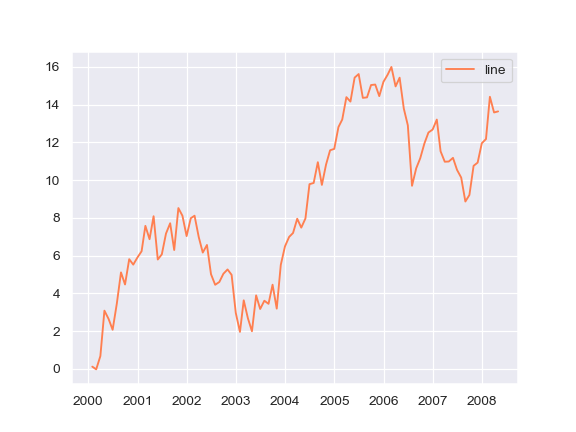
Plot a single Series, pass kwargs to
matplotlib.axes.Axes.plot():>>> ax = sns.lineplot(data=wide_df["a"], color="coral", label="line")
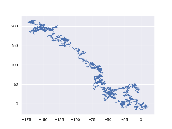
Draw lines at points as they appear in the dataset:
>>> x, y = np.random.randn(2, 5000).cumsum(axis=1)
>>> ax = sns.lineplot(x=x, y=y, sort=False, lw=1)
Use
relplot()to combinelineplot()andFacetGrid: This allows grouping within additional categorical variables. Usingrelplot()is safer than usingFacetGriddirectly, as it ensures synchronization of the semantic mappings across facets.>>> g = sns.relplot(x="timepoint", y="signal", ... col="region", hue="event", style="event", ... kind="line", data=fmri)