seaborn.catplot
-
seaborn.catplot(x=None, y=None, hue=None, data=None, row=None, col=None, col_wrap=None, estimator=<function mean>, ci=95, n_boot=1000, units=None, order=None, hue_order=None, row_order=None, col_order=None, kind='strip', height=5, aspect=1, orient=None, color=None, palette=None, legend=True, legend_out=True, sharex=True, sharey=True, margin_titles=False, facet_kws=None, **kwargs)¶ Figure-level interface for drawing categorical plots onto a FacetGrid.
This function provides access to several axes-level functions that show the relationship between a numerical and one or more categorical variables using one of several visual representations. The
kindparameter selects the underlying axes-level function to use:Categorical scatterplots:
stripplot()(withkind="strip"; the default)swarmplot()(withkind="swarm")
Categorical distribution plots:
boxplot()(withkind="box")violinplot()(withkind="violin")boxenplot()(withkind="boxen")
Categorical estimate plots:
pointplot()(withkind="point")barplot()(withkind="bar")countplot()(withkind="count")
Extra keyword arguments are passed to the underlying function, so you should refer to the documentation for each to see kind-specific options.
Note that unlike when using the axes-level functions directly, data must be passed in a long-form DataFrame with variables specified by passing strings to
x,y,hue, etc.As in the case with the underlying plot functions, if variables have a
categoricaldata type, the the levels of the categorical variables, and their order will be inferred from the objects. Otherwise you may have to use alter the dataframe sorting or use the function parameters (orient,order,hue_order, etc.) to set up the plot correctly.This function always treats one of the variables as categorical and draws data at ordinal positions (0, 1, … n) on the relevant axis, even when the data has a numeric or date type.
See the tutorial for more information.
After plotting, the
FacetGridwith the plot is returned and can be used directly to tweak supporting plot details or add other layers.Parameters: x, y, hue : names of variables in
dataInputs for plotting long-form data. See examples for interpretation.
data : DataFrame
Long-form (tidy) dataset for plotting. Each column should correspond to a variable, and each row should correspond to an observation.
row, col : names of variables in
data, optionalCategorical variables that will determine the faceting of the grid.
col_wrap : int, optional
“Wrap” the column variable at this width, so that the column facets span multiple rows. Incompatible with a
rowfacet.estimator : callable that maps vector -> scalar, optional
Statistical function to estimate within each categorical bin.
ci : float or “sd” or None, optional
Size of confidence intervals to draw around estimated values. If “sd”, skip bootstrapping and draw the standard deviation of the observations. If
None, no bootstrapping will be performed, and error bars will not be drawn.n_boot : int, optional
Number of bootstrap iterations to use when computing confidence intervals.
units : name of variable in
dataor vector data, optionalIdentifier of sampling units, which will be used to perform a multilevel bootstrap and account for repeated measures design.
order, hue_order : lists of strings, optional
Order to plot the categorical levels in, otherwise the levels are inferred from the data objects.
row_order, col_order : lists of strings, optional
Order to organize the rows and/or columns of the grid in, otherwise the orders are inferred from the data objects.
kind : string, optional
The kind of plot to draw (corresponds to the name of a categorical plotting function. Options are: “point”, “bar”, “strip”, “swarm”, “box”, “violin”, or “boxen”.
height : scalar, optional
Height (in inches) of each facet. See also:
aspect.aspect : scalar, optional
Aspect ratio of each facet, so that
aspect * heightgives the width of each facet in inches.orient : “v” | “h”, optional
Orientation of the plot (vertical or horizontal). This is usually inferred from the dtype of the input variables, but can be used to specify when the “categorical” variable is a numeric or when plotting wide-form data.
color : matplotlib color, optional
Color for all of the elements, or seed for a gradient palette.
palette : palette name, list, or dict, optional
Colors to use for the different levels of the
huevariable. Should be something that can be interpreted bycolor_palette(), or a dictionary mapping hue levels to matplotlib colors.legend : bool, optional
If
Trueand there is ahuevariable, draw a legend on the plot.legend_out : bool, optional
If
True, the figure size will be extended, and the legend will be drawn outside the plot on the center right.share{x,y} : bool, ‘col’, or ‘row’ optional
If true, the facets will share y axes across columns and/or x axes across rows.
margin_titles : bool, optional
If
True, the titles for the row variable are drawn to the right of the last column. This option is experimental and may not work in all cases.facet_kws : dict, optional
Dictionary of other keyword arguments to pass to
FacetGrid.kwargs : key, value pairings
Other keyword arguments are passed through to the underlying plotting function.
Returns: g :
FacetGridReturns the
FacetGridobject with the plot on it for further tweaking.Examples
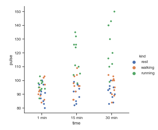
Draw a single facet to use the
FacetGridlegend placement:>>> import seaborn as sns >>> sns.set(style="ticks") >>> exercise = sns.load_dataset("exercise") >>> g = sns.catplot(x="time", y="pulse", hue="kind", data=exercise)
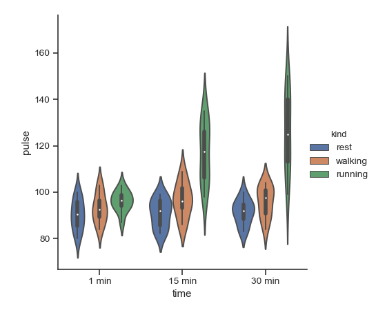
Use a different plot kind to visualize the same data:
>>> g = sns.catplot(x="time", y="pulse", hue="kind",
...                data=exercise, kind="violin")
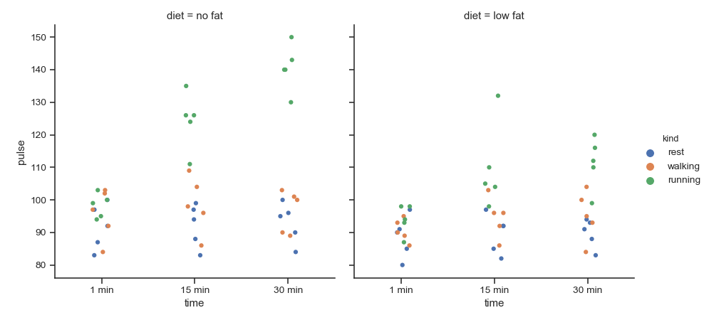
Facet along the columns to show a third categorical variable:
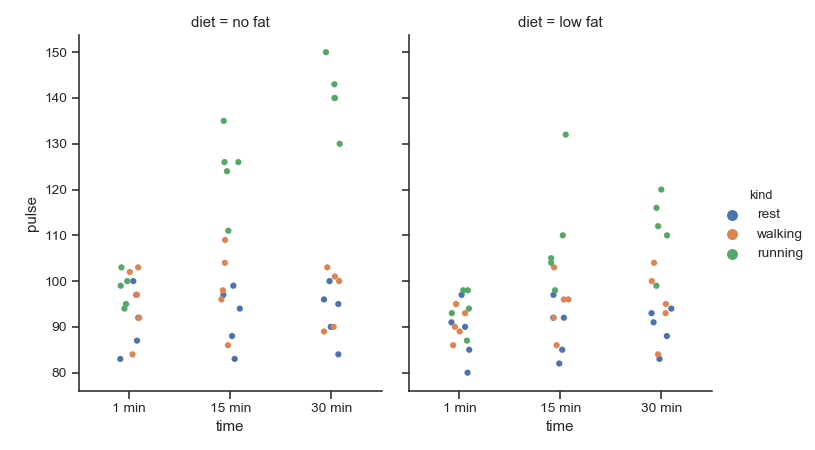
>>> g = sns.catplot(x="time", y="pulse", hue="kind",
...                 col="diet", data=exercise)
Use a different height and aspect ratio for the facets:
>>> g = sns.catplot(x="time", y="pulse", hue="kind",
...                 col="diet", data=exercise,
...                 height=5, aspect=.8)
Make many column facets and wrap them into the rows of the grid:
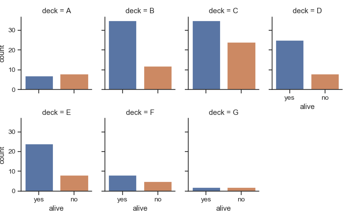
>>> titanic = sns.load_dataset("titanic")
>>> g = sns.catplot("alive", col="deck", col_wrap=4,
...                 data=titanic[titanic.deck.notnull()],
...                 kind="count", height=2.5, aspect=.8)
Plot horizontally and pass other keyword arguments to the plot function:
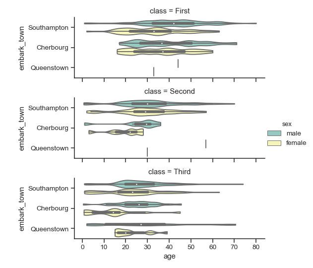
>>> g = sns.catplot(x="age", y="embark_town",
...                 hue="sex", row="class",
...                 data=titanic[titanic.embark_town.notnull()],
...                 orient="h", height=2, aspect=3, palette="Set3",
...                 kind="violin", dodge=True, cut=0, bw=.2)
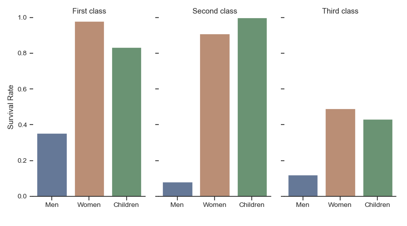
Use methods on the returned
FacetGridto tweak the presentation:>>> g = sns.catplot(x="who", y="survived", col="class", ... data=titanic, saturation=.5, ... kind="bar", ci=None, aspect=.6) >>> (g.set_axis_labels("", "Survival Rate") ... .set_xticklabels(["Men", "Women", "Children"]) ... .set_titles("{col_name} {col_var}") ... .set(ylim=(0, 1)) ... .despine(left=True)) <seaborn.axisgrid.FacetGrid object at 0x...>