seaborn.relplot
-
seaborn.relplot(x=None, y=None, hue=None, size=None, style=None, data=None, row=None, col=None, col_wrap=None, row_order=None, col_order=None, palette=None, hue_order=None, hue_norm=None, sizes=None, size_order=None, size_norm=None, markers=None, dashes=None, style_order=None, legend='brief', kind='scatter', height=5, aspect=1, facet_kws=None, **kwargs)¶ Figure-level interface for drawing relational plots onto a FacetGrid.
This function provides access to several different axes-level functions that show the relationship between two variables with semantic mappings of subsets. The
kindparameter selects the underlying axes-level function to use:scatterplot()(withkind="scatter"; the default)lineplot()(withkind="line")
Extra keyword arguments are passed to the underlying function, so you should refer to the documentation for each to see kind-specific options.
The relationship between
xandycan be shown for different subsets of the data using thehue,size, andstyleparameters. These parameters control what visual semantics are used to identify the different subsets. It is possible to show up to three dimensions independently by using all three semantic types, but this style of plot can be hard to interpret and is often ineffective. Using redundant semantics (i.e. bothhueandstylefor the same variable) can be helpful for making graphics more accessible.See the tutorial for more information.
After plotting, the
FacetGridwith the plot is returned and can be used directly to tweak supporting plot details or add other layers.Note that, unlike when using the underlying plotting functions directly, data must be passed in a long-form DataFrame with variables specified by passing strings to
x,y, and other parameters.Parameters: x, y : names of variables in
dataInput data variables; must be numeric.
hue : name in
data, optionalGrouping variable that will produce elements with different colors. Can be either categorical or numeric, although color mapping will behave differently in latter case.
size : name in
data, optionalGrouping variable that will produce elements with different sizes. Can be either categorical or numeric, although size mapping will behave differently in latter case.
style : name in
data, optionalGrouping variable that will produce elements with different styles. Can have a numeric dtype but will always be treated as categorical.
data : DataFrame
Tidy (“long-form”) dataframe where each column is a variable and each row is an observation.
row, col : names of variables in
data, optionalCategorical variables that will determine the faceting of the grid.
col_wrap : int, optional
“Wrap” the column variable at this width, so that the column facets span multiple rows. Incompatible with a
rowfacet.row_order, col_order : lists of strings, optional
Order to organize the rows and/or columns of the grid in, otherwise the orders are inferred from the data objects.
palette : palette name, list, or dict, optional
Colors to use for the different levels of the
huevariable. Should be something that can be interpreted bycolor_palette(), or a dictionary mapping hue levels to matplotlib colors.hue_order : list, optional
Specified order for the appearance of the
huevariable levels, otherwise they are determined from the data. Not relevant when thehuevariable is numeric.hue_norm : tuple or Normalize object, optional
Normalization in data units for colormap applied to the
huevariable when it is numeric. Not relevant if it is categorical.sizes : list, dict, or tuple, optional
An object that determines how sizes are chosen when
sizeis used. It can always be a list of size values or a dict mapping levels of thesizevariable to sizes. Whensizeis numeric, it can also be a tuple specifying the minimum and maximum size to use such that other values are normalized within this range.size_order : list, optional
Specified order for appearance of the
sizevariable levels, otherwise they are determined from the data. Not relevant when thesizevariable is numeric.size_norm : tuple or Normalize object, optional
Normalization in data units for scaling plot objects when the
sizevariable is numeric.legend : “brief”, “full”, or False, optional
How to draw the legend. If “brief”, numeric
hueandsizevariables will be represented with a sample of evenly spaced values. If “full”, every group will get an entry in the legend. IfFalse, no legend data is added and no legend is drawn.kind : string, optional
Kind of plot to draw, corresponding to a seaborn relational plot. Options are {
scatterandline}.height : scalar, optional
Height (in inches) of each facet. See also:
aspect.aspect : scalar, optional
Aspect ratio of each facet, so that
aspect * heightgives the width of each facet in inches.facet_kws : dict, optional
Dictionary of other keyword arguments to pass to
FacetGrid.kwargs : key, value pairings
Other keyword arguments are passed through to the underlying plotting function.
Returns: g :
FacetGridReturns the
FacetGridobject with the plot on it for further tweaking.Examples
Draw a single facet to use the
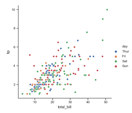
FacetGridlegend placement:>>> import seaborn as sns >>> sns.set(style="ticks") >>> tips = sns.load_dataset("tips") >>> g = sns.relplot(x="total_bill", y="tip", hue="day", data=tips)
Facet on the columns with another variable:
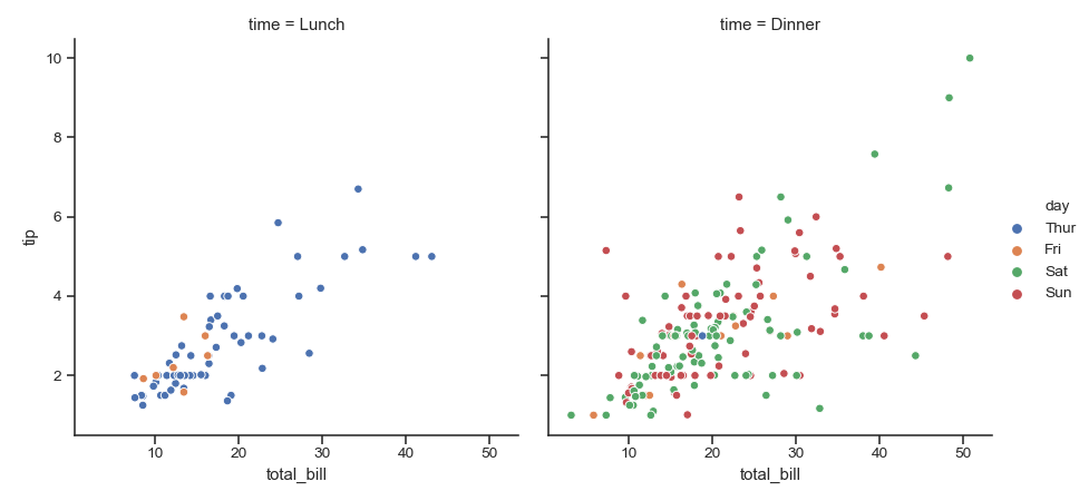
>>> g = sns.relplot(x="total_bill", y="tip",
...                 hue="day", col="time", data=tips)
Facet on the columns and rows:
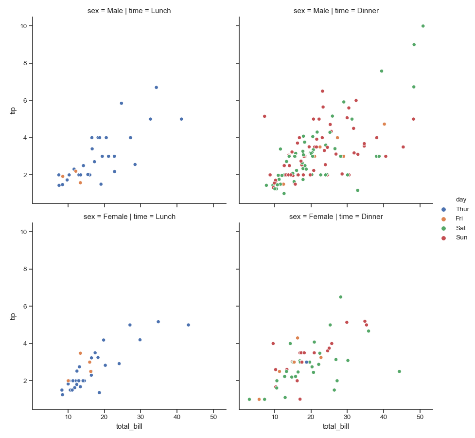
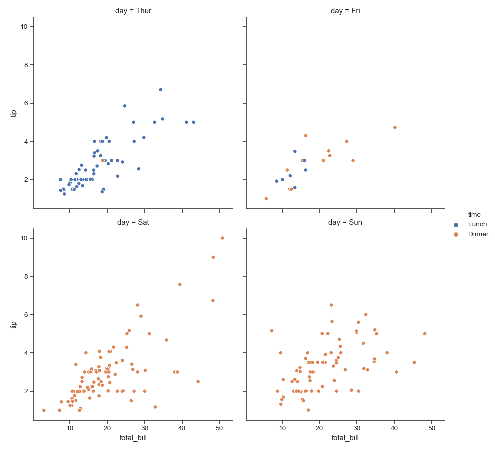
>>> g = sns.relplot(x="total_bill", y="tip", hue="day",
...                 col="time", row="sex", data=tips)
“Wrap” many column facets into multiple rows:
>>> g = sns.relplot(x="total_bill", y="tip", hue="time",
...                 col="day", col_wrap=2, data=tips)
Use multiple semantic variables on each facet with specified attributes:
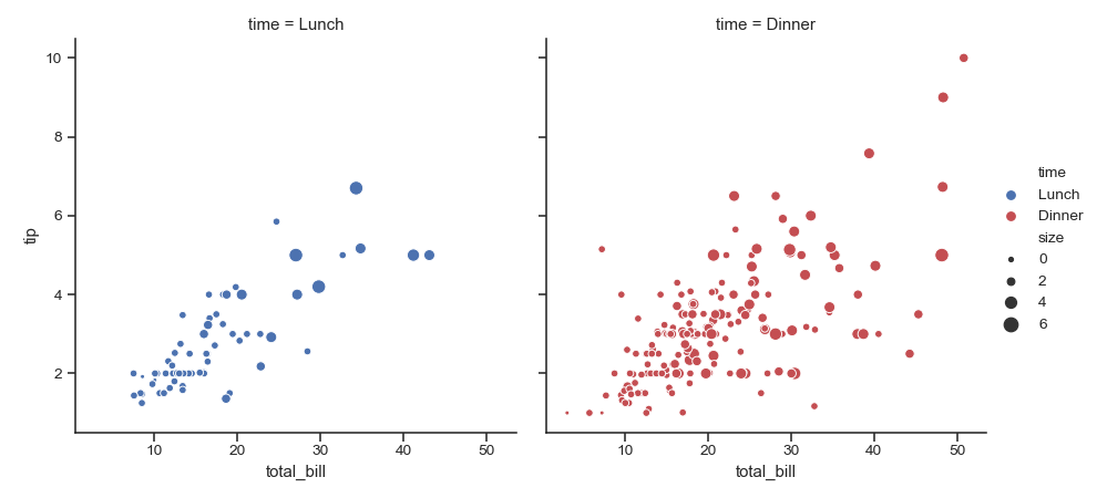
>>> g = sns.relplot(x="total_bill", y="tip", hue="time", size="size",
...                 palette=["b", "r"], sizes=(10, 100),
...                 col="time", data=tips)
Use a different kind of plot:
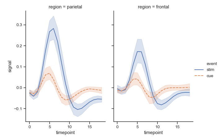
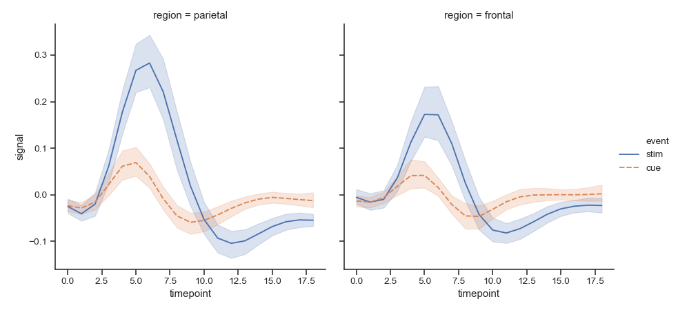
>>> fmri = sns.load_dataset("fmri")
>>> g = sns.relplot(x="timepoint", y="signal",
...                 hue="event", style="event", col="region",
...                 kind="line", data=fmri)
Change the size of each facet:
>>> g = sns.relplot(x="timepoint", y="signal",
...                 hue="event", style="event", col="region",
...                 height=5, aspect=.7, kind="line", data=fmri)