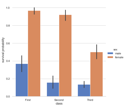
Grouped barplots
Python source code: [download source: grouped_barplot.py]
import seaborn as sns
sns.set(style="whitegrid")

# Load the example Titanic dataset
titanic = sns.load_dataset("titanic")

# Draw a nested barplot to show survival for class and sex
g = sns.catplot(x="class", y="survived", hue="sex", data=titanic,
                height=6, kind="bar", palette="muted")
g.despine(left=True)
g.set_ylabels("survival probability")