seaborn.heatmap(data, *, vmin=None, vmax=None, cmap=None, center=None, robust=False, annot=None, fmt='.2g', annot_kws=None, linewidths=0, linecolor='white', cbar=True, cbar_kws=None, cbar_ax=None, square=False, xticklabels='auto', yticklabels='auto', mask=None, ax=None, **kwargs)¶Plot rectangular data as a color-encoded matrix.
This is an Axes-level function and will draw the heatmap into the
currently-active Axes if none is provided to the ax argument. Part of
this Axes space will be taken and used to plot a colormap, unless cbar
is False or a separate Axes is provided to cbar_ax.
2D dataset that can be coerced into an ndarray. If a Pandas DataFrame is provided, the index/column information will be used to label the columns and rows.
Values to anchor the colormap, otherwise they are inferred from the data and other keyword arguments.
The mapping from data values to color space. If not provided, the
default will depend on whether center is set.
The value at which to center the colormap when plotting divergant data.
Using this parameter will change the default cmap if none is
specified.
If True and vmin or vmax are absent, the colormap range is
computed with robust quantiles instead of the extreme values.
If True, write the data value in each cell. If an array-like with the
same shape as data, then use this to annotate the heatmap instead
of the data. Note that DataFrames will match on position, not index.
String formatting code to use when adding annotations.
Keyword arguments for matplotlib.axes.Axes.text() when annot
is True.
Width of the lines that will divide each cell.
Color of the lines that will divide each cell.
Whether to draw a colorbar.
Keyword arguments for matplotlib.figure.Figure.colorbar().
Axes in which to draw the colorbar, otherwise take space from the main Axes.
If True, set the Axes aspect to “equal” so each cell will be square-shaped.
If True, plot the column names of the dataframe. If False, don’t plot the column names. If list-like, plot these alternate labels as the xticklabels. If an integer, use the column names but plot only every n label. If “auto”, try to densely plot non-overlapping labels.
If passed, data will not be shown in cells where mask is True.
Cells with missing values are automatically masked.
Axes in which to draw the plot, otherwise use the currently-active Axes.
All other keyword arguments are passed to
matplotlib.axes.Axes.pcolormesh().
Axes object with the heatmap.
See also
clustermapPlot a matrix using hierachical clustering to arrange the rows and columns.
Examples
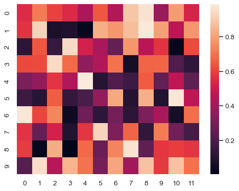
Plot a heatmap for a numpy array:
>>> import numpy as np; np.random.seed(0)
>>> import seaborn as sns; sns.set_theme()
>>> uniform_data = np.random.rand(10, 12)
>>> ax = sns.heatmap(uniform_data)
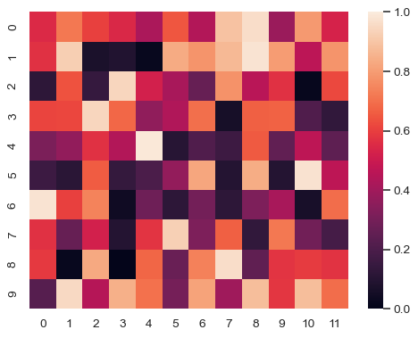
Change the limits of the colormap:
>>> ax = sns.heatmap(uniform_data, vmin=0, vmax=1)
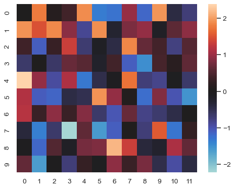
Plot a heatmap for data centered on 0 with a diverging colormap:
>>> normal_data = np.random.randn(10, 12)
>>> ax = sns.heatmap(normal_data, center=0)
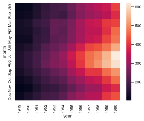
Plot a dataframe with meaningful row and column labels:
>>> flights = sns.load_dataset("flights")
>>> flights = flights.pivot("month", "year", "passengers")
>>> ax = sns.heatmap(flights)
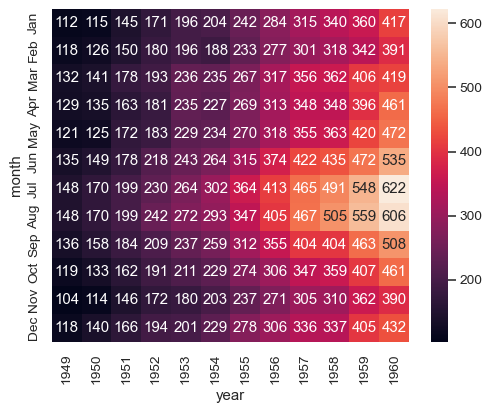
Annotate each cell with the numeric value using integer formatting:
>>> ax = sns.heatmap(flights, annot=True, fmt="d")
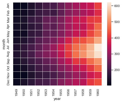
Add lines between each cell:
>>> ax = sns.heatmap(flights, linewidths=.5)
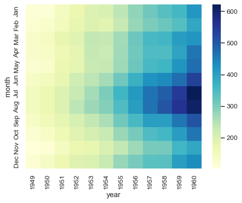
Use a different colormap:
>>> ax = sns.heatmap(flights, cmap="YlGnBu")
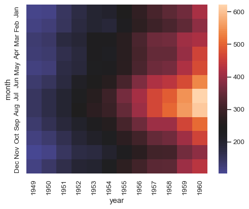
Center the colormap at a specific value:
>>> ax = sns.heatmap(flights, center=flights.loc["Jan", 1955])
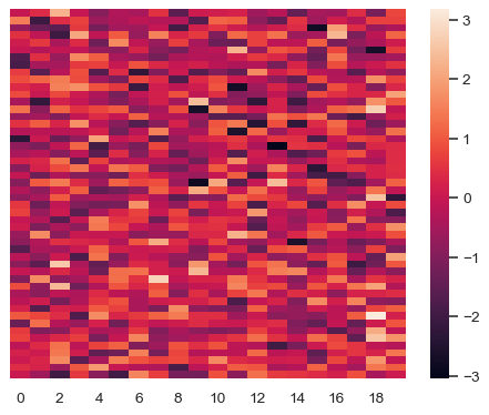
Plot every other column label and don’t plot row labels:
>>> data = np.random.randn(50, 20)
>>> ax = sns.heatmap(data, xticklabels=2, yticklabels=False)
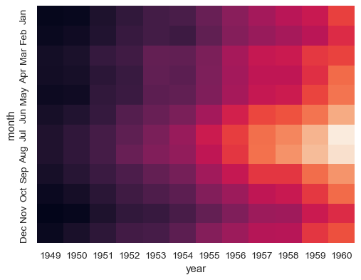
Don’t draw a colorbar:
>>> ax = sns.heatmap(flights, cbar=False)
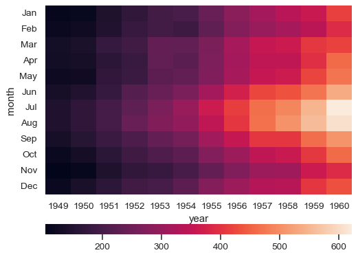
Use different axes for the colorbar:
>>> grid_kws = {"height_ratios": (.9, .05), "hspace": .3}
>>> f, (ax, cbar_ax) = plt.subplots(2, gridspec_kw=grid_kws)
>>> ax = sns.heatmap(flights, ax=ax,
...                  cbar_ax=cbar_ax,
...                  cbar_kws={"orientation": "horizontal"})
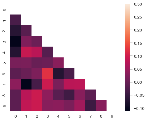
Use a mask to plot only part of a matrix
>>> corr = np.corrcoef(np.random.randn(10, 200))
>>> mask = np.zeros_like(corr)
>>> mask[np.triu_indices_from(mask)] = True
>>> with sns.axes_style("white"):
...     f, ax = plt.subplots(figsize=(7, 5))
...     ax = sns.heatmap(corr, mask=mask, vmax=.3, square=True)
